Choose the Right Photoshop Method for Your Shirt Color Change
You have one product photo and a client who wants to see the same shirt in twelve colors by tomorrow morning. Sound familiar? Whether you are running an e-commerce catalog, building a lookbook for a fashion brand, or retouching portraits, producing realistic shirt color variants from a single image is one of the most common tasks in Photoshop. The catch is that picking the wrong technique can leave you with flat, plastic-looking fabric or hours of unnecessary rework.
This guide walks through three proven methods to change the color of a shirt in Photoshop, each suited to different situations: a Hue/Saturation adjustment layer for fast creative exploration, a Solid Color fill layer with a blend mode for exact color matching, and the Replace Color command for quick one-off swaps. Beyond those core techniques, you will also find dedicated sections on the trickiest scenarios most tutorials skip entirely, like converting a white or black shirt to a vivid chromatic color and handling patterned or striped fabrics without destroying the print.
Before diving into any steps, though, it helps to understand why reaching for the same tool every time leads to inconsistent results.
Why One Method Does Not Fit Every Shirt
Three variables determine which approach gives you the most realistic outcome: the shirt's current color, the complexity of its pattern, and the target color you need to hit. A solid blue polo recolored to red is a completely different challenge than turning a white linen shirt into forest green. Hue-based adjustments rotate existing color data, so they work beautifully on chromatic fabrics but fall apart on whites and blacks that have no color data to rotate. A Solid Color fill layer paired with the Color blend mode, on the other hand, lets you dial in an exact hex value, which is essential when brand guidelines demand precision. And the Replace Color command trades flexibility for speed, making it a practical color changer for quick mockups on uniform fabrics.
Pattern complexity matters just as much. A simple hue shift on a striped or printed shirt can flatten or distort the design, while a luminosity-preserving workflow keeps the pattern intact. Understanding how to change a color in Photoshop starts with matching the method to the material.
Quick Method-Selection Guide
Use the table below to jump straight to the technique that fits your project. Each method is covered step by step in the sections that follow.
| Method | Best For | Difficulty | Limitations |
|---|---|---|---|
| Hue/Saturation Adjustment Layer | Exploring multiple color options quickly; chromatic shirts with visible hue | Beginner | Cannot produce true white or true black; less precise for brand-specific colors |
| Solid Color Fill Layer (Color Blend Mode) | Matching an exact hex, Pantone, or brand color; client-approved swatches | Intermediate | Requires a clean selection mask; may need a secondary Curves layer for brightness control |
| Replace Color Command | Fast one-off edits on solid, uniform-colored shirts | Beginner | Destructive edit (use on a duplicate layer); limited control on multi-toned fabrics |
One principle ties all three approaches together: a non-destructive workflow. As Adobe's own documentation emphasizes, adjustment layers and layer masks let you apply color and tonal changes without permanently altering pixel data, so every edit stays reversible. Think of Photoshop as a powerful image color editor where your original photo is always one click away from restoration. Whether you are doing color replacement in Photoshop for the first time or streamlining a production pipeline, keeping edits non-destructive saves you from the most expensive mistake in retouching: flattening changes you cannot undo.
With the right method identified, the next step is setting up your file so that every color change you make, regardless of technique, remains fully editable from the first layer to the last.
Step 1 - Prepare Your File for Non-Destructive Editing
Every reliable shirt color edit starts before you touch a single slider. Skipping file preparation is the fastest way to paint yourself into a corner, especially on client work where revision requests are inevitable. A few seconds of setup here protects every edit you will make in the steps ahead.
Duplicate Your Background Layer
When you first open an image in Photoshop, it sits on a locked Background layer. Any direct changes to this layer overwrite the original pixels permanently. To keep those pixels safe, press Ctrl+J (Cmd+J on Mac) to duplicate the Background layer. You will see a new layer called "Layer 1" appear above the original in the Layers panel.
Why does this matter? Imagine you have spent twenty minutes perfecting a shirt color change, and the client asks to see the original side by side. Without a preserved Background layer, you would need to undo every step or reopen the file from scratch. For catalog production teams cycling through dozens of color variants, that kind of rework adds up fast. Working on a duplicate means the untouched original is always sitting right there in your layer stack, ready for comparison or a clean restart.
A quick tip: rename the duplicate something descriptive like "Shirt Edit Base" by double-clicking the layer name. When your file grows to five or six layers across multiple color variants, clear naming keeps the Layers panel manageable.
Set Up an Adjustment Layer Workflow
With your duplicate layer in place, click the half-filled circle icon at the bottom of the Layers panel and choose Hue/Saturation. Do not drag any sliders yet. The goal right now is to establish the layer stack pattern that all three color-change methods in this guide will follow: original pixels on the bottom, a working copy above them, and adjustment or fill layers on top.
This structure is the backbone of non-destructive editing in Photoshop. As Adobe's documentation on non-destructive editing explains, adjustment layers apply color and tonal changes without permanently altering pixel values, so the image quality never degrades no matter how many times you revise. You can toggle an adjustment layer's visibility off to instantly compare before and after, or delete it entirely to revert, with zero loss.
Two concepts make this workflow powerful for targeted shirt color edits:
- Layer masks control where an adjustment takes effect. A white mask reveals the adjustment everywhere; painting black onto the mask hides it in specific areas. In Step 2, you will output a precise shirt selection directly onto this mask so the color change only affects the fabric.
- Clipping masks restrict an adjustment layer so it only influences the single layer directly beneath it. Right-click the adjustment layer and choose Create Clipping Mask, or press Ctrl+Alt+G (Cmd+Option+G). This is especially useful when your composition has multiple image layers and you want to change the hue of an image element without shifting colors across the entire canvas.
Together, layer masks and clipping masks give you surgical control over how to change the colour of something in Photoshop while keeping every decision reversible. Whether you end up using Hue/Saturation, a Solid Color fill, or the Replace Color command, this same layer stack logic applies.
Before moving on, save your file as a PSD (File > Save As > Photoshop format). PSD preserves every layer, mask, and adjustment you create. Flattened formats like JPEG or PNG collapse everything into a single layer, which is exactly the irreversible outcome this entire workflow is designed to prevent. Think of the PSD as your master file for editing the color of any image element, and export flattened copies only when the final variant is approved.
With your layer stack in place and your original pixels safely preserved, the next priority is telling Photoshop exactly which pixels belong to the shirt and which do not. That selection quality will make or break the realism of every color change that follows.
Step 2 - Select the Shirt with Precision
A color change is only as convincing as the selection behind it. Rough edges, missed folds, and stray pixels along the neckline are the reason so many shirt recolors end up with ugly halos and color spill onto skin or hair. If you want to know how to change the color of something in Photoshop and have it look real, this is the step where that realism is won or lost.
The good news: Photoshop's AI-powered selection tools give you a strong starting point in seconds. The key is knowing how to refine that starting point into a production-ready mask.
Use Select Subject and Quick Selection for a Fast Start
With your working layer active, go to Select > Subject. Photoshop analyzes the image and attempts to isolate the most prominent object automatically. For a clearly defined shirt against a simple background, this single click often captures 80-90% of the fabric area right away. As Photofocus notes, Select Subject is a reliable first stop that leverages AI to get you working faster.
The initial selection will rarely be perfect, though. Skin along the neckline, a bit of background peeking through under an arm, or hair falling across the collar typically bleed into the marching ants. This is where the Quick Selection Tool (keyboard shortcut W) comes in:
- Add to the selection by holding Shift and painting over shirt areas the AI missed, like deep folds in shadow or a sleeve edge that blends into the background.
- Subtract from the selection by holding Alt (Option on Mac) and brushing over non-shirt pixels that got included, such as exposed skin at the collar, a visible undershirt, or background fragments near the armpit.
Resize your brush with the left and right bracket keys so you can work precisely around tight areas like buttons and seams. The goal is a clean marching-ants outline that hugs the shirt fabric without grabbing anything else. Think of this stage as a fast rough draft. You will use Photoshop's select by color and edge-detection tools next to polish it into a final mask.
Refine Edges Around Collars, Folds, and Hair Overlap
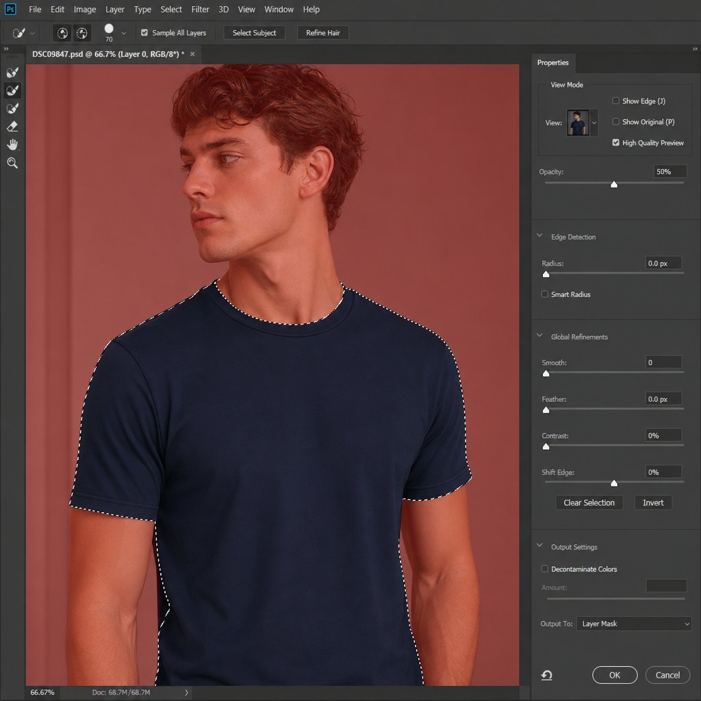
Once your rough selection looks solid, click the Select and Mask button in the Options bar (or go to Select > Select and Mask). This opens a dedicated workspace designed specifically for cleaning up tricky boundaries, and it is where the real precision happens.
Start by choosing a helpful view mode. The Overlay view tints non-selected areas with a colored wash so you can clearly see where the selection falls short. If the shirt color is close to the default red overlay, click the color swatch and pick something with more contrast, like bright green. The On Layers view previews how the masked result will actually look against underlying layers, which is useful for spotting fringe problems early.
Next, adjust image colors at the boundary using these key controls in the Properties panel:
- Edge Detection Radius: Increase this slider to tell Photoshop to look more carefully at a wider band around the selection edge. Turn on Smart Radius so the detection adapts automatically to both hard edges (like a crisp hemline) and soft edges (like loose threads or fuzzy knit fabric).
- Refine Edge Brush Tool: Select this from the toolbar on the left and paint over the most problematic boundaries, especially where hair overlaps the collar or where semi-transparent fabric lets the background show through. As Adobe's Select and Mask tutorial explains, this tool tells Photoshop to re-analyze the brushed area and separate foreground from background with greater accuracy, preserving delicate details like individual strands of hair.
- Shift Edge: Drag this slider slightly negative (around -10 to -20%) to contract the selection boundary inward by a few pixels. This trims away any remaining fringe of the original shirt color or background that clings to the edge.
- Feather: Apply a feather of 1-2 pixels to soften the transition between the selected shirt and everything around it. Without any feathering, the color change can produce a hard, cut-out look along the edges. A subtle feather blends the boundary naturally so the recolor sits convincingly in the scene. As TourBox's feathering guide points out, even a small feather radius eliminates the jagged, artificial outline that gives composites away.
When you are satisfied with the edges, look at the Output Settings at the bottom of the panel. Set the output to Layer Mask and target the Hue/Saturation adjustment layer you created in Step 1. Click OK, and Photoshop converts your refined selection into a mask attached directly to that adjustment layer. White areas on the mask reveal the color change; black areas hide it. The shirt is now isolated, and every pixel outside it is protected.
This is the step most picture color changer tutorials rush through, and it is exactly why so many results look fake. Spending an extra two or three minutes in Select and Mask to change object color in Photoshop cleanly eliminates the color-spill and halo artifacts that no amount of slider tweaking can fix later. A precise mask is the foundation; the creative color work built on top of it is the next step.
Step 3 - Change Shirt Color with Hue and Saturation
With a clean selection mask hugging every fold and seam of the shirt, you are ready to actually change its color. The Hue/Saturation adjustment layer is the most versatile starting point for this job. It is beginner-friendly, completely non-destructive, and lets you cycle through dozens of color options in seconds without ever touching the underlying pixels. If you have ever wondered how do I change a color in Photoshop without flattening the image or losing fabric detail, this is the method to learn first.
Shift the Hue Slider to Swap Colors Instantly
Click the Hue/Saturation adjustment layer thumbnail in the Layers panel to open its Properties. You will see three sliders: Hue, Saturation, and Lightness. Each one controls a different dimension of color, and understanding what they do prevents the most common mistakes.
- Hue rotates the color wheel. Dragging it left or right shifts every selected pixel to a different position on the spectrum. A blue shirt slides through purple, red, orange, yellow, and green as you sweep the slider from end to end. The range spans -180 to +180 degrees, covering the full 360-degree color wheel.
- Saturation controls color intensity. Push it right and the fabric becomes more vivid; pull it left and the color fades toward gray. At -100, the shirt is completely desaturated.
- Lightness adjusts overall brightness. Increasing it washes the color out toward white; decreasing it pushes it toward black. Use this slider sparingly, because large moves flatten the tonal range and destroy the natural shadow and highlight detail in the fabric.
For a shirt that already has a clear, saturated color, like a royal blue polo or a red flannel, simply dragging the Hue slider is often enough to produce a convincing change in picture color. The fabric texture, wrinkles, and lighting all stay intact because you are only rotating the color data, not replacing it.
When the shirt starts from a neutral or muted tone, like a washed-out beige or a pale gray, a standard hue shift may barely register. In that case, check the Colorize box at the bottom of the Properties panel. Colorize overrides the existing color information and applies a single uniform tint across the entire masked area. You then use the Hue slider to pick the tint color, Saturation to control its richness, and Lightness to fine-tune brightness. This is especially useful when you want to change the colour of an image element that has very little chromatic data to rotate in the first place.
A practical workflow looks like this: start without Colorize, drag the Hue slider to explore options, and only enable Colorize if the shift looks weak or uneven. This way you preserve as much of the original tonal variation as possible, which keeps the result looking like real fabric rather than a flat digital overlay.
Use the Targeted Adjustment Tool for Selective Ranges
Not every shirt is a single uniform color. Imagine a denim jacket with slightly different blue tones across the chest, sleeves, and collar, or a garment where shadows shift the fabric into a cooler range while highlights lean warmer. A global hue shift treats all those tones identically, which can push some areas into an unnatural range while others look perfect.
The Targeted Adjustment Tool solves this. In the Hue/Saturation Properties panel, click the hand icon to the left of the Master dropdown. Your cursor changes to an eyedropper with directional arrows. Click directly on the shirt in the canvas, and Photoshop automatically narrows the adjustment to the specific color range you sampled. You will notice the Master dropdown switches to a named range like Blues or Reds, and the color-range sliders at the bottom of the panel adjust to bracket the sampled hue.
As the Photoshop Training Channel explains, clicking on the image targets only the pixels within that hue range, leaving everything else untouched. If the initial sample does not capture the full tonal spread of the fabric, click the Add to Sample eyedropper (the eyedropper with a plus sign) and click on additional areas of the shirt, like a shadowed fold or a sun-hit highlight. Each click widens the targeted range so the color shift applies evenly across the entire garment.
This targeted approach is how to change the color of an object in Photoshop when that object contains subtle color variation. Instead of fighting with a global slider that overshoots in some areas and undershoots in others, you are telling Photoshop exactly which hues to modify and by how much. The result is a more natural, even color swap that respects the tonal complexity of real fabric.
One thing to keep in mind: the Hue/Saturation method works by modifying existing color data. It rotates hues, scales saturation, and shifts lightness, but it cannot manufacture color information that is not there. This leads to an important limitation that trips up many users.
Hue/Saturation cannot produce a true white or true black shirt. White and black pixels contain little to no chromatic data, so there is nothing for the Hue slider to rotate. Attempting to push Lightness to its extremes only washes out texture or crushes detail into a flat, lifeless tone. If your goal is a white, black, or very dark shirt, you will need a different layer strategy covered in Step 6.
For every other color-to-color swap, though, this method is hard to beat. It preserves fabric texture and lighting naturally because it modifies color properties without touching luminosity. The wrinkles, stitching, and weave pattern all come through exactly as they appeared in the original photo. You can toggle the adjustment layer on and off to compare, double-click it weeks later to revise the color, or duplicate it with a different hue setting to generate multiple variants from the same mask.
That flexibility makes Hue/Saturation the go-to approach for how to change to the color of an object in Photoshop when you need creative speed and easy revisions. But what happens when a client hands you a specific hex code or Pantone swatch and says "match this exactly"? Dragging a slider until it looks close enough is not precise enough for brand-critical work, and that is where a different layer type earns its place in the stack.
Step 4 - Use a Solid Color Fill Layer for Exact Color Matching
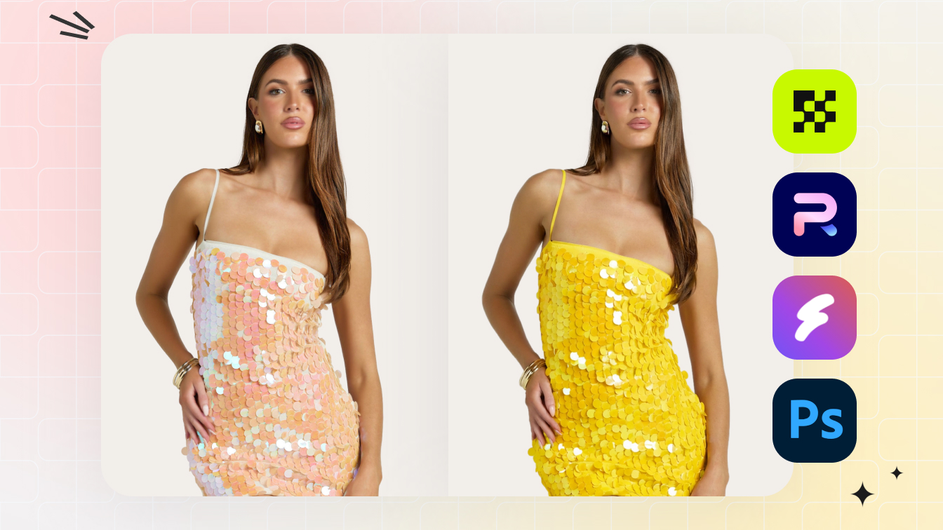
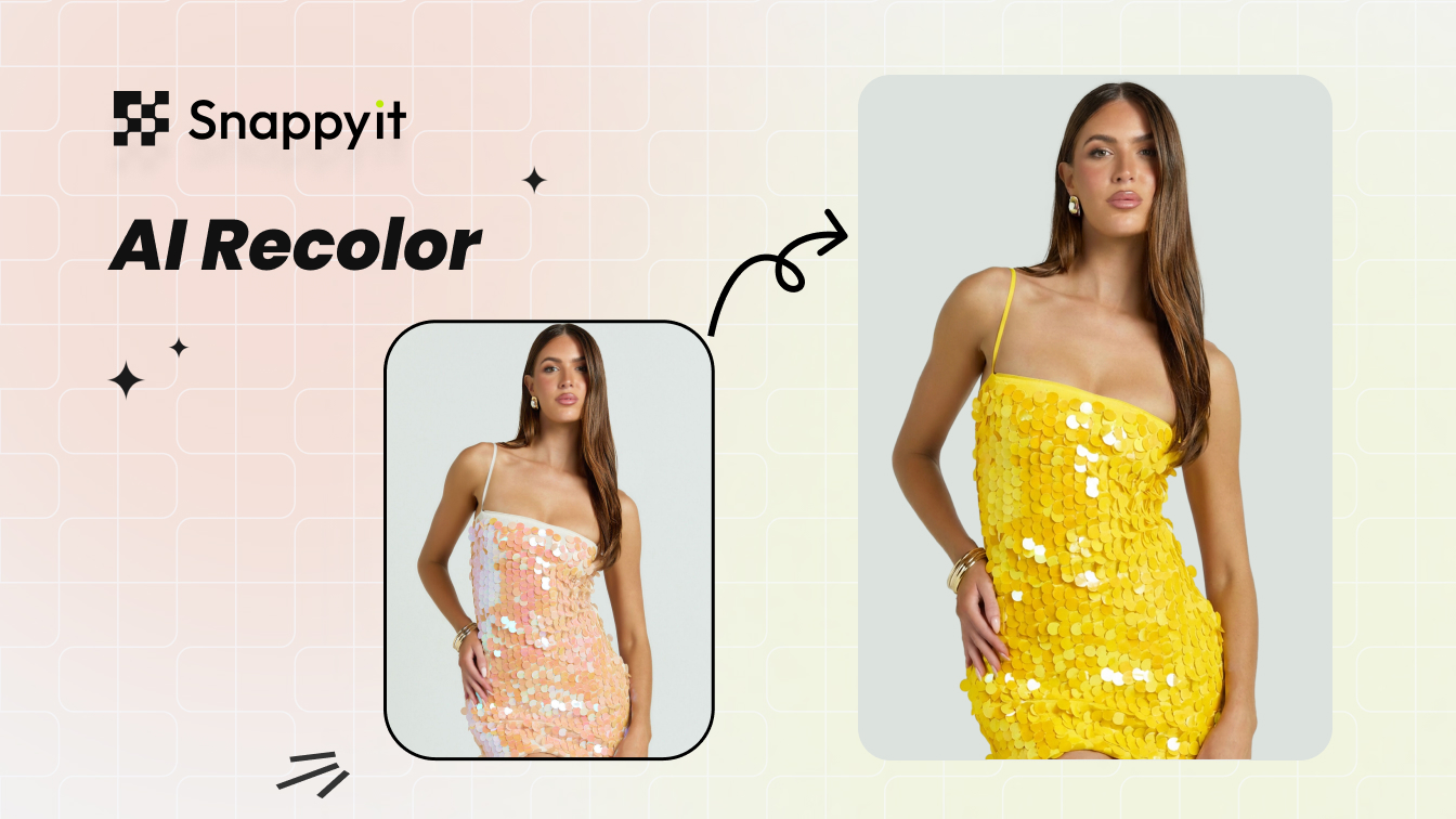
A Hue/Saturation slider is great for exploration, but it cannot guarantee a pixel-perfect match to a specific hex code, Pantone reference, or brand style guide swatch. When a client sends over #1D4E89 and expects the shirt to read back that exact value, you need a method built around precision rather than approximation. That is where a Solid Color fill layer paired with the Color blend mode becomes the right tool for the job.
This approach is the go-to photoshop color replacement technique for e-commerce teams, apparel brands, and anyone who needs to recolor an image to match a defined target. It works equally well for a dress color change in a fashion catalog or a polo shirt variant in a product listing, because the underlying logic is the same: inject an exact color while preserving every bit of fabric detail.
Add a Solid Color Fill Layer and Set the Blend Mode to Color
Here is the step-by-step workflow:
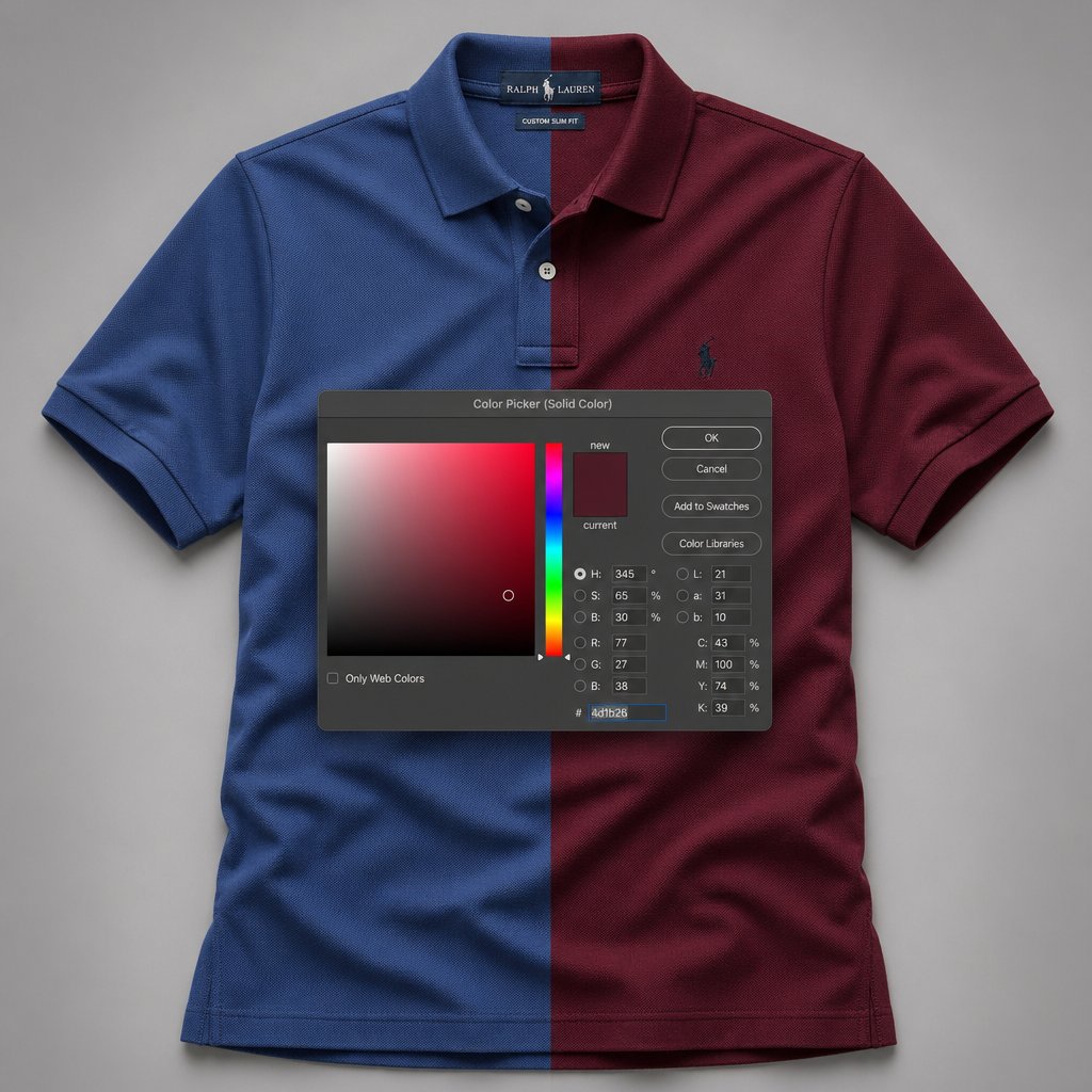
- In the Layers panel, click the Create New Fill or Adjustment Layer icon (the half-filled circle at the bottom) and choose Solid Color.
- The Color Picker dialog opens immediately. Locate the hexadecimal input field at the bottom, marked with a # symbol. Type or paste your target hex code and click OK.
- The entire canvas will flood with that color. Do not panic. Change the layer's blend mode from Normal to Color using the dropdown at the top of the Layers panel.
- Apply the shirt selection mask to this fill layer. If you already have a mask from Step 2, hold Alt (Option on Mac) and drag the mask thumbnail from the Hue/Saturation layer onto the Solid Color layer to copy it. Alternatively, right-click the Solid Color layer and choose Create Clipping Mask to clip it to the masked layer beneath.
The moment you switch to Color blend mode, the magic happens. As PetaPixel explains, the Color blend mode creates a result with the luminance of the base layer and the hue and saturation of the blend layer. In practical terms, Photoshop takes the brightness information from your original shirt pixels, including every wrinkle, stitch, and shadow, and combines it with the exact color you specified. The fabric texture remains completely intact because luminosity is untouched. You get a precise color change without the flat, painted-on look that ruins so many quick edits.
This separation of color from luminosity is why the Solid Color method is the professional standard for how to change color of something in Photoshop when accuracy matters more than speed. The shirt looks like it was actually manufactured in that color, not digitally tinted after the fact.
Match a Specific Target Color with the Color Picker
Not every color brief arrives as a clean hex code. Sometimes you are working from a brand style guide PDF, a competitor product photo, a fabric swatch photograph, or a Pantone reference. Photoshop's Color Picker handles all of these scenarios.
To sample a color from a reference image, open that reference alongside your shirt file. Then double-click the Solid Color layer thumbnail to reopen the Color Picker. With the dialog open, your cursor becomes an eyedropper that works anywhere on screen, not just inside the picker window. Click directly on the reference image, the brand guide, or even a color swatch on a webpage, and the Color Picker captures that exact value. The hex field updates instantly so you can verify the code before clicking OK.
For Pantone matching, the workflow depends on your Photoshop version. In older releases (2022 and earlier), clicking the Color Libraries button inside the Color Picker gives you direct access to Pantone Solid Coated, Uncoated, and other books. Photoshop automatically snaps to the closest Pantone match for whatever color is currently loaded. In newer versions, Pantone libraries have been removed from the default installation, so you will need the Pantone Connect plugin or a manual lookup on Pantone's website to get the RGB or hex equivalent. Either way, once you have the value, paste it into the hex field of your Solid Color fill layer and the photoshop replace color workflow stays the same.
After applying the target color, you may find the result is slightly too intense or not quite right in context. Two quick adjustments handle this:
- Lower the fill layer opacity. Dropping it to 80-90% lets a hint of the original shirt color bleed through, which can look more natural on fabrics where the dye would not be perfectly uniform, like heathered cotton or linen.
- Switch the blend mode to Hue. While Color replaces both hue and saturation, the Hue blend mode only swaps the hue component and keeps the original saturation intact. This produces a subtler shift that works well when the original shirt already has a rich, saturated tone and you just want to rotate it to a new color family without changing its vibrancy.
You can also stack a Curves or Levels adjustment layer above the Solid Color layer (clipped to the same mask) to fine-tune brightness independently. This is useful when the target color is significantly lighter or darker than the original fabric. The Solid Color layer handles the hue and saturation; the Curves layer handles the luminosity. Together, they give you complete control over every dimension of the color change.
The beauty of this entire setup is that nothing is permanent. Double-click the Solid Color thumbnail at any point, weeks or months later, and swap in a different hex code. The mask, the blend mode, and the layer stack all stay in place. For teams producing multiple color variants of the same garment, duplicating this fill layer and changing the color value is all it takes to generate the next option. It is the most efficient way to recolor an image to exact specifications while keeping every decision reversible.
Both the Hue/Saturation and Solid Color methods share one thing in common: they rely on adjustment or fill layers that sit above the original pixels. But what if you need something even faster, a one-click color swap for a quick internal mockup where precision and future editing flexibility are less important? That is the trade-off the Replace Color command offers, and it takes a fundamentally different approach to the problem.
Step 5 - Apply the Replace Color Command for Quick Swaps
Sometimes you do not need a layered, endlessly revisable setup. You need a fast color change image for an internal mockup, a quick social media preview, or a one-off client concept that may never go further. The Replace Color command is built for exactly that kind of speed. It combines selection and color substitution into a single dialog, skipping the separate masking step entirely.
The trade-off is flexibility. Unlike the adjustment-layer methods covered in Steps 3 and 4, Replace Color writes changes directly onto pixels. That makes it a destructive edit, so you should always run it on a duplicate layer, never the original. If you followed Step 1, your Background copy is already in place and ready to absorb the change safely.
Open Replace Color and Sample the Shirt
With your duplicate layer selected, go to Image > Adjustments > Replace Color. A dialog box opens with a black-and-white preview window, an Eyedropper set, and a group of sliders. The preview shows your current selection: white areas will be affected, black areas will not.
Click the default Eyedropper tool inside the dialog, then click directly on the shirt in your image. The preview window updates to show the sampled area in white. For a solid-colored tee, a single click may capture most of the fabric. Real-world shirts, though, rarely read as one flat tone. Folds create shadows, highlights catch light, and dye variation shifts the hue slightly across the garment.
To capture that full tonal range, click the Add to Sample eyedropper (the one with the plus sign) and click on additional areas of the shirt: a shadowed crease near the waist, a bright highlight on the shoulder, a slightly different tone along the sleeve seam. Each click expands the sampled color range so the replacement covers the entire garment evenly. As TeachUcomp's Replace Color walkthrough notes, you can also use the Subtract from Sample eyedropper (the minus sign) to remove any skin or background tones that accidentally got pulled into the selection.
The Fuzziness slider controls how broadly Photoshop interprets your sampled colors. A low value (around 20-40) targets only pixels very close to the exact tones you clicked. A higher value (80-120) expands the range to include neighboring hues and brightness levels. For most shirt fabrics, start around 60-80 and watch the preview window. You want the entire shirt to appear white in the preview while the skin, background, and other elements stay black. If background areas start creeping in, pull Fuzziness back down or subtract those tones with the minus eyedropper.
Adjust Hue, Saturation, and Lightness in the Dialog
Once the preview shows a clean selection of the shirt, look at the Replacement section at the bottom of the dialog. You will find three familiar sliders: Hue, Saturation, and Lightness. These work the same way as their counterparts in a Hue/Saturation adjustment layer, rotating the color wheel, scaling intensity, and shifting brightness respectively.
Drag the Hue slider to pick your new color. The image updates in real time behind the dialog, so you can see the result immediately. Fine-tune with Saturation to control vibrancy and Lightness to adjust how dark or bright the new color reads on the fabric. For a quick image recolor of a solid-colored garment, this entire process takes under a minute from open to OK.
Click OK to apply the change. The pixels on your duplicate layer are now permanently altered. There is no adjustment layer to double-click later, no mask to refine, and no blend mode to swap. If you want a different color, you need to undo (Ctrl+Z / Cmd+Z) and start over, or run Replace Color again on the already-modified pixels, which degrades quality with each pass. This is the core limitation of color substitution in Photoshop through the Replace Color command: it is a one-shot tool.
Choose Replace Color when you need a fast, single-use color swap on a shirt with a uniform solid color and minimal tonal variation. It is ideal for quick mockups, internal proofs, and exploratory concepts where speed matters more than future editability. For production work, client-facing deliverables, or garments with complex tonal shifts, stick with the adjustment-layer methods from Steps 3 and 4.
Compared to the Hue/Saturation and Solid Color fill approaches, Replace Color trades control for convenience. You skip the selection and masking workflow, which saves time, but you also lose the ability to revise without starting over. For teams producing tee shirts that change color across a full seasonal palette, the adjustment-layer methods scale far better. For a quick color change on a PNG destined for a one-time presentation slide, Replace Color gets the job done in a fraction of the time.
All three methods covered so far share one assumption: the shirt has enough chromatic data for Photoshop to work with. A blue shirt shifting to red, a green polo becoming orange, a yellow tee turning purple. But what happens when the starting point is pure white or solid black? Those pixels carry little to no color information, and every technique discussed up to this point will struggle with them. Solving that problem requires a different layer strategy entirely.
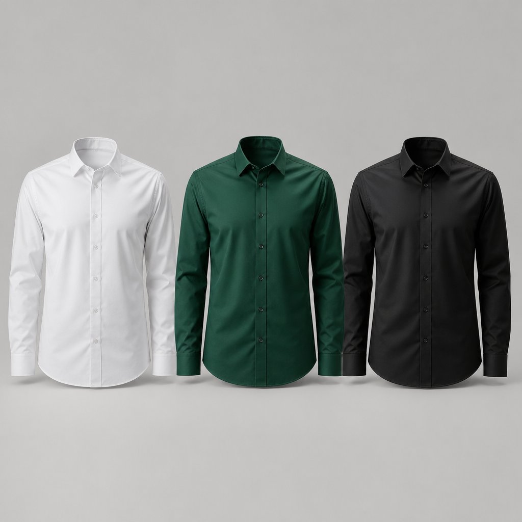
Step 6 - Solve the White and Black Shirt Problem
This is the scenario that breaks most tutorials. You drag the Hue slider on a white dress shirt and nothing happens. You try Colorize on a black tee and get a muddy, washed-out mess. The reason is simple: white and black pixels sit at the extreme ends of the lightness scale with little to no chromatic information. There is nothing for a standard hue rotation to grab onto. Solving this requires a fundamentally different layer strategy for each direction, whether you are converting a colored shirt to white or black, or going the other way and injecting vibrant color into a neutral garment.
Once you understand the logic behind each approach, you will be able to handle any image color change involving achromatic fabrics confidently, something most Photoshop color guides skip entirely.
Change a Colored Shirt to White
Turning a saturated shirt into a clean white is a two-layer process. A single Lightness slider pushed to the max will blow out every fold and wrinkle into a flat, textureless blob. The trick is separating the desaturation step from the brightness push so you retain the fabric's natural shadow and highlight detail.
Start by adding a Hue/Saturation adjustment layer clipped to your shirt selection mask. Drag the Saturation slider all the way to -100. The shirt turns grayscale, and you will immediately see the full tonal range of the fabric: bright highlights on the chest, darker creases near the waist, subtle shadow gradients along the sleeves. This grayscale version is your luminosity map, and preserving it is what makes the final white look like real fabric instead of a flat rectangle.
Next, stack a Curves adjustment layer directly above the Hue/Saturation layer and clip it to the same mask. In the Curves Properties panel, click the center of the curve and drag it upward to brighten the midtones. Then drag the shadow point (the lower-left anchor) slightly upward as well, lifting the darkest tones so they read as light gray rather than medium gray. The goal is to push the overall brightness toward white while keeping enough tonal separation that folds and stitching remain visible.
A Levels adjustment layer works just as well here if you prefer sliders over curves. Drag the midtone slider (the gray triangle beneath the histogram) to the left to brighten, and pull the output shadow slider (the black triangle beneath the output gradient bar) to the right to lift the floor of the darkest tones.
Here is where careful masking makes the difference. Some areas of the shirt, like a sunlit shoulder or a highlight along a collar fold, may clip to pure white and lose all texture. Select a soft, low-opacity brush (around 20-30% opacity), set the foreground color to black, and paint on the Curves layer mask over those blown-out spots. Each brush stroke reduces the brightening effect locally, bringing back just enough shadow detail to keep the fabric looking three-dimensional. Build up the effect gradually with multiple passes rather than one heavy stroke. This selective masking is what separates a convincing white shirt from a flat white shape.
Change a Colored Shirt to Black
The reverse process follows the same logic but pushes tones in the opposite direction. You want deep, rich shadows across the fabric while retaining just enough highlight information to show texture, because a completely flat black rectangle does not look like clothing.
Add a Hue/Saturation adjustment layer clipped to the shirt mask and drag Saturation to -100, just like the white conversion. The shirt goes grayscale again, giving you a clean starting point free of any color cast.
Stack a Curves adjustment layer above it, clipped to the same mask. This time, drag the midpoint of the curve downward to darken the midtones. Pull the highlight point (the upper-right anchor) down as well, but not all the way to the bottom. You want the brightest areas of the fabric, like the peak of a wrinkle catching direct light, to settle around a dark charcoal rather than disappearing into pure black. This preserves the subtle highlight ridges that make the shirt read as a physical object with depth.
If the result looks too flat, add a slight S-curve by placing a second point in the lower quarter of the curve and nudging it down further. This increases contrast within the dark range, separating deep shadows from slightly lighter creases. The fabric gains a sense of volume even at very low brightness levels.
One common mistake: crushing the shadows so aggressively that the shirt becomes a featureless black silhouette. If you lose texture, ease back on the curve adjustment and check the layer mask. Just as with the white conversion, you can paint with a soft black brush on the Curves mask to selectively restore highlight detail in areas where the darkening went too far.
Change a White or Black Shirt to a Chromatic Color
Going from an achromatic shirt to a vivid color is the trickiest direction, and it is the scenario that sends most people searching for how to colour change in Photoshop without getting muddy, unrealistic results. The key is choosing the right blend mode for the starting tone.
For a white shirt, add a Solid Color fill layer with your target color and set the blend mode to Multiply. Clip it to the shirt selection mask. Multiply works by combining the brightness values of the fill layer with the base layer, darkening the result. On white fabric, where the base pixels are at or near maximum brightness, Multiply essentially tints the shirt with the fill color while letting the luminosity variations, every fold, crease, and shadow, show through naturally. The white areas absorb the color; the slightly darker shadow areas absorb it even more, creating realistic depth. As PHLEARN's recoloring tutorial demonstrates, extracting the original highlights and shadows and blending them with a new solid color is the foundation of convincing achromatic-to-color conversions.
Adjust the fill layer opacity to control color intensity. At 100%, the result can look oversaturated on bright white fabric. Dropping to 70-85% often produces a more natural, dyed-fabric appearance. If the color still feels too heavy in the shadows, add a Curves adjustment layer above the fill (clipped to the same mask) and lift the shadow region slightly to open up the darkest folds.
For a black shirt, the approach flips. Add a Solid Color fill layer with your target color and set the blend mode to Screen. Screen is the mathematical opposite of Multiply: it lightens the base pixels by combining them with the blend layer. On black fabric, where the base pixels are at or near zero brightness, Screen lifts those dark tones and infuses them with color. The highlights that were barely visible on the black shirt become the primary carriers of the new hue, while the deepest shadows retain enough darkness to preserve depth.
Black shirts are inherently harder to recolor convincingly because there is so little tonal variation to work with. The PHLEARN method offers an effective workaround: duplicate just the shirt pixels onto a new layer, convert it to a Smart Object, set it to Multiply, and apply a Levels adjustment to pull out hidden highlight and shadow detail before blending with the color fill. This extra step recovers texture information that a simple Screen blend alone might miss, making the final result look more like dyed fabric and less like a colored overlay.
Regardless of whether you start from white or black, stack a Hue/Saturation adjustment layer at the top of the group (clipped to the same mask) to fine-tune vibrancy after the blend mode does its work. A small Saturation boost of +10 to +20 can add richness, while a slight Hue shift lets you nudge the color warmer or cooler without reopening the fill layer. This final control layer is what turns a decent recolour of pictures into a polished, production-ready result.
The photoshop color replacement tool and standard Hue/Saturation adjustments are powerful for chromatic-to-chromatic swaps, but they simply cannot manufacture color data from pixels that have none. The layered blend-mode approach described here fills that gap by injecting color through luminosity math rather than hue rotation. Once you have this technique in your toolkit, no shirt color is off limits, whether you are going from white to navy, black to coral, or any combination in between.
With solid colors, whites, and blacks all covered, one major real-world challenge remains: shirts that are not a single flat color at all. Stripes, prints, plaids, and graphic tees introduce pattern complexity that can collapse under a simple hue shift. Keeping those patterns intact while still changing the base color requires a different masking strategy entirely.
Step 7 - Handle Patterned Fabrics and Troubleshoot Common Issues
Stripes, plaids, floral prints, graphic tees. These are the shirts that make a straightforward hue shift fall apart. You drag the slider, and the pattern either flattens into a single muddy tone or shifts into colors that clash with the original design. The problem is that a global color adjustment treats every pixel inside the mask equally, ignoring the fact that a patterned shirt contains two or more distinct color zones that need to move independently, or in some cases, not move at all.
Knowing how to change color in Photoshop on a solid garment is one skill. Preserving a pattern while changing only the base fabric color beneath it is a different challenge entirely, and it is the one most tutorials never address.
Handle Patterned, Striped, and Printed Fabrics
The core idea is to separate the pattern detail from the base color so you can modify one without destroying the other. Think of it like peeling a decal off a painted wall, repainting the wall, and pressing the decal back on. In Photoshop terms, you achieve this by isolating the pattern as a luminosity map and applying your color change beneath it.
Here is the workflow step by step:
- Duplicate the shirt pixels onto their own layer. With your shirt selection active (Ctrl-click / Cmd-click the layer mask thumbnail to reload it), press Ctrl+J (Cmd+J) to copy just the selected shirt area onto a new layer. Name this layer something like "Pattern Luminosity."
- Desaturate the duplicate. With the Pattern Luminosity layer selected, go to Image > Adjustments > Desaturate (Shift+Ctrl+U / Shift+Cmd+U), or add a Hue/Saturation adjustment layer clipped to it and drag Saturation to -100. The shirt is now grayscale, and every stripe, print element, and texture detail is encoded purely as light and dark values.
- Set the desaturated layer's blend mode to Luminosity. This tells Photoshop to use only the brightness information from this layer and ignore any color data. The pattern detail, every stripe edge, every printed graphic outline, rides on top as a luminosity map.
- Add a Solid Color fill layer beneath the Pattern Luminosity layer. Pick your target tshirt color, set the fill layer's blend mode to Color, and clip it to the shirt selection mask. This layer injects the new base color into the fabric while the luminosity layer above preserves the pattern structure.
The result is a shirt where the base color has changed but the pattern remains crisp and intact. A navy-and-white striped polo becomes a burgundy-and-white striped polo. A black graphic print on a gray tee stays black while the gray shifts to olive. The pattern detail never moves because it lives on a separate luminosity layer that the color fill cannot touch.
For high-contrast patterns like bold black stripes on a white shirt or a dark logo on a light background, channel-based masking offers an alternative route. Open the Channels panel, find the channel with the strongest contrast between the pattern and the base fabric (often the Blue or Red channel), and duplicate it. Use Levels or Curves on the duplicated channel to push the contrast further until the pattern reads as near-black and the base reads as near-white. Ctrl-click (Cmd-click) the channel thumbnail to load it as a selection, then use that selection to mask the pattern elements separately from the base. This gives you independent control: change the base color with one fill layer and, if needed, adjust the pattern color with another. It is more work, but for complex t shirt colour variations on patterned garments, the precision is worth it.
Whichever approach you use, the principle stays the same: separate color from luminosity so each can be edited without interfering with the other. This is the same logic behind how to change colour of object in Photoshop when that object has internal detail you need to protect.
Fix Color Spill, Banding, and Texture Loss
Even with a solid technique, real-world images throw curveballs. Below are the most common problems that surface after a shirt color change, paired with targeted fixes you can apply without starting over.
- Color spill onto skin or background. You notice the new shirt color bleeding onto the model's neck, arms, or the area just outside the garment edge. The cause is almost always a soft or inaccurate layer mask. Zoom in to 200-300%, select the mask thumbnail, pick a small hard-edged brush (hardness around 90-100%), set the foreground color to black, and carefully paint along the spill boundary. Black on the mask hides the color change in those areas, pulling the spill back inside the shirt outline. For subtle fringe, drop the brush opacity to 50% and build up the correction gradually so you do not create a new hard edge.
- Unnatural saturation on dark fabrics. After shifting a dark navy or charcoal shirt to a new color, the result looks radioactive, far more vivid than any real fabric would appear. This happens because the Color blend mode can push saturation higher than the original tonal range supports. The fix is straightforward: lower the Solid Color fill layer's opacity to 70-85%, or switch the blend mode from Color to Hue, which applies only the hue component and leaves the original saturation untouched. Either adjustment dials the vibrancy back to a believable level.
- Banding artifacts on smooth gradients. When a shirt has a gentle tonal gradient, like a soft shadow rolling across a satin blouse, the color change can introduce visible stepping or banding where smooth transitions should be. This is a bit-depth issue amplified by the adjustment. To fix it, select the adjustment or fill layer, go to Filter > Noise > Add Noise, set the amount to 1-2%, choose Gaussian distribution, and check Monochromatic. That tiny amount of noise breaks up the banding without adding visible grain to the image. If the layer is an adjustment layer that does not support direct filtering, convert it to a Smart Object first or add the noise on a separate clipped layer set to Normal blend mode at low opacity.
- Loss of fabric texture after the color change. The shirt looks flat and painted-on, as if someone filled it with a bucket tool. This almost always means the blend mode is set to Normal instead of Color or Hue. In Normal mode, the fill layer's single flat color completely covers the underlying pixels, wiping out every wrinkle, weave, and shadow. Switch the blend mode to Color (to replace hue and saturation while preserving luminosity) or Hue (to replace only the hue). The fabric texture reappears instantly because the original luminosity data shows through. As a Noble Desktop Photoshop curriculum lesson explains, separating color adjustments from brightness adjustments using blend modes is the key to keeping saturation and texture intact.
- Reflected color on surrounding skin. A realistic photo often shows the shirt's color reflecting faintly onto the model's neck or chin. After you change the shirt color, that reflected light still carries the original hue, creating a mismatch. To fix this, add a small, soft-edged Hue/Saturation adjustment layer over the affected skin area. Use the Targeted Adjustment Tool to sample the old reflected color and shift its hue to match the new shirt. Keep the adjustment subtle, just enough to align the reflected tint with the updated garment.
Most of these issues trace back to two root causes: an imprecise mask or an incorrect blend mode. If you find yourself chasing multiple problems at once, step back and check those two things first. A clean mask and the right blend mode solve the majority of how to change colors in Photoshop headaches before they start.
Photoshop CC lets you change color of object after object with full control, but every fix described above is a manual, per-image process. When you are working on a single hero shot or a handful of product photos, that hands-on precision is exactly what you want. The question changes when the project scales to dozens or hundreds of garment images that all need the same treatment, and that is where automation and workflow efficiency become the real bottleneck.
Step 8 - Scale Your Workflow for Multiple Color Variants
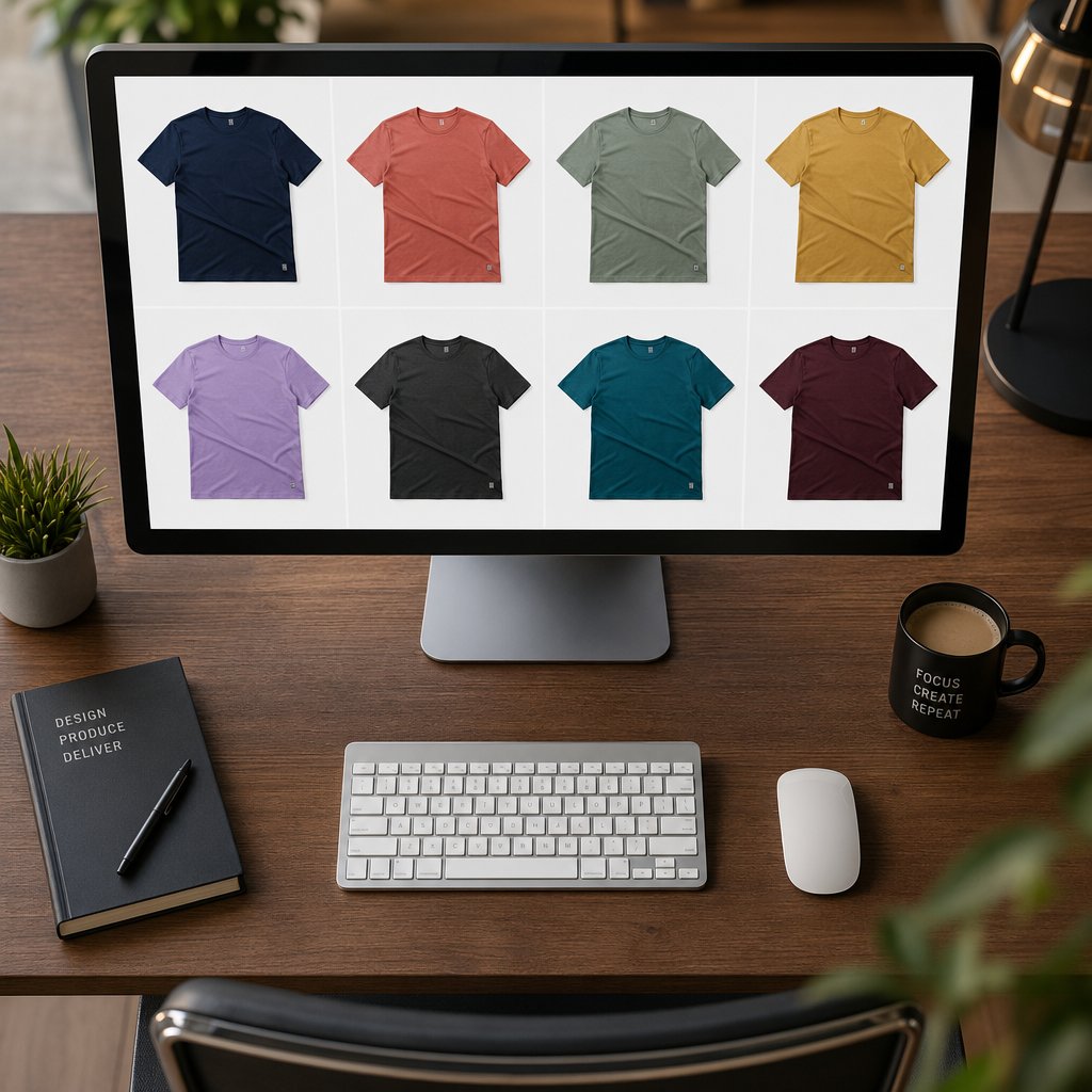
A single shirt recolored to perfection is satisfying. Fifty shirts, each in eight colors, each needing the same level of quality? That is a production challenge. E-commerce teams, apparel brands, and catalog photographers rarely need just one color variant. They need entire collections visualized across a full seasonal palette, often on tight deadlines. The techniques covered in Steps 3 through 7 give you complete creative control on individual images, but repeating that process manually across hundreds of files is where time disappears.
Two paths solve this scaling problem: automating your Photoshop workflow with Actions and Batch processing, or offloading high-volume color generation to AI-powered tools purpose-built for catalog production.
Record a Photoshop Action for Batch Processing
If you have a repeatable color-change workflow, like applying a Solid Color fill layer in Color blend mode with a specific hex value, Photoshop can record every step and replay it across an entire folder of images automatically. Here is how to set it up:
- Open the Actions panel (Window > Actions) and click the folder icon to create a new Action set. Name it something descriptive like "Shirt Color Variants."
- Click the New Action button (the page icon), give it a name like "Navy Variant," and hit Record. From this point, Photoshop logs every operation you perform.
- Walk through your color-change workflow on a sample image: add the Solid Color fill layer, enter your hex code, set the blend mode to Color, and adjust opacity if needed. If you are using Hue/Saturation instead, record the slider positions. Save the file in your desired output format.
- Click the Stop button (the square icon) to end recording.
To run this Action across a batch of files, go to File > Automate > Batch. In the dialog, select your Action set and the specific Action you recorded. Set the Source to the folder containing your shirt images and the Destination to a separate output folder. Check "Override Action Save As Commands" so Photoshop routes every processed file to your chosen destination rather than the location recorded during the Action. Click OK, and Photoshop processes every image in the folder sequentially, applying your exact color-change steps to each one.
For teams that need to photoshop cc replace color across dozens of product shots with the same target value, this workflow cuts hours of repetitive clicking down to minutes. You can record multiple Actions for different colors, like "Red Variant," "Forest Green Variant," and "Charcoal Variant," then batch each one across the same source folder to generate a complete color lineup from a single set of photographs.
There is one significant bottleneck, though. The Action records your color adjustment steps, but it cannot record a selection mask that adapts to each unique image. Every shirt sits differently on every model, with different necklines, sleeve positions, and background interactions. That means each image still needs its own selection mask created manually or semi-manually using the techniques from Step 2. For a small batch of 10-20 images, this is manageable. For catalogs with hundreds of SKUs, the masking step becomes the real time sink, not the color change itself.
AI-Powered Alternatives for High-Volume Color Changes
Photoshop remains the gold standard when you need pixel-level precision on a single image, full control over how to change color of object in Photoshop, and the ability to fine-tune every shadow and highlight by hand. But for teams producing product color variants at catalog scale, the manual selection bottleneck makes pure Photoshop workflows impractical beyond a certain volume.
This is where AI-based color replacement tool options designed specifically for apparel and product photography fill the gap. These tools handle the selection and recoloring in a single automated step, using machine learning to identify garment boundaries, preserve fabric texture, and adapt shadows to the new color without manual masking. The trade-off is less granular control compared to Photoshop's layer stack, but the speed gain is dramatic: what takes 10-20 minutes per image manually can happen in seconds.
For apparel brands, online boutiques, and catalog teams that need to change colour of clothes across dozens or hundreds of SKUs, tools like Snappyit's Color Change offer a practical complement to Photoshop. You upload a product photo, specify the target color, and the AI generates a realistic variant with fabric texture, shadows, and highlights preserved. It is not a replacement for Photoshop's precision on hero shots or complex retouching work, but as a workflow accelerator for generating the tenth or fiftieth color variant of the same garment, it eliminates the masking bottleneck entirely.
The decision between Photoshop and an AI photo color changer comes down to volume and precision needs:
| Factor | Photoshop Actions + Manual Masking | AI Color Change Tools |
|---|---|---|
| Precision | Pixel-level control over every edge and tone | Automated; strong on clean product shots |
| Speed per image | 10-20 minutes (including selection) | Seconds |
| Scalability | Limited by manual masking bottleneck | Handles hundreds of images efficiently |
| Best for | Hero images, complex retouching, editorial work | Catalog-scale production, rapid variant generation |
| Editability | Fully non-destructive with layers and masks | Output is a final image; re-run for changes |
A practical hybrid approach works well for many teams: use Photoshop for your primary hero shots and any image that needs detailed retouching, then use an AI tool to change an image color across the remaining catalog variants where speed and consistency matter more than hand-tuned perfection. This way you get the best of both worlds without burning your retouching team on repetitive bulk work.
Whether you are learning how to replace a color in Photoshop for the first time or managing a production pipeline that processes thousands of garment images per season, the core principle stays the same: match the tool to the task. Photoshop gives you unmatched creative control. AI tools give you unmatched throughput. The color replacement tool in Photoshop and automated alternatives are not competing approaches. They are complementary layers in a modern production workflow, each solving a different piece of the same problem.
How To Change Color Of Shirt In Photoshop FAQs
Can you change a white shirt to a color in Photoshop?
Yes, but standard Hue/Saturation adjustments will not work because white pixels lack chromatic data. Instead, add a Solid Color fill layer set to Multiply blend mode and clip it to your shirt selection mask. Multiply darkens and tints the white fabric while preserving fold and shadow detail. Adjust the fill layer opacity to 70-85% for a natural dyed-fabric appearance, and stack a Curves layer above it to fine-tune brightness in the shadows.
What is the best method to change shirt color without losing fabric texture?
Use either a Hue/Saturation adjustment layer or a Solid Color fill layer set to the Color blend mode. Both approaches preserve the original luminosity data, which contains all the wrinkle, stitch, and weave detail. The Color blend mode replaces only hue and saturation while leaving brightness untouched, so the fabric texture remains fully intact. Avoid using Normal blend mode on fill layers, as it covers the underlying texture completely.
How do I match an exact hex or Pantone color on a shirt in Photoshop?
Create a Solid Color fill layer, paste your hex code into the Color Picker dialog, and set the blend mode to Color. This injects the precise target value while preserving fabric luminosity. For Pantone matching, use the Color Libraries button in older Photoshop versions or the Pantone Connect plugin in newer releases to find the RGB equivalent. You can also sample colors from any open reference image using the eyedropper directly from the Color Picker window.
How do I change the color of a patterned or striped shirt without ruining the print?
Separate the pattern from the base color using a luminosity-preserving technique. Duplicate the shirt pixels onto a new layer, desaturate it to create a grayscale luminosity map, and set that layer to Luminosity blend mode. Then place a Solid Color fill layer in Color blend mode beneath it. The fill changes the base fabric color while the pattern detail rides on top untouched. For high-contrast patterns, channel-based masking offers even more precise separation.
Is there a faster way to change shirt colors for large product catalogs?
For batch processing in Photoshop, record your color-change workflow as an Action and run it via File > Automate > Batch across an entire image folder. The limitation is that each image still needs a manual selection mask. For true high-volume production with hundreds of SKUs, AI-powered tools like Snappyit's Color Change handle garment detection, masking, and recoloring automatically in seconds, making them a practical complement to Photoshop for catalog-scale variant generation.