What Jewelry Photography Retouching Actually Involves
You shot a ring under studio lights, cleaned up the background, bumped the contrast, and called it done. Yet the final image still looks flat, lifeless, or worse, plastic. The problem usually is not your camera or your lighting rig. It is the gap between general photo editing and true jewelry retouching.
Jewelry photography retouching is the specialized post-production process of refining images of rings, necklaces, bracelets, and other pieces by addressing the unique optical behaviors of reflective metals, transparent gemstones, and microscopic surface details that standard editing tools cannot resolve with default adjustments.
That distinction matters more than most photographers realize. General photo editing covers broad corrections like exposure, white balance, and cropping. Jewelry image retouching goes several layers deeper, targeting problems that only exist because of how precious materials interact with light.
What Sets Jewelry Retouching Apart From General Photo Editing
Imagine photographing a polished gold band. The metal acts like a curved mirror, capturing reflections of the camera, the tripod, even the photographer's hands. A portrait retoucher never deals with this. A food photographer never encounters it at this scale. Polished metals produce specular highlights that shift with every millimeter of camera movement, and those highlights define whether the piece looks three-dimensional or flat in the final frame.
Faceted gemstones introduce another layer of complexity. Light enters a diamond, refracts through internal facets, and exits as dispersed color, what the trade calls "fire." Capturing and then enhancing that fire without oversaturating the stone requires targeted adjustments that basic slider moves cannot achieve. Opaque stones like turquoise or lapis demand a completely different approach focused on surface texture rather than internal light behavior.
Then there is scale. Jewelry photo retouching often involves working at 200-400% zoom to address dust particles, micro-scratches, and prong imperfections invisible to the naked eye. At that magnification, every edit is visible, and every shortcut shows.
Why Every Jewelry Image Needs Post-Production Work
Even a perfectly lit capture still contains environmental reflections, minor color casts from surrounding surfaces, and depth-of-field limitations inherent to macro photography. The goal of jewelry retouching is not to fabricate an unrealistic version of the piece. It is to remove the artifacts of the photographic process so the image conveys the same dimension, sparkle, and texture a customer would see holding the piece in hand.
Getting this right depends heavily on what happens before the image ever reaches your editing software, specifically the decisions you make during the shoot itself.
How Your Photography Setup Shapes Retouching Outcomes
Here is a truth most retouching tutorials skip entirely: the quality ceiling of your final image is set the moment you press the shutter. No amount of Photoshop skill can recover detail that was never captured, reconstruct highlights that were blown, or fix color contamination baked into a RAW file. When you edit jewelry photos, you are working within the boundaries your shooting setup defined. A smarter capture workflow does not just produce better source files. It cuts retouching time dramatically and raises the upper limit of what your finished images can achieve.
Lighting Configurations That Minimize Post-Production Work
Jewelry surfaces behave like tiny curved mirrors. A small, direct light source creates harsh specular highlights, the kind that clip to pure white and leave you with unrecoverable hotspots in post. Fixing those hotspots means painting in fake detail, and that is exactly how retouching starts looking artificial.
The solution starts with light size relative to the subject. Large diffused sources, think softboxes or diffusion panels positioned close to the piece, produce smooth gradient reflections across metal surfaces instead of pinpoint glare. Those gradients are far easier to refine during jewelry photo editing because the tonal information is already there. You are enhancing, not inventing.
Light tents take this a step further by surrounding the piece with a controlled reflection environment. When every surface the metal can "see" is neutral white diffusion material, you eliminate stray reflections of camera bodies, tripod legs, and studio clutter. Strategic placement of small black cards within the tent then defines edges and adds contrast to the metal, giving it shape without introducing distracting elements you would need to clone out later.
One detail that often gets overlooked: match the color temperature of all your light sources. Mixed lighting creates subtle color shifts across the metal surface that are tedious to correct selectively. A color reference card shot at the start of each session locks your white balance and prevents the kind of inconsistencies that multiply across a catalog of hundreds of pieces.
Focus Stacking and Macro Lens Selection for Maximum Detail
A macro lens is non-negotiable for serious jewelry work. Standard zoom lenses simply cannot resolve the fine engraving on a band or the individual facets of a small pavé diamond. A dedicated macro lens, typically in the 100mm range with a 1:1 reproduction ratio, gets you close enough to capture those details at their actual size on the sensor.
But macro magnification comes with a tradeoff: extremely shallow depth of field. Even at f/16, a ring shot at close range may have the front prongs sharp while the back of the band falls soft. You will notice this problem immediately when retouching jewelry photos at full resolution, because selective sharpening on out-of-focus areas creates obvious artifacts and halos.
Focus stacking solves this. You capture multiple frames at incremental focus distances, then composite them in software like Helicon Focus or Photoshop to produce a single image with front-to-back sharpness. The result is a source file where every surface is critically sharp, eliminating the need for aggressive sharpening in post that degrades image quality. For multi-stone designs, necklaces with depth, or any piece where the camera-to-subject distance varies across the frame, focus stacking is not optional. It is the difference between a file you can retouch cleanly and one that fights you at every step.
What to Optimize at Capture to Save Hours in Retouching
Beyond lighting and lens choice, a handful of shooting-stage decisions compound into massive time savings when you sit down to edit. Think of these as your pre-retouching checklist:
- Clean the piece at a microscopic level. Use a microfiber cloth, anti-static brush, and compressed air before every single shot. Dust and fingerprints magnified at macro scale translate directly into hours of spot healing.
- Control exposure to preserve highlights. Underexpose by 1/3 to 2/3 stop and monitor your histogram. Blown highlights on polished metal are unrecoverable, while shadow detail in a RAW file can almost always be lifted cleanly.
- Use clean, non-reflective backgrounds. Matte white or neutral gray surfaces simplify masking and prevent color contamination on reflective undersides. Avoid textured or patterned surfaces that complicate clipping paths around intricate chains and prongs.
- Shoot tethered for immediate review. Viewing captures on a calibrated monitor in real time lets you catch dust, unwanted reflections, and focus errors before moving to the next piece, not after you have packed up the set.
- Standardize camera and product positioning. Use a tripod with fixed placement marks so every piece in a catalog shares consistent framing and angle. This makes batch editing predictable and keeps your product pages visually cohesive.
- Capture multiple lighting passes for compositing. Some pieces cannot be perfectly lit in a single exposure. Shooting separate frames optimized for metal highlights, gemstone brilliance, and shadow detail gives you layered source material that reduces extreme retouching later.
Each of these optimizations addresses a specific retouching bottleneck. Together, they shift the balance of your workflow from reactive correction toward intentional refinement, which is where the real quality lives.
With cleaner, more controlled source files on your hard drive, the next question becomes how you structure the editing process itself, specifically building a non-destructive workflow that lets you push creative decisions further without painting yourself into a corner.
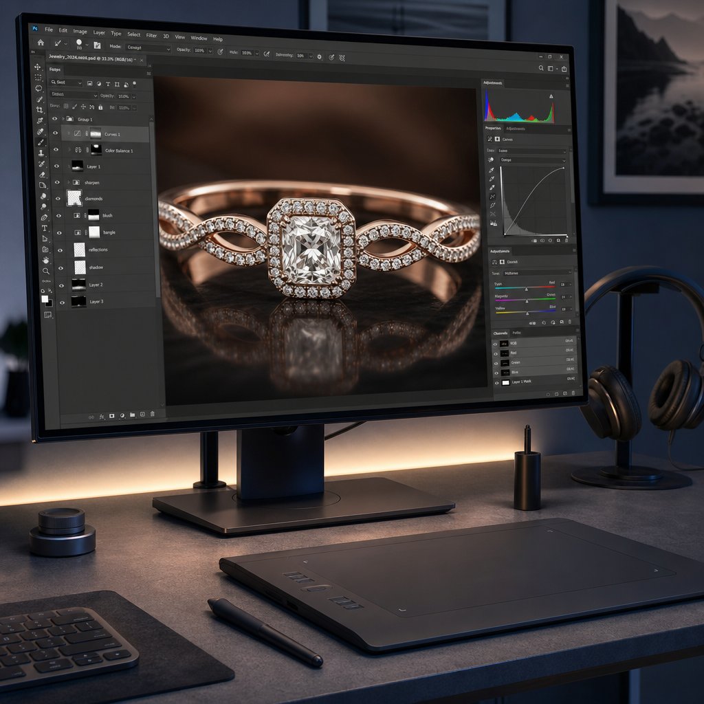
Building a Non-Destructive Editing Workflow
A clean source file only gets you halfway. The other half is how you handle that file once it hits your editing software. Professional jewelry image editing relies on a non-destructive workflow, meaning every adjustment you make can be revised, dialed back, or removed entirely without degrading the underlying pixel data. This is not just a best practice. It is the difference between a retoucher who can respond to client feedback in minutes and one who has to start over from scratch because edits were baked permanently into the image.
The concept is straightforward: never alter your original pixels directly. Instead, stack adjustments, corrections, and retouching on separate layers that sit above the base image. Adobe defines non-destructive editing as making changes without overwriting original image data, which remains available if you need to revert. For jewelry work, where a single piece might go through dozens of revision rounds across metal color, gemstone saturation, and background treatment, this approach is not optional.
RAW Processing Fundamentals for Jewelry Files
Every jewelry editing workflow starts in your RAW processor, whether that is Adobe Camera Raw, Lightroom, or Capture One. This is where you make global corrections that set the foundation for everything that follows in Photoshop. Think of RAW processing as establishing the baseline truth of the image before you begin any creative retouching.
White balance is your first priority. Even with a color reference card shot during capture, you will often need to fine-tune the Temperature and Tint sliders to ensure metals read as their true color. Gold should look warm without veering orange. Platinum and white gold should appear neutral without a blue or yellow cast. Camera Raw lets you click the White Balance tool on a known neutral area, and the Temperature and Tint values adjust automatically to make that point truly gray.
Exposure recovery comes next. If you followed the earlier advice to underexpose slightly for highlight protection, you will lift the Exposure slider to bring the overall brightness back to a natural level. The Highlights slider pulls back any remaining hot spots on polished surfaces, while the Shadows slider opens up darker areas around prong settings and underneath stones. The key here is restraint. You are recovering detail, not creating drama. Heavy-handed tonal adjustments at the RAW stage compress your dynamic range and leave less room for targeted dodge and burn work later.
Lens corrections should be applied before you leave the RAW processor. Enable profile-based corrections to remove barrel or pincushion distortion from your macro lens, and apply chromatic aberration removal to eliminate the purple and green fringing that commonly appears along high-contrast metal edges. These corrections are far more effective on RAW data than on a flattened pixel layer.
One setting that trips up even experienced retouchers: the output color space and bit depth inside Camera Raw. As photographer Greg Benz explains, RAW Smart Objects contain their own internal color space and bit depth settings. If those are set to sRGB and 8-bit while your Photoshop document is 16-bit ProPhoto RGB, the layer gets converted from the smaller space first, and you lose quality silently. Always confirm that your Camera Raw output matches or exceeds your working document settings.
Layer Structure and Organization for Complex Jewelry Edits
When you open your processed file into Photoshop, the temptation is to start retouching immediately. Resist it. Spending two minutes setting up an organized layer structure saves hours of confusion later, especially on complex pieces with multiple metals, stones, and surface types that each require independent treatment.
A professional jewelry photo editor typically builds the PSD file in a specific stack order, from bottom to top:
- Background layer - Your processed RAW file, untouched. This is your safety net. Lock it.
- Cleanup layers - Empty layers set to "Sample All Layers" for Clone Stamp and Healing Brush work. Dust removal, scratch repair, and reflection cleanup happen here without touching the original pixels.
- Dodge and burn group - Curves adjustment layers or 50% gray layers set to Soft Light blending mode for sculpting light and shadow on metal surfaces.
- Color correction group - Hue/Saturation, Selective Color, and Color Balance adjustment layers for refining metal tones and gemstone hues independently.
- Sharpening group - High-pass sharpening layers or Smart Sharpen applied to a merged stamp layer, masked to affect only areas that benefit from added crispness.
- Output layers - Final curves for contrast, any vignetting, and export-specific adjustments like sRGB conversion copies.
Each group should be clearly named. When a client asks you to "make the gold warmer but keep the diamond exactly as is," you need to locate the relevant adjustment layer instantly, not hunt through a stack of unnamed Layer 1 through Layer 47.
For catalog work involving dozens or hundreds of pieces, save this structure as a PSD template. Every new image starts from the same organized foundation, which keeps your jewellery editing consistent and makes batch revisions predictable.
Using Smart Objects and Masks for Reversible Retouching
Smart Objects are the backbone of a truly reversible workflow. When you open your RAW file as a Smart Object in Photoshop, the original RAW data stays embedded inside the layer. Double-click it at any point, and Camera Raw reopens with all your settings intact, ready for adjustment. Changed your mind about white balance after three hours of retouching? Update it inside the Smart Object, click OK, and every layer above it responds to the new base without losing any of your work.
This matters enormously for jewelry image editing because client revisions are constant. A brand might approve an image, then realize the gold tone does not match their website palette. With a Smart Object base, you adjust the RAW processing and the entire edit updates. Without it, you rebuild from zero.
Smart Objects also enable non-destructive transformations. Scaling, rotating, or warping a Smart Object does not degrade pixel quality the way those operations do on a rasterized layer. For composite shots where you need to resize a stone or adjust the angle of a pendant, this preserves sharpness through multiple iterations.
Layer masks complete the non-destructive toolkit. Every adjustment layer in your stack should be masked to affect only its intended target. A Curves layer brightening the diamond should not also blow out the metal band. Paint black on the mask to hide the effect from areas that do not need it. Paint white to reveal it where you do. The beauty of masks is that they are infinitely editable. You never commit to a selection permanently. If your mask edge is too hard or too soft, repaint it. The underlying adjustment stays untouched.
For jewelry specifically, luminosity masks offer precision that manual painting cannot match. These masks are generated from the image's own tonal data, letting you target only the brightest highlights, only the deepest shadows, or any tonal range in between. When you need to enhance the sparkle in a diamond without affecting the matte finish of a bezel setting, a luminosity mask isolates exactly the right pixels.
A quick note on bit depth and color profiles, because these technical settings directly impact how much latitude your non-destructive edits actually give you. Work in 16-bit mode throughout your editing process. The difference between 8-bit (256 tonal levels per channel) and 16-bit (65,536 levels per channel) means dramatically smoother gradients and far less banding when you push curves or color adjustments aggressively. You will notice this most on polished metal surfaces where smooth tonal transitions define the sense of curvature. Convert to 8-bit only at the final export stage for web delivery.
For color profiles, edit in ProPhoto RGB. This wide-gamut space contains virtually every color your camera sensor can capture, preserving the full saturation range of vivid gemstones like emeralds and rubies. Convert to sRGB only when exporting for web or ecommerce platforms, where browsers and monitors expect that standard space. Making this conversion at the very end of your pipeline, rather than the beginning, ensures you never discard color data prematurely.
With a properly structured, non-destructive file in place, you have the flexibility to push creative decisions as far as they need to go. The real test of that flexibility comes when you tackle the single hardest element in any jewelry image: reflective metal surfaces that mirror everything around them.
Retouching Precious Metals and Reflective Surfaces
Polished metal is, optically speaking, a mirror shaped into a curve. A gold band does not just reflect light. It reflects everything: the camera lens, the photographer's shirt, the edge of a softbox, even the ceiling tiles two meters above the set. That reflective behavior is what gives metal its perceived value and dimension, but it also makes jewellery retouching the most technically demanding category of product editing you will encounter.
The challenge is not simply removing unwanted reflections. It is removing them while preserving the surface characteristics that make metal look like metal. Strip away too many reflections and you get a flat, plastic-looking surface with no sense of curvature. Leave too many in and the piece looks dirty or cluttered. High end jewelry retouching lives in the narrow space between those two extremes.
Why Reflections Are the Hardest Challenge in Jewelry Retouching
When you zoom into a polished ring at 300%, you will notice that the metal surface contains a complete miniature image of its environment. Dark bands represent the gaps between light sources. Bright streaks represent the diffusion panels. Colored patches represent whatever objects sat nearby during the shoot. These reflections are not noise or defects. They are the physics of how specular surfaces interact with light, and they define the three-dimensional form of the piece.
This is where amateur retouchers make their biggest mistake. They treat reflections as blemishes and clone them out aggressively, or worse, blur the entire surface with tools like Surface Blur or Gaussian Blur. As Cloud Retouch explains, metal is defined by its texture, the tiny scratches, the metal grain, and the sharp specular highlights. Destroying that micro-contrast with heavy-handed cleanup is the number one reason retouched jewelry ends up looking like cheap plastic rather than precious metal.
The professional approach requires you to think of reflections in two categories: structural reflections that define the shape of the metal (keep these), and environmental distractions that add visual clutter without contributing to form (remove these). A dark reflection running along the curve of a band gives it dimension. A reflection of your tripod leg sitting in the middle of that same curve adds nothing. Learning to distinguish between the two is what separates competent jewellery photo retouching from amateur cleanup.
Dodge and Burn Techniques for Realistic Metal Dimension
Dodge and burn is the core sculpting technique for metal surfaces. Rather than adding or removing reflections wholesale, you are selectively brightening and darkening areas to enhance the existing light pattern and push the sense of three-dimensionality further.
The most flexible method uses two Curves adjustment layers: one set to brighten (the dodge layer) and one set to darken (the burn layer). Fill both layer masks with black so neither has any visible effect initially. Then paint with a soft white brush at low opacity, typically 5-15%, to gradually reveal the brightening or darkening exactly where you want it.
On a polished gold band, you would brighten the top ridge where light naturally catches the surface, and darken the inner edges where the curve falls away from the light source. This mimics how light wraps around a cylinder and reinforces the volumetric shape the viewer's brain expects to see. The key word here is "gradually." Building up density in multiple passes at low opacity produces smooth, natural-looking transitions. A single stroke at high opacity creates an obvious painted look that screams fake.
For high end jewellery retouch work, pair your dodge and burn layers with luminosity masks. These masks, generated from the image's own tonal data, let you constrain your brightening to only the existing highlights or your darkening to only the existing shadows. The result is that you amplify the natural light pattern rather than fighting against it. You are turning up the volume on what the light already did, not inventing new light from scratch.
Blending Modes That Enhance Metal Shine Without Artifacts
Beyond dodge and burn, specific blending modes and tools give you surgical control over metal surfaces without risking destructive edits.
Frequency separation for surface cleanup. This technique splits your image into two layers: a high-frequency layer containing texture and fine detail, and a low-frequency layer containing color and tonal gradients. You can smooth out uneven color patches or unwanted reflection tones on the low-frequency layer without touching the grain and micro-scratches that make metal look real. Standard clone stamping blends both texture and tone simultaneously, which is why it often produces that telltale "smeared" look on polished surfaces. Frequency separation avoids this by letting you address each component independently.
Curves with luminosity masks for highlight control. When specular highlights clip to pure white, you lose detail permanently. But highlights that are close to clipping, sitting at 245-252 on the RGB scale, can be pulled back with a gentle Curves adjustment masked to affect only those near-white values. This recovers the subtle gradient at the peak of a reflection, making it look like a smooth rolloff rather than a hard white blob. The luminosity mask ensures you are not accidentally darkening midtone areas that should remain untouched.
Gradient maps for consistent metal tone. Different areas of a metal surface often pick up different color casts from the environment. The left side of a ring might read slightly warm from a nearby gold reflector card, while the right side picks up a cool cast from a white wall. A Gradient Map adjustment layer, mapped from shadow tone to highlight tone using colors sampled from the cleanest area of the metal, unifies the entire surface into a consistent hue. Use the Blend If sliders to protect the extreme highlights and deep shadows from the correction, applying it only to the midtone range where color inconsistencies are most visible.
Color Handling by Metal Type
Each metal has a distinct spectral signature, and treating them identically is a fast path to unrealistic results. Here is how the approach shifts depending on what you are working with:
| Metal Type | Color Character | Primary Retouching Focus | Common Mistake |
|---|---|---|---|
| Yellow gold | Warm, saturated yellow-orange | Maintain warmth without pushing into orange; keep highlights clean white, not yellow | Over-saturating until it looks like brass or costume jewelry |
| White gold | Cool neutral with slight warmth | Preserve the subtle warm undertone that distinguishes it from platinum | Making it too blue-white, which reads as silver or platinum instead |
| Platinum | Cool, dense gray with bright highlights | Emphasize the weight and density through strong contrast between highlights and shadows | Letting it look identical to white gold or sterling silver |
| Rose gold | Warm pink-copper tone | Balance the pink without letting it look like copper or salmon; keep shadows neutral | Pushing saturation until it looks like costume copper |
| Sterling silver | Bright, high-contrast, cool neutral | Preserve the crisp, mirror-like reflections; silver shows every imperfection | Over-smoothing until it loses its characteristic sharp reflections |
Yellow gold requires careful attention in the Selective Color adjustment layer. Target the Yellows and Reds channels to fine-tune the warmth without contaminating the highlights. The brightest specular reflections on gold should still read as clean white, not tinted yellow. If your highlights are picking up color, use a Hue/Saturation layer masked to the highlight range and desaturate just those values.
Rose gold is particularly tricky because its pink-copper tone sits in a narrow range between "elegant" and "cheap." Push the saturation even slightly too far and it reads as costume copper. Pull it back too much and it looks like dirty white gold. Reference images from the actual piece under neutral lighting are essential for calibrating your color corrections.
Silver and platinum both appear as cool neutrals, but they differ in density and contrast behavior. Platinum has a heavier, denser appearance with smoother tonal transitions. Silver is brighter and more mirror-like, with sharper contrast between reflections and shadows. When retouching a piece that contains both metals, or when working across a catalog that includes both, maintaining this visual distinction prevents customer confusion about what they are actually buying.
The discipline required for metal retouching, that careful balance between cleanup and preservation, applies equally to the other half of most jewelry pieces. Gemstones present their own set of challenges, but the underlying principle remains the same: enhance what the material naturally does with light rather than inventing something it does not.
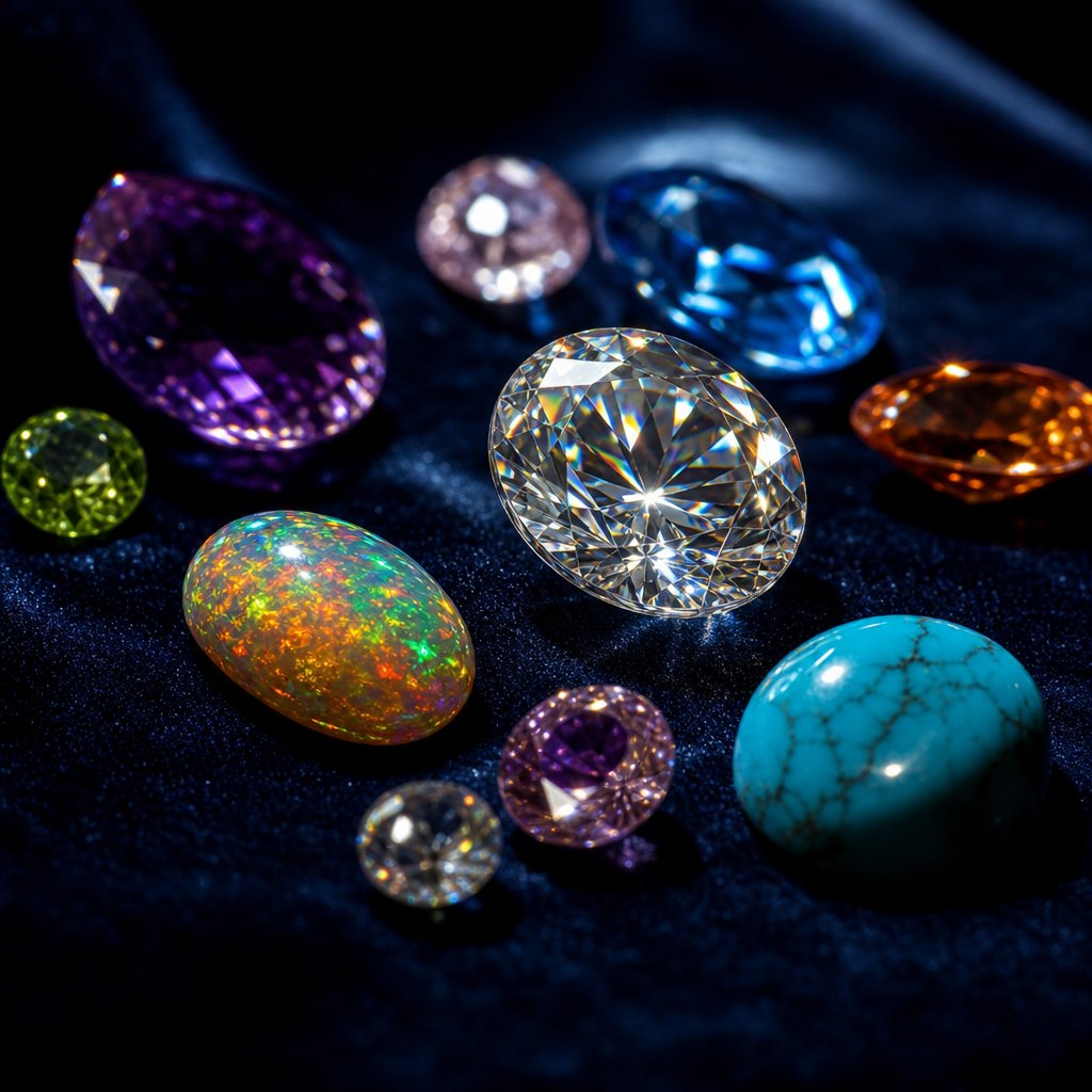
Gemstone Retouching Challenges by Material Type
Metals reflect light off their surface. Gemstones do something far more complex: they absorb, refract, scatter, and transmit light through their internal structure. That fundamental difference means the retouching approach you just refined for polished gold or platinum will not transfer directly to the stones set within it. Each gemstone category interacts with light in a distinct way, and your jewellery image retouching strategy needs to respond to those optical properties rather than applying a one-size-fits-all enhancement.
The mistake most retouchers make is treating all stones the same, usually by cranking saturation and adding a generic sharpening pass. The result? Diamonds that glow like LED bulbs, turquoise that looks spray-painted, and opals that lose their delicate color shifts entirely. A material-first approach solves this by matching your tools and techniques to the physics of each stone type.
Transparent Gemstones and Enhancing Internal Fire
Diamonds, sapphires, emeralds, and other transparent or semi-transparent stones derive their visual appeal from what happens inside them. Light enters through the crown, bounces off internal facets, and exits as dispersed spectral color. In diamonds, this dispersion is called "fire." In colored stones like sapphires, the interplay between body color and internal reflections creates depth that distinguishes a real gem from a piece of colored glass.
Your retouching goal with transparent stones is to enhance that internal light behavior without making it look artificially amplified. Start by isolating the stone from its metal setting. For transparent gems, the Color Range selection tool often works better than the Pen Tool because the stone shares edge pixels with the metal beneath it. Sample the brightest facet highlights, expand the selection slightly, and refine the edge with a feathered mask. This gives you a working selection that follows the optical boundaries of the stone rather than just its physical outline.
Once isolated, use a Curves adjustment layer to lift the brightest internal highlights, the tiny pinpoints of spectral color that represent fire. Target only the upper quarter of the tonal range so you are amplifying existing brilliance rather than brightening the entire stone uniformly. For colored transparent gems like emeralds or rubies, a Selective Color adjustment lets you push the dominant hue slightly without affecting the neutral facet reflections that provide contrast.
The critical mistake here is over-brightening. Professional retouching guides emphasize that gemstones with impossible levels of brilliance are a hallmark of overprocessing. A diamond should still contain dark facets alongside bright ones. Those dark areas are what make the bright facets read as sparkle. Remove the contrast and you get a featureless white blob instead of a gem.
Opaque Stones and Surface Texture Preservation
Turquoise, lapis lazuli, jade, onyx, and coral behave completely differently. Light does not pass through them. Instead, their appeal comes from surface color, texture, and pattern. The veining in turquoise, the gold pyrite flecks in lapis, the translucent depth of fine jade: these are all surface or near-surface phenomena that require a texture-first retouching approach.
The primary challenge with opaque stones is maintaining accurate color saturation without destroying the subtle surface variations that make each stone unique. When you boost saturation globally, you flatten those variations into a uniform color block. The turquoise loses its natural matrix pattern. The lapis looks like solid blue paint.
Instead, work with targeted Hue/Saturation adjustments masked to the stone area. Increase saturation modestly, no more than 10-15 points, and use the Vibrance slider rather than Saturation when possible. Vibrance protects already-saturated pixels from clipping while lifting the less saturated areas, which preserves the natural color variation within the stone.
For texture enhancement, a High Pass filter set to a low radius (1-3 pixels) on a merged stamp layer, blended in Overlay mode and masked to the stone, sharpens surface detail without introducing halos along the stone-to-metal boundary. This brings out the fine grain of jade or the crystalline structure of lapis without the artifacts that Unsharp Mask tends to produce on organic textures.
Iridescent Materials and Play-of-Color Retouching
Opals, labradorite, moonstone, and ammolite present the most delicate retouching challenge of all. These stones display play-of-color or adularescence, optical phenomena where different colors appear depending on the viewing angle. As gemstone photography specialists note, opals can display all the colors of the rainbow in an iridescent moving pattern as light diffracts through tiny silica spheres within the gem. Capturing this accurately requires consistent lighting during the shoot, and preserving it during retouching demands an equally careful hand.
The temptation with iridescent stones is to boost saturation to make those color flashes more vivid. The problem? Oversaturation destroys the subtlety that makes play-of-color beautiful. A fine opal shows soft, shifting hues that blend into each other. Push the saturation and those transitions become harsh, garish bands of color that look digitally painted rather than naturally occurring.
Luminosity masks are your best selection tool for iridescent surfaces. Because the color play exists primarily in the mid-to-highlight tonal range, a luminosity mask targeting those values isolates the iridescent areas without selecting the darker base color of the stone. You can then apply gentle Vibrance adjustments or use a Color Balance layer to shift specific tonal ranges, warming the highlights slightly to enhance fire tones or cooling the shadows to deepen the base.
For moonstone and labradorite, where adularescence creates a floating glow beneath the surface, a subtle dodge pass on the brightest area of the optical effect enhances the phenomenon without making it look like a lens flare was pasted on top. Keep your brush opacity at 3-5% and build gradually. The effect should look like the stone is glowing from within, not like someone painted a white streak across it.
| Stone Category | Primary Challenge | Key Tools | Common Mistakes |
|---|---|---|---|
| Transparent (diamond, sapphire, emerald) | Enhancing internal fire and brilliance without losing facet contrast | Color Range selection, Curves on highlight range, Selective Color for hue control | Over-brightening until dark facets disappear; uniform glow replacing natural sparkle pattern |
| Opaque (turquoise, lapis lazuli, jade) | Preserving surface texture and natural color variation | Pen Tool for hard edges, Vibrance over Saturation, High Pass sharpening masked to stone | Flattening color variation with global saturation; destroying matrix patterns and surface grain |
| Iridescent (opal, labradorite, moonstone) | Maintaining delicate play-of-color without oversaturation | Luminosity masks for tonal isolation, Color Balance by range, low-opacity dodge for glow | Oversaturating color flashes into garish bands; harsh transitions replacing soft color shifts |
Selecting gemstones cleanly from their metal settings is half the battle in jewellery image editing. The right selection tool depends entirely on the stone type. Hard-edged opaque stones with clear boundaries respond well to the Pen Tool, which gives you precise, anchor-point-based paths along the bezel or prong edges. Transparent stones where the metal shows through require Color Range selections that respect the optical blending at the boundary. And iridescent stones, where color shifts right up to the edge of the setting, benefit from luminosity masks that follow tonal boundaries rather than geometric ones.
Whichever tool you use, refine your selection edge with a 0.5-1 pixel feather to avoid the hard cutoff that screams "masked in Photoshop." For jewelry image retouching services working at catalog scale, saving these selections as alpha channels in your PSD template means you never rebuild them from scratch when revisions come back.
Getting gemstone retouching right means your colors are accurate within the file. But accuracy inside Photoshop is only half the equation. What happens when that carefully calibrated opal lands on a customer's uncalibrated laptop screen, or gets converted to CMYK for a print catalog? Color management across output formats introduces an entirely different set of problems.
Color Accuracy and File Format Best Practices
You spent hours perfecting the warm tone of a rose gold band and the deep blue saturation of a sapphire. The file looks flawless on your editing monitor. Then a client opens it on their laptop and the gold looks orange. A customer views it on their phone and the sapphire reads purple. The print catalog arrives and everything shifts muddy. This is not a retouching failure. It is a color management failure, and it undoes all the careful jewellery photo editing work upstream.
Color accuracy in jewelry photography retouching is not just about getting the hues right inside Photoshop. It is about ensuring those hues survive the journey from your editing environment to every screen, browser, and printed page where the image will ultimately live. Without a deliberate color management workflow, even the most skilled retouching produces unpredictable results at the point of sale.
Maintaining True Color Across Monitors and Output Formats
The root of most color inconsistency is simple: your monitor is lying to you. Every display renders color differently based on its panel technology, age, ambient lighting, and factory calibration. Two monitors sitting side by side on the same desk will show the same file with noticeably different warmth, brightness, and saturation unless both have been profiled to a known standard.
Monitor calibration is the non-negotiable first step. A hardware calibrator, a small colorimeter that attaches to your screen, measures how your display actually renders a series of known color patches and builds an ICC profile that corrects for its specific deviations. As X-Rite's softproofing guide explains, if you are working from a monitor that is displaying the wrong color, it is impossible to make good design and editing decisions. Calibration optimizes your monitor for contrast, brightness, and color temperature so what you see matches a defined standard.
For jewelry photo editing services handling precious metals and gemstones, calibration settings matter more than they do for general photography. Set your white point to 6500K (D65) for screen-destined work, or 5000K (D50) if your primary output is print. Target a luminance of 120 cd/m2 for typical studio lighting conditions, and calibrate to a gamma of 2.2, which matches the native behavior of most modern displays and produces the smoothest gradients on polished metal surfaces.
Recalibrate regularly. Displays drift over time as backlights age and panel characteristics shift. Monthly calibration is sufficient for most workflows, but if you are running a jewellery photo editing service where color-critical approvals happen daily, weekly calibration eliminates any accumulated drift before it becomes visible in your output.
Soft-proofing extends calibration into prediction. Once your monitor is profiled, applications like Photoshop can simulate how your image will appear when converted to a different output profile, whether that is an sRGB web browser, a CMYK press condition, or a specific printer. You activate soft-proofing under View > Proof Setup > Custom, select the destination profile, and your calibrated monitor approximates the final output appearance. This lets you catch problems, like a vivid emerald green falling outside the CMYK gamut, before you deliver the file rather than after the catalog prints.
Resolution and File Format Requirements by Destination
Jewelry images travel to wildly different destinations, each with its own technical requirements. An image optimized for Amazon's product listing will fail in a print catalog, and a print-ready TIFF will choke a social media upload. Matching your export settings to each destination prevents quality loss and platform rejections.
| Destination | Resolution | Color Profile | File Format | Compression |
|---|---|---|---|---|
| Amazon | 2000px longest side (minimum 1000px for zoom) | sRGB | JPEG or PNG | JPEG quality 85-95; PNG for transparent backgrounds |
| Shopify | 2048 x 2048px recommended | sRGB | JPEG, PNG, or WebP | JPEG quality 80-90; WebP for faster load times |
| Etsy | 2000px shortest side recommended | sRGB | JPEG or PNG | JPEG quality 85-90; keep under 10MB |
| Print catalog | 300 DPI at final print size | CMYK (e.g., FOGRA39, GRACoL 2013) | TIFF or PDF/X-4 | LZW or no compression for TIFF |
| Social media (Instagram, Pinterest) | 1080 x 1080px or 1080 x 1350px | sRGB | JPEG or PNG | JPEG quality 85; avoid over-compression artifacts on metallic highlights |
A few details in this table deserve extra attention. Amazon requires a pure white background (RGB 255, 255, 255) for main product images, with the product filling at least 85% of the frame. For jewelry, where pieces are small and intricate, this means your export crop needs to be tight enough that the ring or necklace dominates the canvas without losing breathing room around prongs and chain ends.
Shopify gives you more creative freedom since you control your own storefront, but consistency across your product grid matters. Use uniform image dimensions so thumbnails align cleanly. Square formats work well for most jewelry categories, though vertical 4:5 crops can showcase elongated pieces like drop earrings or pendant necklaces more effectively.
Print output introduces the biggest color shift risk. Converting from your wide-gamut ProPhoto RGB editing space to CMYK compresses the available color range significantly. Vivid blues, greens, and saturated reds that look stunning on screen may fall outside the printable gamut entirely. This is where soft-proofing becomes essential: preview the CMYK conversion before committing, and adjust problem areas manually rather than letting the automatic conversion clip them unpredictably.
Color Profile Workflow From Capture to Delivery
The full color pipeline for jewellery photo editing services looks like this: capture in your camera's native color space (typically Adobe RGB or the sensor's raw gamut), process in ProPhoto RGB at 16-bit depth for maximum editing latitude, and convert to the destination profile only at the final export step. Each stage preserves the widest possible color range until the moment you absolutely must narrow it for a specific output.
When that final conversion happens, you choose a rendering intent, which determines how out-of-gamut colors get handled. Two intents matter for jewelry work:
- Relative Colorimetric converts all in-gamut colors accurately and clips out-of-gamut colors to the nearest reproducible value. FESPA's color management guide notes this is the default for most automated workflows and gives the most accurate conversion for colors that fit within the destination gamut. Enable Black Point Compensation (BPC) alongside it to preserve shadow detail by mapping the darkest point of your source profile to the darkest point of the output profile.
- Perceptual compresses the entire tonal range proportionally so that relationships between colors are maintained, even if individual values shift slightly. This is useful when converting to a small-gamut output like newsprint or uncoated paper, where many jewelry colors would otherwise clip. The tradeoff is that in-gamut colors may shift slightly to make room for the compressed out-of-gamut values.
For most ecommerce jewelry work converting from ProPhoto RGB to sRGB, Relative Colorimetric with BPC produces the most faithful results because sRGB can reproduce the majority of colors you will encounter in metal and gemstone photography. Reserve Perceptual for CMYK conversions targeting small-gamut print conditions where vivid gemstone colors would otherwise lose differentiation.
One practical tip that saves headaches across large catalogs: embed the sRGB profile in every web-destined export. Not all browsers and platforms are fully color-managed, and an untagged image may display differently depending on the viewer's system assumptions. Embedding the profile costs a few kilobytes of file size and eliminates ambiguity about how the colors should be interpreted.
For jewellery photo editing service providers handling hundreds of SKUs, build these export settings into Photoshop Actions or Lightroom Export Presets. One preset per destination, with the correct resolution, color profile, format, and compression baked in. This removes human error from the equation and ensures every image in a batch meets platform specifications without manual checking.
Color accuracy and proper file formatting protect the integrity of your retouching all the way to the customer's eyes. But even with perfect color management, other technical and creative errors can undermine your results. The most common mistakes in jewelry retouching are not always obvious while you are making them, which is exactly why they persist across so many product catalogs.
Common Jewelry Retouching Mistakes and How to Avoid Them
You can master non-destructive workflows, nail your color management, and understand the physics of every metal and gemstone type. And still produce images that look off. The reason? Small, repeatable errors that compound across a catalog until the entire product line feels inconsistent or overprocessed. These mistakes rarely announce themselves while you are making them. They only become obvious when you step back and view the full set together, or worse, when a customer receives a piece that looks nothing like the photo.
The good news: once you know what to look for, most of these issues are straightforward to fix. Here are the errors that show up most frequently in jewelry photography retouching, paired with the specific corrections that eliminate them.
Over-Processing Errors That Make Jewelry Look Fake
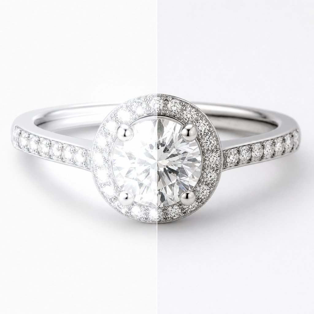
Over-processing is the single fastest way to destroy buyer trust. Research shows that high-quality product photos get 94% more conversions than low-quality ones, but "high-quality" does not mean "heavily edited." Overly polished jewelry feels unnatural and takes away its authentic charm. Customers scroll past images that look artificial because their brain registers something wrong even if they cannot articulate what it is.
- Over-sharpening that creates pixel halos. Those weird glowing edges around prongs and stone settings happen when sharpening radius and amount values are too aggressive. The fix: use selective sharpening masked to edges and detail areas only, not the entire image. Keep your radius between 0.5-1.5 pixels for jewelry, apply sharpening at 100% view to catch halos early, and use the masking slider in Lightroom or a luminosity mask in Photoshop to protect smooth metal surfaces from sharpening artifacts.
- Excessive saturation that makes gemstones look artificial. A sapphire pushed 30 points in saturation stops looking like a natural stone and starts looking like colored glass. The fix: use Vibrance instead of Saturation for global adjustments, limit targeted saturation boosts to 10-15 points maximum, and always compare your edit against a reference photo of the actual piece under neutral light. If the color on screen would surprise someone holding the real stone, you have gone too far.
- Over-polished metal that kills authenticity. Real gold has natural variations in its shine. Smoothing every surface to a uniform mirror finish removes the micro-texture that tells the viewer's brain this is actual metal. The fix: dial back shine adjustments and use selective brightening on specific highlight areas rather than blanket surface smoothing. Let some areas stay naturally matte to preserve dimension.
- Removing all shadows. Some retouchers delete shadows completely, leaving jewelry floating in a featureless white void. Without shadows, pieces lose their sense of weight and physical presence. The fix: keep soft, natural shadows that ground the piece on its surface. Remove only harsh or distracting shadows that pull attention away from the jewelry itself.
- Overuse of glow or soft filters. That dreamy soft-focus look might work for lifestyle content, but it destroys the crisp detail that luxury jewelry demands. The fix: keep catalog images sharp and detail-focused. If you want a softer aesthetic, achieve it through lighting during the shoot rather than filters in post.
Consistency Mistakes That Weaken Product Catalogs
A single beautifully retouched image means nothing if it sits alongside 50 others that all look slightly different. Inconsistency across a product catalog signals "unprofessional" to shoppers faster than almost any other visual cue. When backgrounds do not match, lighting direction shifts between products, and color temperatures vary from image to image, customers wonder if they are shopping from a legitimate brand or a random marketplace seller.
- Inconsistent background tones. One product sits on bright white, the next on slightly gray, another on warm cream. The fix: establish a standard background color value (pure white is RGB 255, 255, 255 for most ecommerce platforms) and apply the same background treatment preset to every image. Check consistency by placing thumbnails side by side before publishing.
- Shifting lighting direction across the catalog. If your ring images show light coming from the upper left but your necklace images show light from directly above, the catalog feels disjointed. The fix: standardize your lighting setup position and maintain it across all shooting sessions. When retouching, avoid flipping or rotating images in ways that reverse the apparent light direction.
- Inconsistent color temperature between metals. Your yellow gold looks warm in one image and neutral in another. Rose gold shifts between pink and copper across the product line. The fix: create a color reference swatch for each metal type in your catalog and match every image to that reference using Selective Color adjustment layers. Document the exact adjustment values so they can be replicated across batches.
- Ignoring brand style consistency. Each product photo looking like it came from a different store destroys brand recognition. The fix: create an editing preset that defines your exact settings for contrast, color grading, sharpening, and shadow treatment. Apply it as a starting point for every image, then make piece-specific adjustments on top of that consistent foundation.
McKinsey research found that companies focusing on consistent customer journeys can increase satisfaction by 20% and boost revenue by 15%. In ecommerce, visual consistency is a core part of that journey. A single inconsistent image among hundreds can break customer confidence, because as their research warns, a single negative experience has four to five times greater relative impact than a positive one.
Technical Errors That Limit Output Quality
- Destructive editing that prevents revisions. Flattening layers, editing directly on the background, or saving over your original file means any revision request requires starting from zero. The fix: always maintain a layered PSD with your original RAW file accessible. Save iterative versions rather than overwriting. If a client asks you to "make the gold warmer" three weeks after delivery, you should be able to open the file and adjust a single layer.
- Poor background removal leaving fringe pixels. Zoom into the edges of a clipped jewelry piece and you will often find a thin halo of the original background color clinging to chain links, prong tips, and filigree details. The fix: after making your initial selection, contract it by 1-2 pixels and apply a 0.5 pixel feather. Use the Decontaminate Colors option in Select and Mask to push edge pixels toward the subject color rather than the background. For intricate chains, refine the mask manually at 200% zoom.
- Excessive noise reduction that destroys texture. Smoothing out grain completely makes metal surfaces look painted and gemstones look like plastic. The fix: apply noise reduction selectively and conservatively. Use luminance noise reduction only where grain is genuinely distracting, and preserve the natural texture that gives materials their tactile quality. Zoom to 100% while adjusting to see exactly when you have crossed the line from cleanup into destruction.
- Skipping final color profile adjustment. Hours of editing that look perfect on your calibrated monitor, then completely different on a customer's phone because you exported without embedding an sRGB profile. The fix: always export web images with the sRGB profile embedded. Check your files on multiple devices before publishing to catch any conversion issues.
Quality Control Checklists for Catalog Work
When you are processing dozens or hundreds of pieces for a jewelry photo retouching service, individual inspection of every pixel is not realistic. You need a systematic QA process that catches errors before they reach the client. Doopic's QA framework demonstrates how professional operations maintain consistency at scale through structured checkpoints rather than relying on individual editor judgment alone.
Build your own pre-delivery checklist around these verification steps:
- Thumbnail grid review. Export all images at thumbnail size and view them together in a grid. Inconsistencies in background tone, brightness, color temperature, and framing become immediately obvious at small scale when they might hide at full resolution.
- 100% zoom edge scan. For every image, zoom to 100% and scan the full perimeter of the piece. Check for fringe pixels, halo artifacts from sharpening, and any remaining dust spots near edges that the initial cleanup missed.
- Metal color spot-check. Sample the midtone value of each metal type across the batch using the Eyedropper tool. The RGB values should fall within a tight range. If your yellow gold reads 210, 180, 90 in one image and 195, 160, 75 in another, the batch will look inconsistent on the product page.
- Multi-device preview. View final exports on at least two different screens, ideally including a phone, before delivery. This catches profile embedding errors and compression artifacts that only appear on non-calibrated displays.
- File specification verification. Confirm dimensions, file size, color profile, and format match the destination requirements. A single image exported at the wrong resolution or in the wrong color space can trigger a platform rejection or display incorrectly.
For jewellery retouching services handling large volumes, automate as much of this verification as possible. Photoshop Actions can flag images that fall outside specified file size ranges. Scripts can verify that embedded profiles match your delivery spec. The goal is catching technical errors systematically rather than hoping you notice them during a manual scroll-through at the end of a long editing session.
These mistakes and their fixes address the craft of retouching itself. But there is a broader operational question that determines whether your workflow scales or collapses under volume: at what point does handling everything in-house stop making sense, and how do you evaluate whether outsourcing produces better results for less effort?
Scaling Your Workflow and Outsourcing Decisions
Knowing how to retouch jewelry at a high level is one thing. Doing it consistently across 500 SKUs while meeting weekly upload deadlines is an entirely different problem. At some point, every jewelry brand, photographer, or ecommerce seller hits a volume threshold where the question shifts from "how do I retouch this?" to "should I still be the one retouching this at all?"
The answer depends on your specific situation: your volume, your margins, your turnaround requirements, and how central image quality is to your brand positioning. There is no universal right answer, but there are clear signals that tell you when each model makes sense.
When In-House Retouching Makes Sense and When It Does Not
Handling jewelry retouching services internally works well under specific conditions. If you are a small studio producing fewer than 50 images per week, your retoucher sits next to your photographer, and your brand style requires constant real-time creative decisions, keeping the work in-house gives you tight feedback loops and direct quality control. You can adjust on the fly, experiment with new looks, and maintain a level of creative intimacy that is hard to replicate with an external team.
The model breaks down when volume scales. Imagine you are launching a new collection of 200 pieces, each needing 3-5 angles, all due within two weeks. Suddenly your single in-house editor is buried under 600-1000 images while also handling revision requests from last month's catalog. Quality drops. Deadlines slip. Overtime costs spike. The bottleneck is not skill. It is capacity.
There is also the hidden cost of maintaining in-house capability. Software licenses for Photoshop and Capture One run $50-100 per month. A calibrated editing monitor costs $1,000-2,000. Training a retoucher to handle the specific challenges of reflective metals and gemstone enhancement takes months of supervised work before they produce catalog-ready output independently. For businesses with fluctuating workloads or seasonal spikes, those fixed costs sit idle during slow periods.
Evaluating Outsourcing Partners for Quality and Consistency
When you decide to outsource jewelry photo retouching services, the selection process matters more than the decision itself. A bad outsourcing partner produces worse results than a mediocre in-house workflow because you lose the ability to course-correct in real time. A good partner, on the other hand, delivers consistent quality at scale while freeing your team to focus on photography, marketing, and product development.
Here is what to evaluate when vetting any jewelry retouching company:
- Portfolio relevance. General product retouching experience does not transfer directly to jewelry. Ask for before-and-after samples specifically showing polished metals, faceted gemstones, and intricate settings. If their portfolio only shows clothing or electronics, they likely lack the specialized skills jewelry demands.
- Style matching capability. Send 3-5 reference images that represent your brand aesthetic and ask for a test edit. A strong partner will match your style closely on the first attempt. If the test results require extensive revision notes, communication overhead will eat into your time savings.
- Revision policy and turnaround. Most reputable providers offer 1-3 free revision rounds and deliver standard orders within 24-48 hours. Clarify what counts as a "revision" versus a "new edit" to avoid billing surprises on complex pieces.
- Scalability without quality drop. Ask how they handle volume spikes. A provider that delivers beautiful work on 20 test images but cannot maintain that standard across 500 images per week is not a viable long-term partner. Dedicated account managers and consistent editor assignment help maintain style continuity across large batches.
- Data security. Your product images often represent unreleased designs. Confirm that the provider uses secure file transfer, signs NDAs, and has clear policies around data retention and deletion after project completion.
Services built specifically for jewelry, like Snappyit's Jewelry Retouch, are designed around the unique demands of polishing metal surfaces, enhancing gemstone clarity, and maintaining visual consistency across large ecommerce catalogs. When evaluating any photography retouching service, the key differentiator is whether their workflow was built for jewelry from the ground up or adapted from general product editing as an afterthought.
Volume Thresholds and Cost Considerations
Pricing for jewelry retouching services follows a predictable pattern: per-image cost decreases as batch size increases. Understanding where the breakpoints fall helps you budget accurately and choose the right model for your current scale.
| Factor | In-House | Outsourced |
|---|---|---|
| Monthly fixed cost | $3,500-$6,000+ (salary, software, hardware, training) | $500-$2,000 (variable, based on volume) |
| Per-image cost at low volume (under 100/month) | $15-$35 (when factoring all overhead) | $2-$8 depending on complexity |
| Per-image cost at high volume (500+/month) | $5-$10 (overhead spread across more images) | $1-$4 with volume discounts of 20-40% |
| Scalability during peak seasons | Limited by headcount; overtime or temp hires needed | Scales immediately without additional hiring |
| Turnaround flexibility | Constrained to business hours and team capacity | Often 24/7 operations with express options |
| Quality control | Direct oversight, immediate feedback | Requires clear briefs, sample approvals, and QA checkpoints |
| Style consistency | High, if same editor handles all work | Depends on dedicated editor assignment and documentation |
The crossover point where outsourcing becomes more cost-effective than in-house typically falls around 100-200 images per month for most jewelry businesses. Below that threshold, the overhead of managing an external relationship, writing briefs, reviewing proofs, and handling revisions, can outweigh the cost savings. Above it, the math shifts decisively toward outsourcing because you avoid scaling fixed costs linearly with volume.
A hybrid approach often works best for growing brands. Keep a small internal team or a single skilled editor for hero shots, campaign imagery, and pieces requiring heavy creative direction. Route catalog-scale work, standard product angles, background cleanup, and batch color correction, to an external jewelry retouching service that handles volume efficiently. This gives you creative control where it matters most while avoiding the capacity ceiling that stalls catalog growth.
One factor that often gets overlooked in the cost calculation: revision cycles. If your outsourcing partner requires three rounds of feedback before delivering acceptable results, the time cost of managing those revisions can negate the per-image savings. The best partnerships minimize revision loops through detailed style guides, reference image libraries, and initial calibration batches where both sides align on expectations before production volume begins.
Whether you keep retouching in-house, outsource it entirely, or split the workload, the operational model you choose today will likely evolve as new tools reshape what is possible. AI-powered automation is already changing which tasks require human hands and which can be handled algorithmically, and that shift is redefining the economics of jewelry retouching at every scale.

AI and Automation in Modern Jewelry Retouching
The economics of jewelry retouching shifted the moment AI tools moved beyond generic photo filters into task-specific automation. Where a skilled editor once spent 20-40 minutes per image on background removal alone, jewelry photography AI now handles that same task in 30-90 seconds with results that match or exceed manual quality for most standard pieces. That speed difference is not incremental. It fundamentally changes how studios allocate human attention across a production pipeline.
But speed without accuracy is worthless in an industry where a single misrepresented gemstone color triggers a return. Understanding exactly where AI delivers reliable results and where it still falls short is the difference between a workflow that scales intelligently and one that produces technically clean but emotionally flat images.
Where AI Accelerates Jewelry Retouching Today
AI excels at tasks that are repetitive, rule-based, and visually consistent across large batches. These are the operations where human editors add little creative value but burn significant time. An ai jewelry photo editor handles them faster and, critically, with more consistency than a human working through image number 300 on a Friday afternoon.
The tasks where automation delivers production-ready results:
- Background removal and replacement. Jewelry-specific AI tools trained on thousands of rings, chains, and settings handle edge detection around fine prongs and thin chain links far more reliably than generic removal tools. Processing time drops from 20-40 minutes per image manually to under 90 seconds.
- Batch color correction. Normalizing white balance, exposure, and color temperature across hundreds of images shot under identical conditions. AI applies corrections with mathematical consistency that eliminates the drift a human editor introduces over long sessions.
- Dust and spot removal. Identifying and healing sensor dust, surface particles, and minor blemishes across large batches without the tedium of manual spot healing on every frame.
- Shadow generation. Rebuilding natural-looking drop shadows or reflection shadows after background removal, matched to a consistent lighting direction across the catalog.
- File format conversion and resizing. Automated export pipelines that output platform-specific versions (Amazon, Shopify, social media) from a single master file without manual intervention.
Industry data supports the efficiency gains. AI background removal for jewelry processes images at $0.90-$1.99 per image compared to $5-$133 for manual Photoshop editing depending on complexity. For a 500-image catalog, that translates to $450-$995 versus $2,500-$66,500 in manual labor costs.
Tasks That Still Require Human Expertise
AI recognizes patterns. Humans understand intent. That distinction matters enormously for the creative decisions that separate a flat product shot from an image that communicates luxury, craftsmanship, and desire. As industry professionals consistently observe, AI does not understand jewelry. It only recognizes patterns, which means it cannot make the nuanced judgment calls that drive conversions on high-value pieces.
The tasks where human retouchers remain essential:
- Creative dodge and burn. Sculpting three-dimensionality into metal surfaces requires artistic judgment about where light should fall to maximize the sense of form. AI cannot decide that a particular curve needs more contrast to read as volumetric.
- Gemstone fire enhancement. Amplifying the internal brilliance of a diamond or the play-of-color in an opal without crossing into oversaturation demands understanding of how each stone type interacts with light. AI frequently smooths away the very facet reflections that make stones look valuable.
- Brand-specific style matching. Every luxury brand has a visual signature: a particular shadow quality, a specific contrast curve, a characteristic warmth in their gold tones. Translating that aesthetic consistently across new product images requires creative interpretation, not pattern matching.
- Complex reflection management. Deciding which reflections define the shape of a piece and which are environmental distractions requires contextual understanding that current AI lacks.
- Structural correction. Straightening prongs, correcting symmetry issues, or digitally adjusting the position of a stone in its setting involves understanding the physical construction of jewelry.
Research from jewellery photo retouching services providers suggests that AI handles roughly 10-15% of the total retouching workflow reliably on its own, primarily the initial groundwork. The remaining 85-90%, including precise metal retouching, gemstone enhancement, shadow creation, and color calibration, still requires human expertise to reach the quality threshold that drives conversions.
Building a Hybrid Workflow for Speed and Quality
The most effective modern jewelry photo editing service operations do not choose between AI and human editors. They layer both into a sequential pipeline where each handles what it does best. Think of it as AI clearing the runway so your skilled retouchers can focus exclusively on high-value creative work rather than burning hours on mechanical tasks.
A practical hybrid workflow looks like this:
- Stage 1 (AI): Background removal, batch color normalization, dust cleanup, and shadow generation. Processed in minutes across the full batch.
- Stage 2 (Human review): Quick quality check on AI output. Flag any images where edges failed on complex chains or where gemstone transparency was handled incorrectly.
- Stage 3 (Human creative): Dodge and burn for metal dimension, gemstone enhancement, brand-specific color grading, and any structural corrections. This is where the image transforms from clean to compelling.
- Stage 4 (Automated export): Platform-specific resizing, profile conversion, and file delivery handled by scripts or export presets.
Solutions like Snappyit's Jewelry Retouch represent this hybrid philosophy in practice, combining AI-powered processing for speed and consistency with professional-grade output quality tuned specifically for jewelry ecommerce. The platform handles the repetitive heavy lifting of background cleanup and image polishing at scale, letting brands and studios direct their human attention toward the creative refinements that define their visual identity.
For smaller operations exploring this space, many providers offer a free jewelry editing photo service trial that lets you test AI-processed results against your current manual output before committing to a workflow change. These trials are worth running on your most complex pieces first, the ones with intricate chains, transparent stones, and mixed metals, because that is where you will see the true capability ceiling of any automated tool.
The trajectory is clear: AI will continue absorbing more of the mechanical workload as models improve. But the creative judgment that makes a jewelry image sell, the understanding of how light defines luxury, how color builds trust, and how dimension creates desire, remains a fundamentally human skill. The brands that thrive will be the ones that stop treating AI and human expertise as competing options and start treating them as complementary layers in a single, unified workflow.
Why Your Jewelry Photography Retouching Still Looks Fake FAQs
What is the difference between jewelry retouching and regular photo editing?
Regular photo editing handles broad corrections like exposure, white balance, and cropping. Jewelry retouching is a specialized discipline that addresses the unique optical behaviors of reflective metals, transparent gemstones, and microscopic surface details. It involves managing specular highlights on curved metal surfaces, enhancing internal fire in faceted stones, and removing environmental reflections while preserving the three-dimensional form that makes precious materials look valuable. Working at 200-400% zoom to fix dust particles and prong imperfections is standard practice in jewelry retouching but rarely required in general editing.
How much does professional jewelry photo retouching cost?
Pricing varies based on complexity and volume. At low volumes under 100 images per month, outsourced jewelry retouching typically costs $2-$8 per image depending on the level of detail required. At higher volumes of 500 or more images monthly, per-image costs drop to $1-$4 with volume discounts of 20-40%. In-house retouching carries hidden overhead including software licenses, calibrated monitors, and training time that can push effective per-image costs to $15-$35 at low volumes. Services like Snappyit's Jewelry Retouch offer scalable pricing designed specifically for ecommerce jewelry brands processing large catalogs.
Can AI replace human jewelry retouchers?
Not entirely. AI excels at repetitive, rule-based tasks like background removal, batch color correction, dust cleanup, and shadow generation, processing these in seconds rather than minutes. However, creative tasks like dodge and burn for metal dimension, gemstone fire enhancement, brand-specific style matching, and complex reflection management still require human judgment. Current estimates suggest AI reliably handles about 10-15% of the total retouching workflow independently. The most effective approach is a hybrid workflow where AI handles mechanical groundwork and human editors focus on the creative refinements that drive conversions.
What software and tools are best for jewelry image retouching?
Adobe Photoshop remains the industry standard for jewelry retouching due to its layer-based non-destructive workflow, Smart Objects, luminosity masks, and frequency separation capabilities. RAW processing starts in Adobe Camera Raw, Lightroom, or Capture One for white balance, exposure recovery, and lens corrections. Focus stacking software like Helicon Focus handles depth-of-field compositing for macro shots. A hardware monitor calibrator is essential for color accuracy. The workflow typically moves from RAW processor to a structured PSD file with organized layer groups for cleanup, dodge and burn, color correction, sharpening, and output.
How do I keep jewelry photos consistent across a large product catalog?
Consistency requires standardization at every stage. During shooting, use fixed camera positioning, identical lighting setups, and uniform backgrounds across all sessions. In post-production, build a PSD template with preset layer structures and save editing presets that define your exact contrast, color grading, and sharpening values. Create color reference swatches for each metal type and match every image to those references. Before delivery, run a thumbnail grid review to spot inconsistencies in brightness and tone, and use the Eyedropper tool to verify that metal RGB values fall within a tight range across the batch.