At a glance
Jewelry retouching techniques, workflows, and quality standards that turn flat product photos into stunning images that sell.
| Need | What to do |
|---|---|
| Get oriented | Read the short summary, then use the checklist below. |
| Create a test image | Try Jewelry Retouch Free |
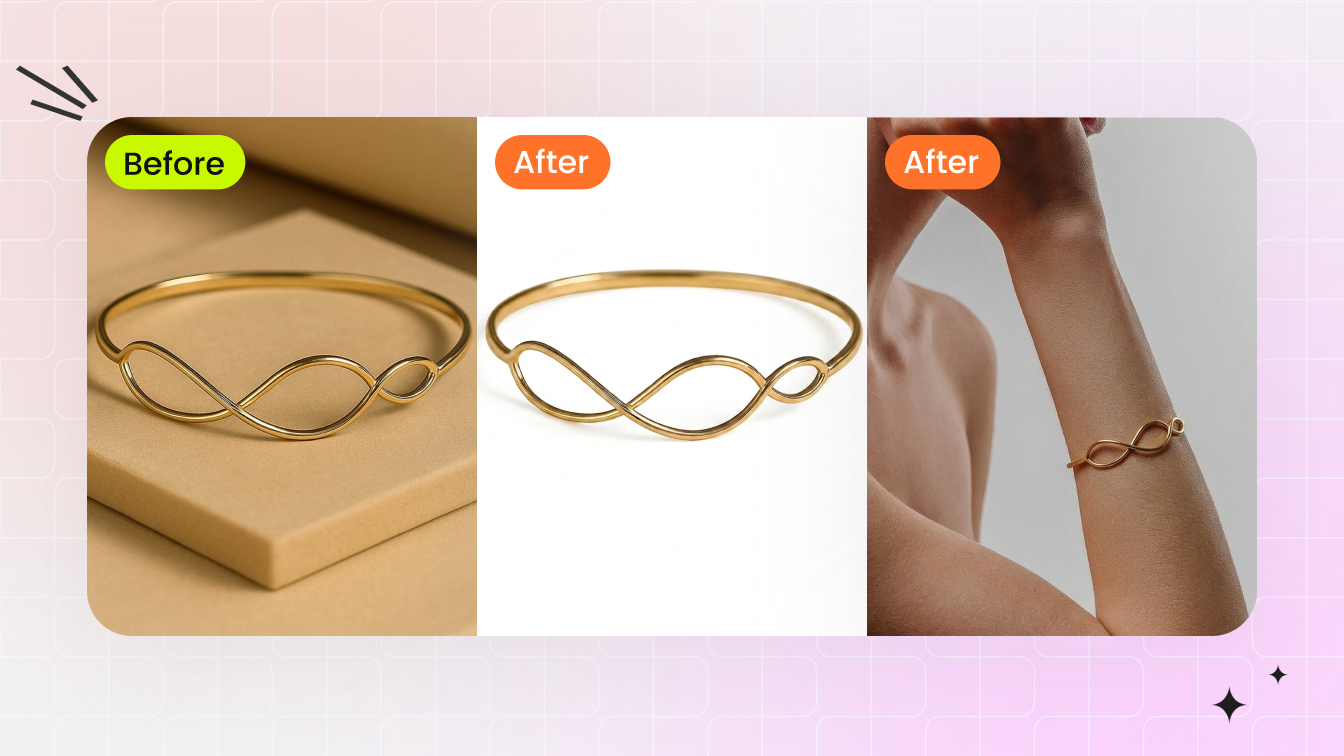
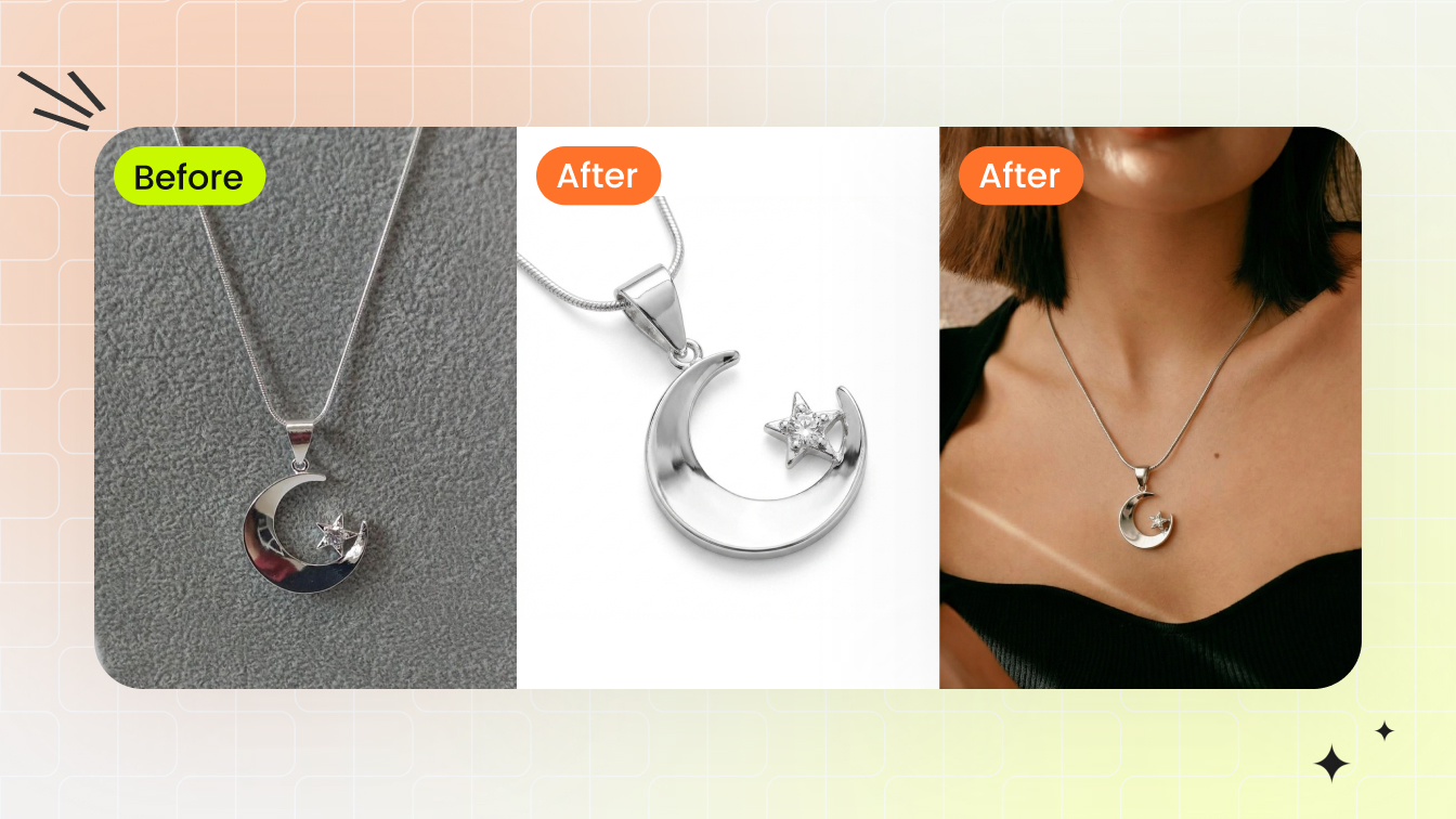
What Is Jewelry Retouching and Why It Matters
You spent hours setting up the perfect shot. The lighting looked great in person. But when you pull the images onto your screen, the diamonds look flat, the gold reads slightly orange, and there are dust specks you never noticed clinging to every prong. Sound familiar? This gap between what jewelry looks like in real life and what the camera captures is exactly why jewelry retouching exists.
Jewelry retouching is the specialized post-production process of correcting imperfections introduced during photography — such as dust, scratches, unwanted reflections, and color inaccuracies — while enhancing the visual appeal of metal surfaces and gemstones for commercial use. It goes beyond general photo editing by addressing the unique optical challenges of highly reflective, refractive, and microscopic subjects.
That distinction matters more than most sellers realize. A beautiful piece can look lifeless in a raw photograph because cameras struggle with the same properties that make jewelry stunning to the human eye: mirror-like metal surfaces, transparent stones that bend light in unpredictable ways, and details so fine they only reveal flaws under magnification.
What Jewelry Retouching Actually Involves
Jewelry photo retouching covers a specific set of corrections and enhancements tailored to precious materials. The process typically includes removing dust particles and micro-scratches that high-resolution cameras amplify, smoothing metal surfaces without erasing natural texture, enhancing gemstone sparkle and color accuracy, controlling reflections that mirror the studio environment, and creating natural shadows that give pieces dimension on clean backgrounds.
Think of it this way: general photo editing adjusts the overall image. Jewelry photo editing targets the unique material properties of metals and stones at a pixel level. A portrait retoucher works with skin tones and facial features. A jewelry retoucher works with specular highlights on curved gold, light refraction inside a diamond, and the subtle color shift between white gold and platinum. The skill set overlaps, but the subject demands a fundamentally different eye.
Why Standard Photo Editing Falls Short for Jewelry
Basic editing tools handle brightness, contrast, and cropping well enough for most product categories. Jewelry breaks those rules. Adjusting overall brightness on a ring image might fix the band but blow out the diamond. A global color correction that warms the gold could push a white sapphire into yellow territory. Reflective surfaces pick up everything in the room — light stands, camera bodies, even the photographer's shirt — and no amount of contrast tweaking removes those.
This is why the process requires targeted, layer-based work on individual elements within the same image. Each metal, each stone, and each shadow needs independent attention. The complexity scales quickly, especially when you factor in the extreme close-up magnification that e-commerce demands.
In the sections ahead, you'll see exactly what makes these pieces so technically demanding to retouch, how different jewelry types require entirely different approaches, and how to build a workflow that moves from RAW file to polished final image without losing detail or authenticity along the way.
Technical Challenges That Make Jewelry Uniquely Difficult to Retouch
Why does a simple gold ring require more retouching skill than an entire living room furniture set? The answer comes down to physics. Jewelry combines the most optically complex materials on earth — polished metals, transparent crystals, and refractive gemstones — into objects small enough to fit on a fingertip. Every property that makes these pieces beautiful in person actively works against the camera. Understanding these challenges is the first step toward solving them during jewelry photography retouching.
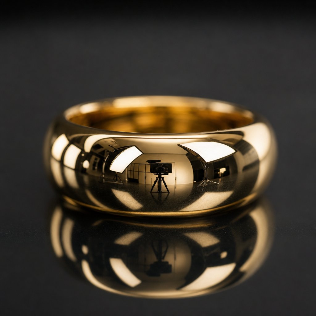
Reflectivity and Mirror-Like Metal Surfaces
Polished gold, silver, and platinum behave like curved mirrors. They don't just reflect light — they reflect everything. The camera, the tripod, the photographer's hands, ceiling tiles, even the black fabric draped behind the setup. A gold cuff can clearly show the texture of a phone case used during shooting, and a cabochon ring will map the entire office environment across its surface.
Here's where it gets more complex for retouching jewelry photos: different metals produce different specular highlight behaviors. Gold has a warm, broad highlight spread because its surface absorbs blue wavelengths and reflects yellow-red tones. Silver and platinum produce sharper, cooler, more concentrated highlights. White gold sits somewhere between, often reading as slightly gray without careful light sculpting. When a single piece combines two metals — say a platinum band with rose gold accents — the retoucher must handle two completely different reflection profiles within the same image, often requiring separate exposure treatments for each surface.
Prong settings add another layer of difficulty. Each tiny metal claw creates its own shadow pattern and reflection angle. Four prongs on a solitaire ring mean four micro-reflections, four shadow directions, and four potential spots where environmental clutter becomes visible. Multiply that across a pave setting with dozens of prongs, and you'll see why metal cleanup alone can consume hours of careful work.
Transparent Gemstones and Light Refraction
Metals reflect light. Gemstones do something far more unpredictable — they bend it, split it, and scatter it internally. A diamond's brilliance comes from total internal reflection, where light enters the stone, bounces between facets, and exits at angles determined by the cut's precision. Capturing that fire in a photograph requires intense, directional lighting. Without it, diamonds appear dull and lifeless, looking more like glass than precious stone.
Colored gemstones introduce refraction challenges of their own. A sapphire can appear faded or washed out when light sources are inconsistent, and emeralds shift hue depending on the color temperature of the illumination. During jewellery image retouching, the goal is restoring the color and depth the human eye perceives — but the camera never captured it accurately in the first place. You're essentially reconstructing optical behavior from incomplete data, which demands both technical skill and material knowledge.
Transparent stones also pick up color casts from their surroundings. A diamond set in yellow gold can appear warmer than it actually is because the metal reflects colored light back into the stone. Correcting the diamond's color without shifting the gold's warmth requires precise masking and independent color adjustments — exactly the kind of targeted work that separates jewelry image retouching from standard photo editing.
Scale and Magnification Challenges
Jewelry is tiny. E-commerce images display it large. That mismatch means every photograph is essentially a macro shot, magnifying the subject far beyond what the naked eye would ever notice. A dust particle invisible in person becomes a dark boulder at 100% zoom. A hairline scratch on a band transforms into a canyon. The grain of polishing compound left in a crevice looks like debris.
This extreme magnification also reveals inconsistencies in metalwork that are perfectly acceptable in person but distracting on screen. Slight asymmetry in prong placement, minor tool marks from hand fabrication, or uneven polish across a curved surface — all become visible problems that need careful attention without erasing the handcrafted character of the piece.
Mixed-material compositions compound the issue further. A watch face combines polished steel, matte brushed surfaces, transparent crystal, luminous dial markers, and sometimes ceramic or leather — each requiring different exposure handling within a single frame. The retoucher must balance all these surfaces simultaneously, ensuring no single material is over or underexposed relative to the others.
These optical and scale challenges don't exist in isolation. They stack. A diamond ring presents reflective metal, refractive stones, complex prong shadows, and microscopic detail all at once. That convergence is precisely why jewelry sits at the top of the difficulty scale for product retouching — and why the approach must vary significantly depending on the type of piece you're working with.
How Different Jewelry Types Demand Different Retouching Approaches
A solitaire ring and a multi-strand necklace share almost nothing in common when it comes to jewelry image editing. The reflective surfaces, shadow patterns, and structural details shift dramatically from one category to the next. Treating every piece with the same retouching playbook is one of the fastest ways to produce inconsistent, unconvincing results. Each jewelry type carries its own primary challenge — and its own set of traps that catch even experienced editors off guard.
Rings and Stone Settings
Rings are deceptively complex. The band is a curved, reflective cylinder that mirrors the entire shooting environment along its surface. Inside the band, you'll often find deep shadows that obscure hallmarks or create distracting dark voids. The stone setting — whether prong, bezel, or pave — introduces dozens of micro-shadows and tiny reflections that need individual attention.
When you edit jewelry photos of rings, the primary focus is balancing the interior shadow against the exterior highlights while keeping the stone vibrant. A common mistake? Over-smoothing the band to the point where it looks like a 3D render rather than a physical object. Another pitfall is cleaning up prong reflections so aggressively that the prongs lose their three-dimensional form and appear flat against the stone.
Necklaces and Chain Details
Necklaces introduce a completely different problem: repetition at scale. A cable chain might have hundreds of individual links, and every single one catches light at a slightly different angle. The retoucher's job is creating visual consistency across those links without making the chain look artificially uniform. Each link still needs its own subtle highlight variation, or the piece reads as digitally generated.
Clasps are another frequent trouble spot in jewellery editing. They're functional hardware, not decorative elements, so they tend to photograph poorly — showing tool marks, spring mechanisms, or awkward shadow pockets. Drape shadows beneath a necklace's curve also require careful construction. Too sharp and they look pasted on. Too soft and the piece appears to float above the surface.
Watches, Bracelets, and Earrings
Watches are arguably the most demanding single category for jewelry editing. A single watch face combines polished steel, matte brushed surfaces, a transparent crystal that produces its own reflections, printed dial text that must remain razor-sharp, and a bracelet with dozens of repeating links that each need uniform highlight treatment. The crystal surface alone can require separate retouching passes to remove double reflections while preserving the dial's legibility beneath it.
Bracelets share the repetition challenge of necklaces but add hinge and clasp mechanisms that create complex shadow pockets. Tennis bracelets demand stone-by-stone consistency — if one stone appears duller or more saturated than its neighbors, the eye catches it immediately.
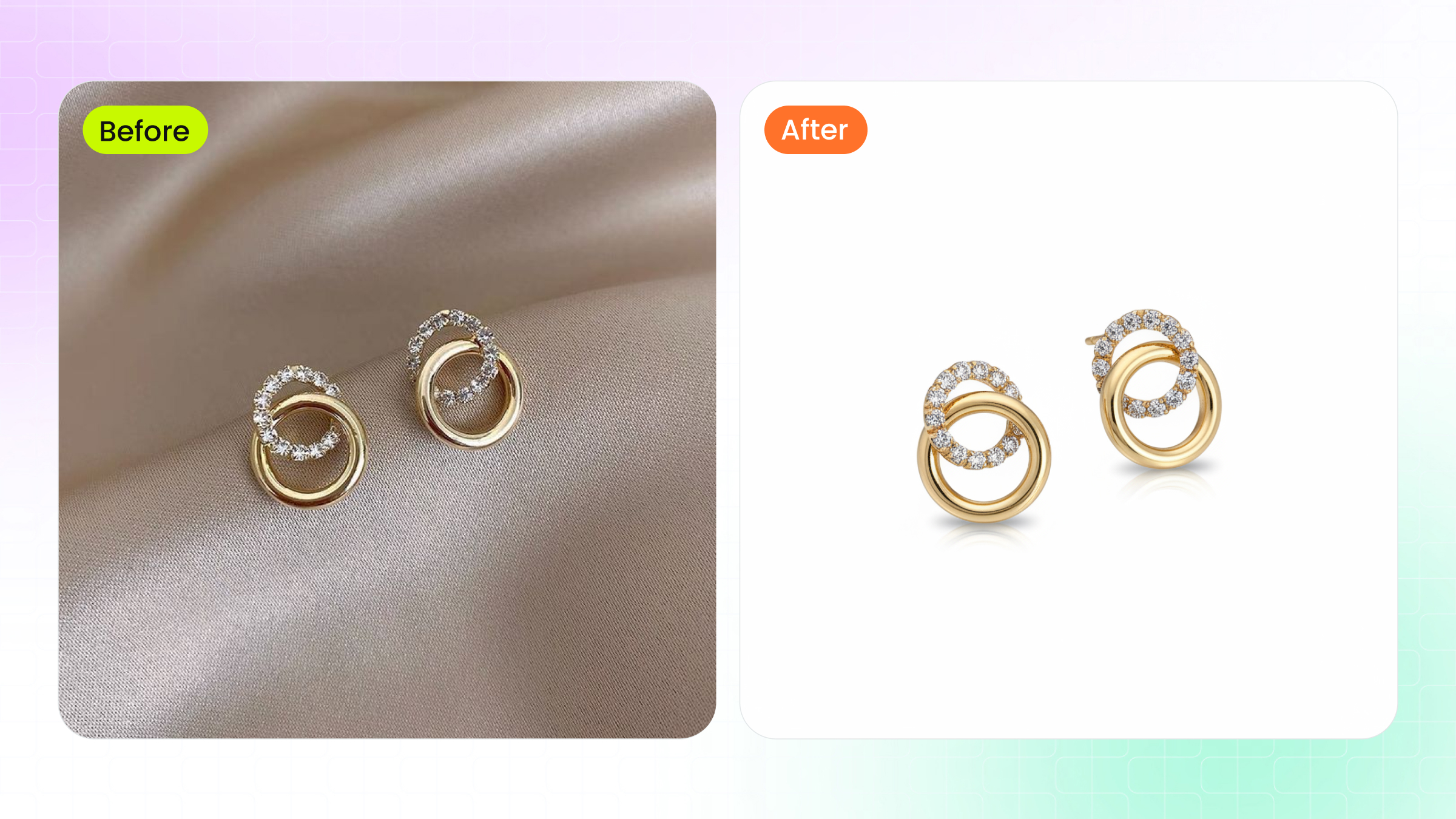
Earrings bring symmetry into focus. When photographed as a pair, even minor differences in angle, shadow, or highlight placement between the left and right piece become glaringly obvious. Post and hook hardware often needs cleanup or subtle repositioning to appear elegant rather than utilitarian. Drop earrings add movement-related challenges — ensuring the dangle elements appear naturally positioned rather than stiff or artificially arranged.
| Jewelry Type | Primary Challenge | Key Retouching Focus | Common Mistakes |
|---|---|---|---|
| Rings | Curved band reflections and interior shadows | Stone brilliance, prong detail, band highlight sculpting | Over-smoothing metal to a plastic look; flattening prongs |
| Necklaces | Chain link consistency across hundreds of elements | Link uniformity, clasp cleanup, natural drape shadows | Making links too uniform (CGI look); ignoring clasp hardware |
| Earrings | Symmetry matching between paired pieces | Left/right consistency, post cleanup, balanced highlights | Mismatched shadow angles; stiff-looking dangle elements |
| Bracelets | Repeating link patterns and hinge shadows | Link-to-link highlight uniformity, hinge detail preservation | Inconsistent stone brightness in tennis bracelets; lost hinge detail |
| Watches | Mixed materials and crystal reflections over dial | Dial clarity, crystal reflection control, bracelet uniformity | Removing reflections that erase depth; blurring dial text during smoothing |
This reference framework gives you a starting point for approaching each piece type with the right priorities. But knowing what to focus on is only half the equation — the sequence in which you tackle these corrections matters just as much. A disorganized workflow leads to redundant work, destructive edits, and inconsistent output across a product catalog.
The Complete Jewelry Retouching Workflow From RAW to Final Export
Sequence isn't a preference in jewellery photo retouching — it's a requirement. Performing steps out of order creates compounding problems: color-correct after sharpening and you'll amplify artifacts. Build shadows before removing the background and you'll waste hours reconstructing edges. A structured workflow eliminates redundant effort and protects image quality at every stage.
Why does order matter so much here? Because each step builds on the one before it. Color correction establishes the tonal foundation that all detail work references. Background removal defines the edges that shadow creation depends on. Skipping ahead or shuffling stages forces you to redo earlier work — or worse, bake destructive edits into your file permanently.
Pre-Retouching Setup and RAW Processing
Every jewellery retouch begins before you touch a single pixel of the jewelry itself. The RAW file contains far more tonal and color data than a JPEG, giving you room to recover blown highlights on metal surfaces and pull detail from shadowed stone settings. Start here:
- Import the RAW file and set your color workspace. Use Adobe Camera Raw, Lightroom, or Capture One to open the file in a 16-bit, ProPhoto RGB or Adobe RGB workspace. This preserves the widest color gamut for metals and gemstones. Correct white balance first — gold should read warm but not orange, silver should sit neutral without blue drift. Adjust exposure to recover any clipped highlights on reflective surfaces, then open shadows just enough to reveal detail in prong settings and band interiors.
- Remove or replace the background. Use the Pen Tool at 300% zoom or higher to trace precise paths around the piece, paying close attention to thin prongs, open chain links, and gaps between stones. Convert the path to a selection, then mask — never delete — the background. Place a pure white layer (RGB 255, 255, 255) beneath for e-commerce, or a neutral gray for further creative work. Masking keeps your options open if edge refinement is needed later.
This foundation stage is where non-destructive habits matter most. Convert your base image to a Smart Object before proceeding. Every adjustment layer, every filter, every correction you apply from this point forward should sit on its own layer or layer group. If something goes wrong at step six, you can revise without flattening your entire file and starting over.
Core Retouching Sequence From Cleanup to Enhancement
With clean edges and accurate color established, the detail work begins. Each step targets a specific material property:
- Dust and scratch cleanup. Zoom to 400-800% and work across the entire piece systematically. Use the Spot Healing Brush for isolated dust particles and the Clone Stamp at reduced opacity for scratches on polished surfaces. Work on a separate empty layer set to "Sample All Layers" so your corrections remain independent of the base image.
- Metal surface smoothing and highlight sculpting. This is where jewellery photo editing diverges most sharply from general product work. Use Dodge and Burn on a 50% gray layer set to Soft Light to shape highlights along curved bands and flatten distracting hot spots. The goal is controlled, directional reflections that suggest studio lighting — not the chaotic environmental reflections the camera captured.
- Gemstone color and clarity enhancement. Create targeted selections around each stone using Color Range or careful pen paths. Adjust saturation, luminosity, and contrast independently from the metal. For diamonds, increase micro-contrast to restore fire. For colored stones, use Selective Color adjustments to push hues toward their ideal without shifting surrounding metal tones.
- Shadow creation or refinement. With the background already removed, you have full control over shadow placement. Build shadows on a separate layer using soft black brushes at low opacity, or transform a duplicate of the piece into a shadow shape using Gaussian Blur and perspective distortion. Natural-looking shadows need soft edges that graduate away from the contact point — too sharp and the piece looks cut-and-pasted.
Final Output and Platform-Specific Export
The last two steps lock in your work and prepare it for its destination:
- Final color grading and sharpening. Apply a Curves or Levels adjustment layer for global tonal refinement. Then flatten a merged copy to the top of your layer stack (Shift + Ctrl + Alt + E) and apply a High Pass filter at 1-2 pixel radius set to Overlay for controlled sharpening. Mask out areas that don't benefit from sharpening — soft shadow gradients, for example — to avoid introducing noise.
- Export for target platform. Convert to sRGB color profile for web use. Save as JPEG at quality 80-90 for e-commerce platforms, or PNG for images requiring transparency. Match platform dimension requirements — Amazon's 1000x1000px minimum, Shopify's recommended 2048x2048px — and keep file sizes optimized for fast page loads without visible compression artifacts.
One final principle ties this entire workflow together: save your layered working file separately from your exports. That PSD or TIFF with all adjustment layers intact is your safety net. When a client requests a color shift, a different crop, or a new background six months later, you can reopen the file and make targeted changes without re-retouching from scratch.
A clean workflow gets you from RAW capture to polished output efficiently. But efficiency means little if the techniques within each step lack precision — and that's where specific tool knowledge, layer configurations, and settings make the difference between competent results and truly high-end work.
Essential Retouching Techniques With Specific Tools and Settings
Knowing the workflow order is one thing. Executing each step with precision is where high end jewelry retouching separates itself from basic cleanup work. The techniques below aren't surface-level tips — they're the specific layer setups, tool configurations, and reasoning that professional retouchers rely on daily. Each one solves a distinct problem that jewelry surfaces present, and each one builds on the non-destructive foundation established in your workflow.
Here's a quick overview of the core techniques and when to reach for each one:
- Frequency Separation — Smoothing metal tone and color without destroying surface texture
- Dodge and Burn (Curves method) — Sculpting highlights and shadows on curved reflective surfaces
- Pen Tool pathing — Creating pixel-perfect selections around gemstones and intricate settings
- Focus Stacking — Compositing multiple exposures for edge-to-edge sharpness in macro shots
- Color Range selections — Isolating specific metals in mixed-material pieces for independent adjustment
Frequency Separation for Metal Surfaces
Imagine you need to even out an uneven color cast on a gold band, but the surface has a fine brushed texture you can't afford to lose. Standard blurring destroys the texture. Cloning introduces pattern repetition. Frequency separation solves this by splitting the image into two independent layers: one holding color and tonal information (low frequency), and another holding texture and fine detail (high frequency).
The concept works like an audio equalizer applied to images — low frequencies carry the broad forms, light, and color, while high frequencies carry surface detail. You edit each independently without affecting the other.
Here's the layer setup for jewelry metal work:
- Duplicate your base layer twice. Name the bottom copy "Low" and the top copy "High."
- Select the Low layer. Apply Gaussian Blur at a radius between 4-8 pixels for jewelry (the radius should be just large enough to eliminate the texture detail you want to preserve, but small enough to retain the overall tonal shape of the metal).
- Select the High layer. Go to Image > Apply Image. Set the source layer to "Low," blending to Subtract, Scale to 2, Offset to 128. This extracts only the texture information.
- Set the High layer's blending mode to Linear Light.
You now have full separation. On the Low layer, use a soft brush or the Mixer Brush to smooth out uneven color transitions, hot spots, or blotchy reflections on metal — without touching the brushed or polished texture above. On the High layer, use the Clone Stamp to fix texture imperfections like scratches or dust marks without shifting the underlying color.
For jewelry specifically, keep the blur radius conservative. Metal textures are finer than skin pores, so a radius of 4-6 pixels typically captures the right separation point on a high-resolution file. Go too high and you'll push structural highlight information into the texture layer, making tonal corrections on the Low layer less effective.
Dodge and Burn for Highlight Control
Curved metal surfaces — ring bands, bangle edges, pendant bezels — need highlights that follow their three-dimensional form. The camera often captures chaotic reflections from the studio environment instead of clean, directional light gradients. Dodge and burn lets you reshape those highlights manually, sculpting the perception of form and light.
The Curves-based setup offers more control than painting on a gray layer for high end jewellery retouch work:
- Create two Curves Adjustment layers above your retouching stack.
- Pull the first curve slightly upward in the midtones (brightening). Name it "Dodge." Invert the layer mask to black (Ctrl/Cmd + I).
- Pull the second curve slightly downward in the midtones (darkening). Name it "Burn." Invert its mask to black as well.
- Paint with a white, soft-edged brush at 3-5% opacity on each mask to reveal the effect only where needed.
Why Curves instead of a 50% gray layer? Curves give you finer control over which tonal range you're affecting. You can target just the upper midtones for highlight sculpting on bright metals, or just the lower midtones for deepening shadow pockets in prong settings — without accidentally blowing out already-bright areas or crushing already-dark ones.
For jewelry, the key application is creating smooth, graduated highlights along curved bands. Work at 100-200% zoom, painting in the direction the highlight should travel. Build up gradually with multiple passes rather than a single heavy stroke. After dodging and burning, check for color shifts — brightened areas may appear slightly desaturated, and darkened areas can push toward oversaturation. Clip a Hue/Saturation adjustment layer to your Curves layers to correct these shifts without affecting the rest of the image.
A visual aid helps enormously here. Place a 50% gray layer set to Color blending mode at the top of your stack. This desaturates the view so you can judge luminosity values without color distracting your eye — particularly useful when working on gold, where warm tones can mask uneven brightness.
Advanced Masking for Gemstones and Mixed Materials
Gemstones and metals live in the same image but need completely independent treatment. Boosting saturation on a ruby shouldn't warm the white gold around it. Increasing contrast inside a diamond shouldn't darken the platinum prongs holding it. Precise masking is what makes this possible.
Pen Tool paths for gemstones: The Pen Tool remains the most accurate method for isolating stones from their settings. Zoom to 300% or higher. Place anchor points at each corner where the stone meets the metal, and use Bezier handles to curve the path along rounded edges. For round brilliant cuts, you'll typically need 8-12 anchor points to trace the girdle cleanly. Save the path in the Paths panel — you'll reuse it for multiple adjustment layers throughout the retouching process.
Convert the path to a selection with a 0.3-0.5 pixel feather. This micro-feather prevents hard, visible edges on your adjustments without bleeding corrections into the surrounding metal. Apply your Curves, Hue/Saturation, or Selective Color adjustments through this selection as a layer mask.
Color Range for isolating metals: When a piece combines yellow gold, white gold, and rose gold — or gold with silver hardware — Color Range selections let you target each metal independently. Go to Select > Color Range, click on the specific metal tone with the eyedropper, and adjust Fuzziness between 30-60 to expand or narrow the selection. Hold Shift and click additional sample points to capture the full tonal range of that metal across highlights and shadows.
This technique is especially powerful for a jewelry photo retouching service handling mixed-metal collections. You can create a single Color Range selection for all yellow gold elements, save it as an alpha channel, and apply consistent color grading across every piece in the catalog — ensuring the gold reads identically from product to product.
Focus stacking for macro composites: When photographing small pieces like stud earrings or delicate rings at close range, the camera's depth of field becomes razor-thin. Even at f/14, the front of a ring may be sharp while the back falls out of focus. Focus stacking solves this by combining multiple shots — each focused on a different plane — into one fully sharp composite.
In Photoshop, load your stack images via File > Scripts > Load Files into Stack. Select all layers, then run Edit > Auto-Align Layers (this corrects for any micro-shifts between frames). Finally, Edit > Auto-Blend Layers with "Stack Images" selected. Photoshop analyzes sharpness across each layer and creates masks that reveal only the focused portions of each frame. For web-resolution jewelry images, 3-5 stacked frames typically provide full coverage. Print-quality work at higher magnification may require 10-15 frames to achieve edge-to-edge clarity.
Each of these techniques addresses a specific material challenge. Frequency separation handles tonal inconsistency without sacrificing texture. Dodge and burn reshapes light on reflective curves. Pen paths and Color Range give you surgical control over individual elements. Focus stacking eliminates the depth-of-field limitations inherent to macro photography retouching service work. Together, they form the technical toolkit that turns a competent edit into genuinely polished output — but the real question is whether that polish meets the standards your specific platform or client demands.
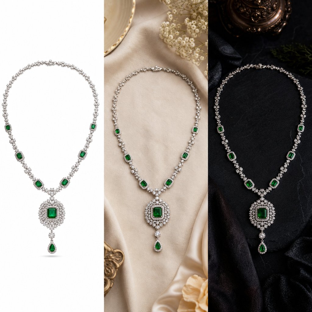
Retouching Standards for E-Commerce vs Print vs Luxury Advertising
A retouched image that performs perfectly on Amazon might look flat in a print catalog and completely wrong in a luxury brand campaign. The destination dictates the standard. Every jewelry photo editing service structures its output around where the image will live, because resolution, color profile, background treatment, and retouching depth all shift depending on the end use. Applying one standard across all channels wastes effort in some areas and falls short in others.
Here's how the four primary tiers compare at a glance:
| End Use | Background Standard | Resolution | Retouching Depth | Typical Turnaround |
|---|---|---|---|---|
| E-Commerce Listings | Pure white (RGB 255,255,255) or platform-compliant neutral | 2000-2048px on longest side (sRGB) | Clean, accurate, consistent across SKUs | 24-48 hours per batch |
| Social Media Marketing | Lifestyle context, branded gradients, or environmental | 1080-1200px (platform-optimized, sRGB) | Brand-consistent color grading, mood enhancement | 48-72 hours |
| Print Catalogs | White, off-white, or designed page layouts | 300 PPI at final print size (CMYK) | High detail preservation, CMYK-safe color | 3-5 business days |
| Luxury Advertising | Creative composites, dramatic lighting, editorial environments | 300+ PPI at large format (CMYK or ProPhoto RGB) | Editorial-level perfection, composite work, mood lighting | 5-10 business days per image |
E-Commerce Platform Image Requirements
Each marketplace enforces its own technical rules, and non-compliance can get your listings suppressed or rejected outright. Amazon is the strictest: main images require a pure white background with the product filling at least 85% of the frame. No props, no text, no watermarks. Resolution should hit at least 2000px on the longest side to enable their zoom function. Every jewelry photo editing services provider working with Amazon sellers builds these constraints into their export templates by default.
Etsy takes a more flexible approach. Lifestyle-friendly images with props and context perform well, and square aspect ratios tend to display best across devices. The retouching focus shifts from clinical accuracy toward warmth and storytelling — slightly styled shadows, natural surfaces, and brand-consistent color grading that makes a shop feel cohesive.
Shopify gives you full creative freedom, but consistency across your entire catalog matters most. When a customer clicks between product variants — different stone colors in the same ring setting, for example — the metal tone, shadow angle, and background should remain identical. Inconsistency signals carelessness, even if each individual image looks fine on its own. Image optimization for fast page load speeds also factors heavily into Shopify SEO performance.
Social Media and Marketing Standards
Social platforms reward visual impact over technical precision. A perfectly retouched product shot on a white background gets scrolled past on Instagram. The same ring placed in a lifestyle context — on a hand, against textured fabric, with warm directional light — stops thumbs. Retouching for social media means building atmosphere: brand-consistent color grading, aspect ratio optimization for feed versus stories versus reels, and sometimes compositing pieces into environmental scenes they were never photographed in.
The retouching depth here is less about pixel-level cleanup and more about mood. Color grading should match your brand palette across every post. Shadows can be more dramatic. Highlights can run hotter for visual punch. But the piece itself still needs accurate color representation — you don't want customers expecting a warm rose gold and receiving something that reads pink only in your Instagram lighting.
Print and Luxury Advertising Retouching Depth
Print demands a fundamentally different technical approach. Every image must be converted to CMYK color mode at 300 PPI minimum at its final printed size. Colors that look vibrant in sRGB on screen can shift dramatically during CMYK conversion — bright blues go dull, saturated reds lose punch. A jewellery photo editing services workflow for print includes a dedicated CMYK soft-proofing step where the retoucher adjusts problem colors before export, not after the printer flags them.
Bleed requirements add another consideration. Images extending to the page edge need an extra 3mm of artwork beyond the trim line, and critical details like gemstone edges must sit inside the safe zone to avoid accidental cropping during cutting.
Luxury advertising sits at the top of the production scale. These images aren't just retouched — they're constructed. Composite backgrounds, dramatic mood lighting painted in post-production, editorial-level skin and surface perfection, and creative color grading that evokes emotion rather than simply representing the product accurately. A single hero image for a luxury campaign might require 8-12 hours of retouching from a jewellery photo editing service specializing in high-end output. The standard isn't "does this look clean?" — it's "does this make someone feel something?"
Understanding which tier your images need to meet prevents both under-investing and over-spending. But regardless of the tier, one question remains constant: how do you actually judge whether the retouching quality meets the standard you're paying for?
How to Evaluate Jewelry Retouching Quality Like a Professional
You've received a batch of retouched images back — maybe from a jewellery retouching service, maybe from your own editing session. They look good at a glance. But "looks good" isn't a quality standard. Without a structured evaluation framework, subtle problems slip through: colors that drift from the physical piece, textures smoothed into oblivion, or technical specs that fail platform requirements. Most sellers don't catch these issues until customers start returning products that "don't match the photo."
Here's a practical checklist you can apply to every retouched jewelry image before it goes live:
- Color accuracy — Does the retouched metal tone match the physical piece under calibrated, neutral lighting?
- Detail preservation — At 200-300% zoom, are surface textures intact or have they been smoothed away?
- Catalog consistency — Do metal tones, shadow angles, and backgrounds match across the full product line?
- Natural appearance — Does the piece look like a real photograph or a plastic CGI render?
- Technical compliance — Are color profile, resolution, dimensions, and file size correct for the target platform?
Color Accuracy and Detail Preservation Checks
Color is where trust lives. If a customer sees warm yellow gold on screen and receives a piece that reads closer to champagne, you've lost credibility — and likely gained a return. Evaluating color accuracy means comparing the retouched file against the physical piece under controlled conditions. Use a calibrated monitor (hardware-calibrated with a colorimeter, not just software-adjusted) and view the piece under D50 or D65 standard illumination. The on-screen image should read as a believable match, not an exact scientific replica, but close enough that no customer would feel misled.
Pay particular attention to white metals. Platinum, white gold, and silver sit close together on the color spectrum, and aggressive retouching can push them all toward the same neutral gray. Each should retain its distinct character — platinum slightly darker and cooler, white gold with a faint warmth, silver brighter and more reflective.
Detail preservation requires zooming in. Pull the image to 200-300% and scan across metal surfaces. You should still see the micro-texture of the finish — the fine grain of a polished surface, the directional lines of a brushed band, the slight irregularity of a hand-hammered piece. Maintaining the product's original texture and feel while removing imperfections is the hallmark of skilled work. If the metal looks uniformly smooth like melted plastic, the retoucher went too far. If gemstone facets appear soft or blended together rather than crisp and distinct, sharpening was either skipped or applied destructively.
Consistency Standards Across Product Lines
A single beautiful image means nothing if it doesn't match the rest of your catalog. When a customer browses your collection, every piece should feel like it belongs to the same visual family. That means identical background white values (check with the eyedropper — anything below RGB 252,252,252 can read as gray on some screens), matching shadow directions and softness, and uniform metal color grading across all pieces of the same material.
This is where jewellery photo retouching services prove their value or expose their weaknesses. Ask yourself: does the 14k yellow gold in your ring listings match the 14k yellow gold in your pendant listings? Are shadows falling from the same angle on every product? Does the overall brightness and contrast feel uniform as you scroll through the collection? Inconsistency breeds distrust. It signals that images were processed by different people with different standards — or that no standard existed at all.
A practical test: open five images from the same metal type side by side at equal zoom. If one reads warmer, one reads brighter, and one has sharper shadows than the others, the batch fails consistency regardless of how good each image looks individually.
Red Flags That Signal Poor Retouching Quality
Some problems are subtle. Others announce themselves once you know what to look for. These red flags indicate that jewelry image retouching services delivered substandard work:
- Haloing around edges — A bright or dark fringe where the piece meets the background. This typically results from over-sharpening or sloppy masking. Zoom to 200% along the product outline and look for any glow or dark line that doesn't belong to the piece itself.
- Inconsistent reflection angles — Highlights on a ring band should follow a logical light direction. If the left side of the band shows a highlight from above while the right side suggests light from below, someone painted highlights without understanding the three-dimensional form.
- Color banding in gradients — Smooth tonal transitions on metal surfaces should remain smooth. If you see visible stepping or striping — lighter or darker stripes running across what should be a seamless gradient — the file was likely over-compressed, worked in 8-bit mode when 16-bit was needed, or had its levels pushed too aggressively.
- Loss of surface texture — The piece looks like a 3D render rather than a photograph. Metal appears uniformly smooth with no grain, no micro-variation, no life. This happens when retouchers apply heavy Gaussian blur directly to the image layer or use frequency separation with too high a blur radius.
- Artificial-looking gemstones — Stones that glow uniformly rather than showing distinct facet patterns, or diamonds with oversaturated rainbow fire that looks painted rather than optical. Real gemstones have depth and internal complexity. Over-processed stones look flat and synthetic.
When you spot these issues, you have actionable feedback to send back. "The haloing on images 12-18 needs correction" is far more useful than "these don't look right." A structured quality framework turns subjective impressions into specific, fixable notes — which matters whether you're evaluating your own work or deciding if an external provider meets your standards. That decision itself — handling retouching internally versus partnering with a specialist — depends heavily on your catalog size, volume demands, and the economics of your operation.
DIY or Outsource
Knowing how to evaluate quality is one thing. Deciding who actually does the work is a different calculation entirely — and it's one that changes as your business grows. A seller with 20 SKUs faces a completely different equation than a brand managing 2,000. The right answer depends on where you sit today and where you're headed in the next 12 months.
Self-Assessment Framework by Volume and Skill Level
Think about three variables: how many images you need retouched per month, how much time you can invest in learning, and how consistent your output needs to be across the catalog. These three factors sort most sellers into clear profiles.
Low volume (under 50 SKUs): If you're launching a small collection or selling handmade pieces on Etsy, learning basic jewelry retouching yourself can make sense. The investment is primarily time — expect 40-60 hours to develop competent skills with Photoshop's core tools. Your per-image cost is essentially your own hourly rate plus software subscriptions. The tradeoff? Quality will be inconsistent while you're learning, and each image takes significantly longer than it would for an experienced editor. For simple cleanup and background removal, this path works. For high-end gemstone enhancement or complex metal sculpting, the learning curve steepens dramatically.
Growing brands (50-500 SKUs): This is where the math shifts. At 100+ images per month, spending 30-60 minutes per image in-house means dedicating a full-time role to retouching alone. A hybrid approach often makes the most financial sense here — handle quick corrections internally while outsourcing jewelry photo retouching services for complex pieces or large batch drops. You maintain creative oversight without bottlenecking your entire operation during product launches.
High-volume operations (500+ SKUs): At scale, consistency becomes the dominant concern. Multiple retouchers working without centralized standards produce visually fragmented catalogs. Turnaround speed directly impacts revenue — delays in getting images live reduce your selling window and cut into peak sales periods. Professional jewelry retouching services become less of a luxury and more of an operational requirement at this tier.
When Professional Retouching Services Make Financial Sense
The real cost of in-house retouching extends far beyond a retoucher's salary. Factor in health benefits, equipment (calibrated monitors, Wacom tablets, software licenses), office space, management overhead, training time, and the inevitable slow periods where you're paying someone with no images to process. One industry analysis puts the total cost of ownership for a single in-house retoucher above $124,000 annually when all direct and indirect costs are included — far more than the $75,000 salary line item suggests.
Compare that to outsource jewelry photo retouching services where you pay per image, scale up or down with demand, and carry zero overhead during slow months. Per-image rates for professional jewelry work typically range from $2-$5 for standard e-commerce edits up to $10-$50 for high-end retouching, depending on complexity. At 500 images per month with a $4 average, you're looking at $24,000 annually — a fraction of the in-house total cost, with no recruitment headaches, no equipment depreciation, and no idle capacity during off-seasons.
The cost-of-delay factor deserves attention too. Every day your images sit in a retouching queue instead of going live on your store is a day of lost sales. Seasonal jewelry — holiday collections, Valentine's Day pieces, bridal lines — has a fixed selling window that doesn't shift because your retoucher is backed up. Professional services with guaranteed turnaround times eliminate this bottleneck.
| Factor | DIY (In-House) | Partial Outsource | Full Outsource |
|---|---|---|---|
| Volume Fit | Under 50 SKUs | 50-500 SKUs | 500+ SKUs |
| Cost Structure | Fixed (salary + overhead) regardless of volume | Mixed (internal base + per-image for overflow) | Variable (per-image, scales with demand) |
| Quality Consistency | Depends on individual skill; varies with fatigue | Good for core work; may vary across providers | High when using established service with style guides |
| Turnaround Speed | Limited by team capacity; bottlenecks during peaks | Flexible; overflow handled externally | Predictable SLAs; 24-48 hour standard delivery |
| Skill Required | Advanced Photoshop; jewelry-specific knowledge | Moderate internal skill + vendor management | Quality evaluation and communication skills |
Finding the Right Production Partner
If you're leaning toward outsourcing — partially or fully — the vendor selection process matters as much as the decision itself. A cheap per-image quote means nothing if onboarding takes weeks, communication burns hours, or quality requires constant re-dos. Look for providers who demonstrate jewelry-specific expertise (not just general product editing), offer structured onboarding with style guide development, provide transparent revision policies, and can show before-and-after samples on pieces similar to yours.
For brands seeking professional-quality results at scale, platforms like Snappyit's jewelry retouching service are built specifically around maintaining visual consistency across large e-commerce catalogs — addressing the exact consistency and turnaround challenges that make high-volume in-house work unsustainable. The key differentiator to evaluate in any provider is whether they have systems for maintaining uniform output as your volume grows, or whether they're simply adding more freelancers to handle overflow.
Ask these questions before committing: What's the onboarding timeline? How do you maintain consistency when multiple editors work on my catalog? What's your actual turnaround — not best-case, but average? Do you assign dedicated editors to my account? Can you handle volume spikes during product launches without quality dropping?
The right partner feels like an extension of your team rather than a vendor you're constantly managing. That distinction becomes even more critical when you're processing hundreds of images per month and need every single one to meet the same standard — which brings up the question of how to scale production efficiently without letting quality slip through the cracks.
Scaling Jewelry Image Production With Batch Processing
Processing five images with meticulous care is manageable. Processing five hundred with that same care — while keeping every single one visually consistent — is where most jewelry brands hit a wall. The techniques and quality standards covered throughout this article don't change at scale. What changes is how you organize, automate, and systematize the work so that volume doesn't erode the precision your catalog demands.
The core tension is straightforward: some retouching steps are repetitive and rule-based, making them perfect candidates for automation. Others require a trained human eye making subjective decisions about light, color, and form. Knowing which is which — and building systems around that distinction — is what separates a jewelry retouching company that delivers consistent catalogs from one that produces beautiful individual images that don't match each other.
Automation-Friendly Steps vs Manual Attention Tasks
Not every step in your workflow benefits from automation. Applying the wrong approach to the wrong task either wastes time or destroys quality. Here's how the split typically breaks down for jewelry catalogs:
Steps you can batch with confidence:
- Background removal — AI-powered selection tools and recorded Photoshop Actions can handle initial background extraction across hundreds of images. You'll still need manual edge refinement on complex pieces (open chain links, filigree, thin prongs), but the bulk removal step is highly automatable.
- Initial color correction — If you shoot under consistent lighting with a color checker reference, a single Camera Raw preset or Lightroom profile applies accurate white balance and exposure correction across an entire batch in seconds.
- Resizing and export — Photoshop Droplets or Image Processor scripts handle dimension changes, color profile conversion (sRGB for web), and file format exports without any manual intervention. Set your Amazon, Shopify, and social media specs as separate export presets and run them on entire folders.
- File renaming and organization — Batch rename tools (Bridge, Lightroom, or dedicated utilities) apply consistent naming conventions like brand-category-SKU-angle-001.jpg across thousands of files. This sounds minor until you're searching for a specific variant image across 3,000 files with camera-generated names like DSC_4872.NEF.
- Canvas and margin standardization — Actions that add consistent padding, center the product, and match canvas dimensions ensure every image in your catalog occupies the same visual space regardless of the piece's actual proportions.
Steps that require individual human attention:
- Highlight sculpting on metal surfaces — Every ring band curves differently. Every pendant catches light at a unique angle based on its form. Dodge and burn work must respond to the specific three-dimensional shape of each piece.
- Gemstone color and clarity enhancement — A sapphire's ideal saturation point differs from a tanzanite's. A diamond's fire depends on its cut quality. These decisions require judgment, not formulas.
- Edge refinement on complex settings — Pave settings, milgrain borders, and delicate filigree need hand-traced paths. Automated edge detection consistently fails on these intricate structures.
- Shadow creation — Natural-looking shadows must respond to the piece's actual shape, weight, and contact points. A flat chain casts a different shadow than a domed cocktail ring.
The practical approach? Record Photoshop Actions for your automatable steps — background fill, color profile assignment, canvas resize, sharpening parameters — and run them as batch processes through File > Automate > Batch or as Droplets you can drag folders onto. Then queue the manual work separately, with each image arriving at the retoucher's screen already prepped and standardized.
Building Style Guides for Catalog Consistency
When one person retouches your entire catalog, consistency lives in their head. The moment a second editor touches your images — whether that's a new hire, a freelancer handling overflow, or a jewellery retouching services provider — you need that consistency documented externally.
A jewelry retouching style guide doesn't need to be elaborate. It needs to be specific. Include these elements:
- Metal tone references — Provide hex values or Lab color coordinates for how each metal should render. Yellow gold at your brand might target a specific warmth that differs from another brand's interpretation. Include a reference image showing the approved tone for 14k yellow gold, 18k yellow gold, rose gold, white gold, platinum, and sterling silver.
- Shadow specifications — Document the shadow angle (typically 135 or 180 degrees), softness level, opacity range, and distance from the product. Include a sample showing the exact shadow treatment for rings, necklaces, and earrings separately — they behave differently due to their contact profiles.
- Background standards — Specify the exact RGB value (pure white at 255,255,255 for e-commerce, or your branded background tone), acceptable tolerance range, and how far the background extends beyond the product edges.
- Highlight behavior — Show examples of approved highlight placement on curved bands, flat surfaces, and gemstone tables. Define how bright specular highlights should get (maximum luminosity value) and where they should fall relative to the piece's geometry.
- Gemstone treatment rules — Specify saturation ranges for colored stones, contrast levels for diamonds, and whether fire/dispersion should be enhanced or kept natural. Include before-and-after examples showing the acceptable enhancement range.
The style guide becomes your quality control anchor. Every image gets compared against it — not against the retoucher's personal aesthetic preferences. Catalog consistency across hundreds of products depends on making these decisions visible and repeatable rather than leaving them implicit in someone's workflow habits.
Template PSD files accelerate this further. Build a master file with pre-configured layer groups — background layer, shadow layer, cleanup layer, dodge/burn layers, color adjustment group, sharpening layer — named and organized identically for every image. When retouchers open a template rather than starting from a blank canvas, they follow the same structure by default. Layer naming conventions might seem trivial, but they prevent the chaos of inheriting someone else's unnamed, ungrouped 47-layer file when revisions come in months later.
Scaling Production Without Sacrificing Image Quality
Volume creates pressure that quality resists. The faster you push images through a pipeline, the more tempting it becomes to skip the 300% zoom check, rush the edge refinement, or accept "close enough" on metal tone matching. Scaling successfully means building systems that make quality the path of least resistance — not something that requires extra effort on top of speed.
Three principles keep quality intact at scale:
1. Separate production roles from quality control roles. The person retouching should never be the final quality gatekeeper on their own work. Even experienced editors develop blind spots after hours of pixel-level work. A dedicated QC step — even if it's just a 60-second check against the style guide per image — catches drift before it compounds across a batch. Professional retouching operations use multiple review stages for technical accuracy, artistic consistency, and final verification precisely because single-pass workflows leak errors at volume.
2. Process images in category batches, not random order. Retouching all your gold rings in one session, then all your silver necklaces in the next, keeps your eye calibrated to that specific material. Jumping between a rose gold bangle and a platinum pendant and a yellow gold chain forces constant mental recalibration — and that's where tone inconsistencies creep in. Batch by material and category, just as you'd batch photography sessions by shooting method.
3. Use reference images as live anchors. Pin your approved reference image for each category on a second monitor or in a corner of your workspace. Every piece you retouch gets a quick visual comparison against that anchor before it moves to QC. This simple habit prevents the gradual drift that happens when each image is only compared to the one before it — a chain where small shifts accumulate into visible inconsistency across the full catalog.
For ecommerce sellers processing hundreds of jewelry images with uniform quality standards, platforms like Snappyit's jewelry retouching service build these consistency systems directly into their production pipeline — style guide adherence, batch processing infrastructure, and multi-stage quality checks that maintain visual uniformity whether you're submitting 50 images or 500. The value isn't just speed; it's the guarantee that image number 487 matches image number 3.
Scaling jewelry image production is ultimately a systems problem, not a talent problem. The techniques remain the same at any volume. What changes is whether those techniques are applied within a framework that enforces consistency — or left to individual judgment that inevitably varies from image to image, editor to editor, and week to week. Build the system first. The quality follows.
Frequently Asked Questions About Jewelry Retouching
1. What is the difference between jewelry retouching and regular photo editing?
Jewelry retouching is a specialized post-production process that targets the unique optical properties of metals and gemstones at a pixel level. Unlike general photo editing that adjusts overall brightness, contrast, and cropping, jewelry retouching requires layer-based work on individual elements within the same image. Each metal surface, gemstone, and shadow needs independent treatment because global adjustments that fix one material often damage another. For example, brightening a ring band might blow out the diamond, or warming gold tones could push a white sapphire into yellow territory. This material-specific approach demands knowledge of how different metals reflect light and how gemstones refract it, making it fundamentally different from standard product photography editing.
2. How much does professional jewelry retouching cost per image?
Professional jewelry retouching rates typically range from $2 to $5 per image for standard e-commerce edits, which include background removal, dust cleanup, basic color correction, and shadow creation. High-end retouching for luxury advertising or print catalogs can run $10 to $50 per image depending on complexity, composite work, and editorial-level perfection required. When comparing costs, consider that in-house retouching carries hidden expenses beyond salary, including calibrated monitors, software licenses, training time, and idle capacity during slow periods. Services like Snappyit's jewelry retouching (https://snappyit.ai/jewelry-retouch) offer per-image pricing that scales with demand, eliminating fixed overhead costs while maintaining consistent quality across large catalogs.
3. What software and tools are best for jewelry photo retouching?
Adobe Photoshop remains the industry standard for jewelry retouching due to its non-destructive layer system, precise masking tools, and advanced techniques like frequency separation and Curves-based dodge and burn. Key tools include the Pen Tool for pixel-perfect gemstone selections, Clone Stamp and Spot Healing Brush for dust removal, and Curves Adjustment Layers for highlight sculpting. Adobe Camera Raw or Lightroom handles initial RAW processing and white balance correction. A Wacom graphics tablet provides the pressure sensitivity needed for subtle dodge and burn work on curved metal surfaces. For focus stacking macro shots, Photoshop's Auto-Blend Layers function composites multiple focal planes into one sharp image.
4. How long does it take to retouch a single jewelry image?
Retouching time varies significantly by complexity and end-use standard. A standard e-commerce product image requiring background removal, basic cleanup, and color correction typically takes 15 to 30 minutes for an experienced retoucher. Complex pieces like watches with mixed materials, pave-set rings with dozens of stones, or images destined for luxury print advertising can require 2 to 12 hours per image. Batch processing techniques, including Photoshop Actions for repetitive steps and template files with pre-configured layer structures, can reduce per-image time by 30 to 50 percent for catalog work where consistency matters more than individual creative treatment.
5. Should I outsource jewelry retouching or do it myself?
The decision depends on three factors: monthly image volume, available learning time, and consistency requirements. Sellers with under 50 SKUs can benefit from learning basic techniques themselves, though expect 40 to 60 hours to develop competent skills. Growing brands with 50 to 500 SKUs often find a hybrid approach most cost-effective, handling simple edits internally while outsourcing complex work. High-volume operations with 500-plus SKUs typically need professional services for consistent quality and predictable turnaround times. Platforms like Snappyit (https://snappyit.ai/jewelry-retouch) specialize in maintaining visual uniformity across large e-commerce catalogs, addressing the consistency and scalability challenges that make high-volume in-house retouching unsustainable.
Generate your first pro-grade retouched jewelry photo in 90 seconds
Stop letting flat product photos cost you sales. Snappyit AI Jewelry Retouch revives diamond sparkle, polishes metal, removes dust, and outputs marketplace-ready images at a fraction of agency cost.
Try Snappyit AI Jewelry Retouch free →