At a glance
Retouch jewelry in Photoshop with a five-step workflow: RAW color correction, non-destructive cleanup, frequency separation, gemstone enhancement, and export.
| Need | What to do |
|---|---|
| Get oriented | Read the short summary, then use the checklist below. |
| Create a test image | Try Jewelry Retouch Free |
Why Jewelry Retouching Needs Its Own Workflow
Jewelry is one of the hardest subjects to retouch because the materials behave badly on camera. Polished metal mirrors everything around it, transparent stones bend and split light, and the imperfections you need to remove (dust, hairline scratches, fingerprints) are invisible at arm's length but obvious at full resolution.
Generic brightness and contrast sliders don't solve any of that. A yellow gold band needs different color handling than a matte silver pendant, and a diamond's sparkle lives in the tonal range inside individual facets. So instead of a grab-bag of tips, this guide follows a repeatable pipeline you can run on a single engagement ring or a whole catalog: process the RAW, build a layered file, clean the surface, sculpt the metal, enhance the stones, then sharpen and export. The same approach covers how to retouch jewelry across rings, necklaces, earrings, bracelets, and watches.
You'll need Photoshop with Adobe Camera Raw, a calibrated monitor, and a RAW file (or a high-res JPEG). A pen tablet helps with brush precision but isn't required.
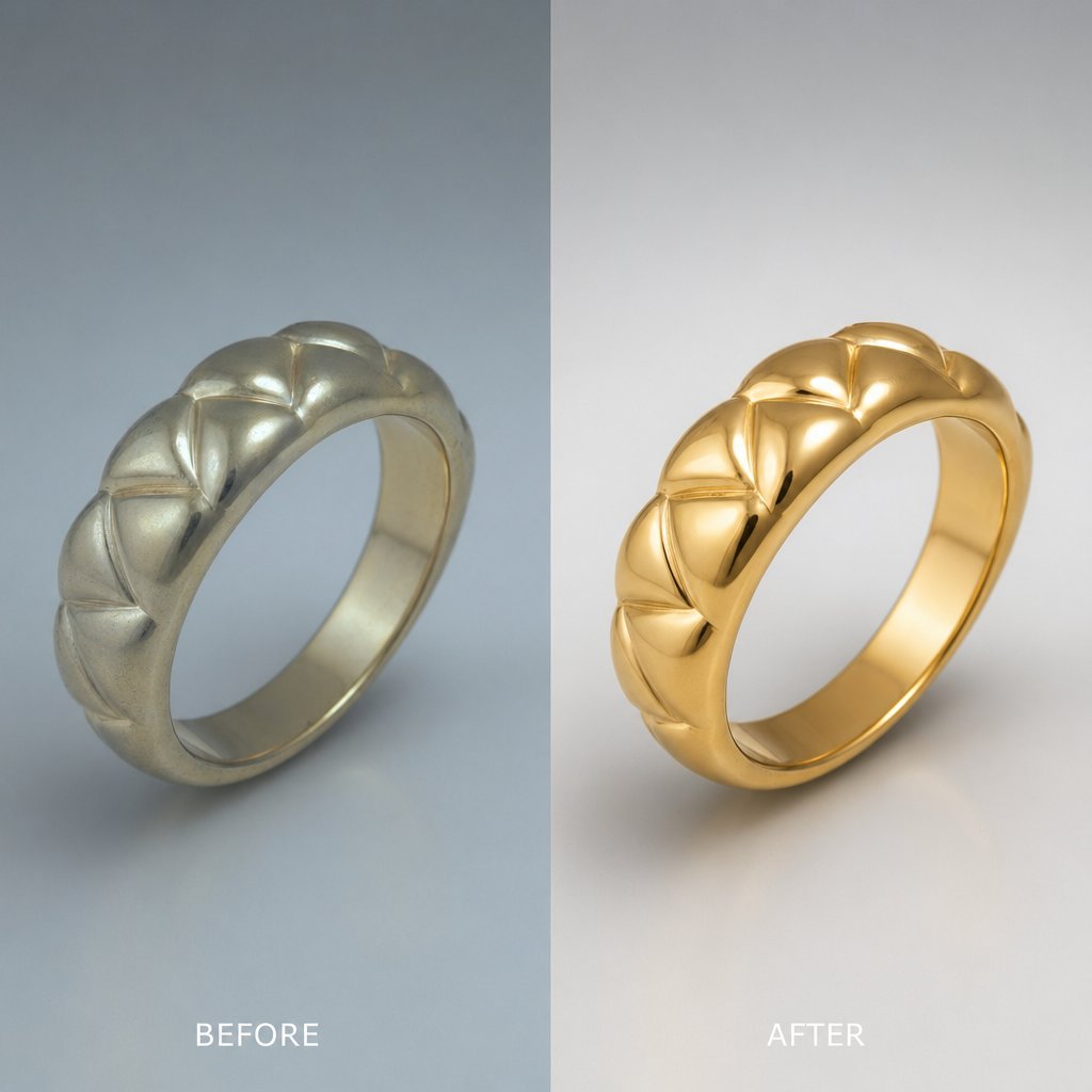
Step 1: Fix Metal Color in Camera Raw First
Get the color and exposure as close to final as possible before you touch a single pixel. RAW files carry far more tonal data than the default preview shows, and metal tones and blown highlights are dramatically easier to fix here, where you still have the full bit depth, than later in Photoshop.
Double-clicking a RAW file opens Adobe Camera Raw (ACR) automatically. With a JPEG you can still get there through Filter > Camera Raw Filter, though you'll have less room to recover detail.
Set white balance for true metal
White balance is the most important adjustment you'll make. A small temperature shift can turn yellow gold a sickly green or leave platinum a flat, lifeless gray. If you shot with a gray card in frame, grab the White Balance eyedropper in ACR's Basic panel and click it. Camera Raw neutralizes the cast for you, which is the fastest and most reliable route when lighting was consistent.
Without a gray card, you adjust Temperature and Tint by eye. Different metals read true at different targets. Use this as a starting framework, not a rulebook, and judge the result against the physical piece:
| Metal | Temperature | Tint | Goal |
|---|---|---|---|
| Yellow gold | Warm | Slight magenta | Rich warmth without going orange |
| Rose gold | Slightly warm | More magenta | Pink-copper, not salmon |
| White gold | Neutral to cool | Neutral | Clean silver-white, distinct from platinum |
| Platinum | Cool | Slight magenta | Denser, darker gray than white gold |
| Sterling silver | Neutral | Neutral to slight green | Bright reflective neutral, no blue cast |
Toggle ACR's before/after preview often to confirm you're moving the right way.
Recover highlights and open shadows
Polished metal clips to pure white easily, and once a specular highlight blows out, no later editing brings it back. Pull the Highlights slider left to recover those reflections; hold Alt (Option on Mac) while dragging to see exactly where clipping still happens. Push Shadows right to open up prong settings, the undersides of chain links, and other dark crevices.
Keep Exposure moves small so you don't flatten the whole tonal range. A touch of Contrast adds definition to metal surfaces. For the brightest specular reflections, Adobe notes that a little extra Whites clipping is actually fine. A slightly negative Blacks anchors the deepest shadows and adds perceived depth. For finer work, the Parametric Curve lets you pull down highlight brightness on the metal while leaving gemstone tones alone, which is more precise than the global Highlights slider.
One step you shouldn't skip: hold Shift and click "Open Object" at the bottom of ACR. That brings the image in as a Smart Object, so you can double-click the layer thumbnail later to reopen these RAW settings and re-grade the metal without redoing anything. If a client wants the ring shifted from warm yellow gold to a cooler white gold, that's a thirty-second fix instead of a restart. The core principle of jewelry retouching at this stage is simple: solve color and exposure now, where it's cheap.
Every correction you skip in Camera Raw becomes far harder to fix in Photoshop, and that goes double for metal.
Step 2: Build a Non-Destructive Layer Structure
Before you pick up the Clone Stamp, spend a minute organizing the file. A busy jewelry image can collect dozens of localized edits, and without a hierarchy they turn into a tangle that's impossible to revise. As Retouching Academy points out, stacking order directly affects how flexible your file stays. Pixel layers go at the bottom, adjustment layers above them, so tonal changes always apply predictably to everything beneath.
Group your work into clearly labeled folders. A reliable structure, bottom to top:
| Group | Contents | Purpose |
|---|---|---|
| RAW Smart Object | Camera Raw base image | Re-open RAW settings anytime |
| Cleanup | Empty layers for dust, scratches, reconstruction | All healing and cloning |
| Color Correction | Curves, Hue/Saturation, Selective Color with masks | Per-element color refinement |
| Dodge & Burn | 50% gray layers set to Soft Light | Sculpt metal and stones |
| Sharpening | High Pass / Smart Sharpen | Output detail |
| Export Crop | Crop guides, canvas layers | Final framing |
Name layers for what they touch (Diamond_Curves, Band_HueSat, CL_Dust) so anyone on the team can find an edit instantly across dozens of SKUs.
Two non-destructive habits do most of the heavy lifting. First, once a group of cleanup layers is finished, select them, right-click, and Convert to Smart Object; any filter you apply then becomes a Smart Filter you can re-edit or remove. Second, clip adjustment layers to a selection. Make a Pen Tool selection of a sapphire, add a Curves layer to deepen the blue, then right-click and Create Clipping Mask, and the adjustment affects only that stone, leaving the metal untouched. When a revision request lands, you open the relevant group, tweak one layer, and the rest of the file stays intact.
Skip the manual grind when you can. Snappyit's AI jewelry retouch tool cleans dust, corrects metal tone, and boosts gemstone brilliance automatically.
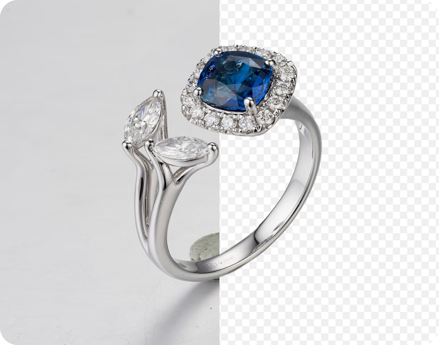
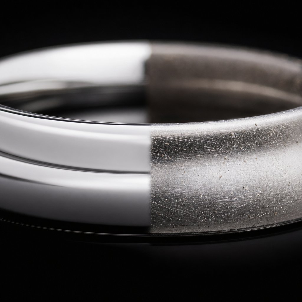
Step 3: Clean Dust, Scratches, and Smudges
Zoom to 200% and the flaws appear: dust on a prong, hairline scratches across a shank, a fingerprint dulling a bezel. On reflective metal, the tool you choose matters a lot.
The Healing Brush averages sampled pixels with their surroundings, which is great on skin but smears highlights on polished gold, leaving a muddy gray patch where a clean line of light belongs. So for metal, the Clone Stamp is your main tool. Set it up on a new empty layer: opacity around 70-90% so you can build coverage gradually, Sample set to "Current & Below," and Aligned turned on. "Current & Below" tells Photoshop to read pixels from the layers underneath while depositing new pixels only on your cleanup layer, exactly as the architecture from Step 2 intends.
The Spot Healing Brush still earns its place, just a narrow one: use it in Content-Aware mode for isolated dust on matte, non-reflective areas like a brushed band or the flat back of a pendant. Anywhere near a reflection edge, switch back to the Clone Stamp. One more trick worth knowing, from Julieanne Kost's clone and heal tips: setting the Healing Brush to Replace blend mode stops it from blending tone and color, so the healed edge stays crisp against a metal boundary.
What each piece type needs
Rings often show linear tool marks along the inner shank from sizing. Clone along the curve of the band, not across it, sampling from a clean section and working in short overlapping strokes. Casting pits near prong bases clone away cleanly at slightly reduced opacity so you don't flatten the texture.
Necklaces and chains trap dust in the gaps between links. Skip Content-Aware Fill here; it mangles the repeating geometry. Instead, Alt-click (Option-click) a clean link to set a source, then stamp carefully. The Clone Source panel stores multiple sample points, which helps when you need clean texture from several different links.
Earrings have posts and butterfly backs that are often bent, scratched, or soft. Minor scratches clone away normally; for a badly damaged post, duplicate a clean section onto a new layer, position it with Free Transform, and mask the edges for a seamless blend.
Whatever the piece, zoom to 200-300%, follow the grain of the finish, and resample often. On reflective metal, even a small shift in light direction between source and destination shows immediately, so a single misaligned stroke is visible. Work edge to edge using Page Up and Page Down to move a full screen at a time, so nothing slips through on complex multi-stone or articulated pieces.
Sample frequently and match the light direction. One misaligned clone stroke is instantly obvious on reflective metal.
Step 4: Sculpt the Metal with Frequency Separation and Dodge-and-Burn
Clean metal still looks flat. What separates a professional jewelry shot from a plain product photo is how light reads across the surface: smooth tonal gradations on polished gold, crisp reflections on silver. Two techniques get you there.
Frequency separation: smooth tone, keep texture
A metal surface in a photo holds two things at once: broad tonal transitions (light to dark across a curved band) and fine texture (the micro-grain of a finish). Frequency separation lets you edit them independently, so you can fix blotchy tonal shifts without erasing the grain.
- Stamp a merged copy of your cleaned image (Ctrl+Alt+Shift+E / Cmd+Option+Shift+E) and duplicate it twice. Name the lower copy "Low Frequency," the upper "High Frequency."
- Hide High Frequency. On Low Frequency, run Filter > Blur > Gaussian Blur with just enough radius to dissolve the fine texture while keeping the broad light-to-dark transitions.
- Show and select High Frequency. Run Image > Apply Image with Layer set to Low Frequency, Blending Subtract, Scale 2, Offset 128.
- Set High Frequency's blend mode to Linear Light.
The image looks unchanged until you paint. Select Low Frequency, take a soft brush at low opacity, sample a nearby tone (hold Alt/Option), and paint over uneven patches. The broad color and luminosity smooth out while the texture above stays intact. Restraint is everything: paint only where the transition looks wrong. Over-smoothing produces the plastic, airbrushed look that reads as amateur. This works best on large curved surfaces like ring shanks, bangle interiors, and watch cases.
Dodge-and-burn: add the light that's missing
Where frequency separation fixes the light, dodge-and-burn adds it, painting highlights brighter and shadows deeper to sculpt three-dimensional form. As this Photoshop tutorial notes, it gives you surgical control over where the eye goes.
- Create a new layer set to Soft Light, checked "Fill with Soft-Light-neutral color (50% gray)." Name it "D&B Metal."
- Soft round brush, foreground white, very low opacity. Paint where light should catch: the top ridge of a band, the leading edge of each prong, the crest of a bracelet link.
- Switch to black at the same low opacity and paint where shadow should deepen: the underside of a setting, the recesses between links, the inner curve of a hoop.
Keep opacity low and build up in passes. A heavy stroke looks painted rather than lit; treat each one as a whisper of light. On a solitaire, dodge the top facets of the setting so the diamond sits forward and burn the gallery beneath it to push it back. On a tennis bracelet, alternate dodges on the top face of each link with burns in the gaps to bring out the articulation.
Luminosity masks for mixed metals
Some pieces combine, say, bright platinum prongs with a darker rhodium band, and a global Curves move that brightens one wrecks the contrast with the other. Luminosity masks solve this by using the image's own brightness to build a selection. Ctrl-click (Cmd-click) the RGB channel in the Channels panel to load a highlights selection, refine it, then use it as a mask on a Curves layer so your change touches only the bright surface. It's the cleanest way to separate metals of different reflectivity, tame specular highlights without flattening midtones, and tune the contrast between a stone and its setting.
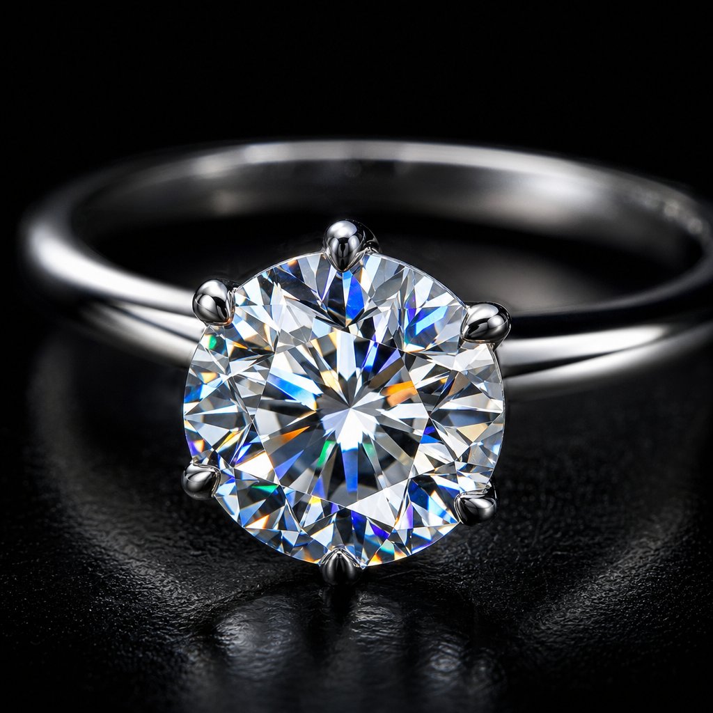
Step 5: Enhance Gemstones by Type
Metal retouching shapes how light moves across a surface; gemstone work shapes how it moves through one. A diamond refracts and splits light, an emerald absorbs most wavelengths and transmits green, a pearl diffuses light across layers of nacre. Because the optics differ, one enhancement recipe applied to every stone fails. The clipped adjustment layers you set up in Step 2 are what make per-stone control practical.
Diamonds: brilliance and fire
Brilliance is the bright white flashes bouncing back at the viewer; fire is the spectral color dispersion, the small rainbows in the facets. Isolate the stone first. The Pen Tool gives the cleanest edge: trace the outline at the girdle, close the path, and press Ctrl+Enter (Cmd+Return) to make a selection. Quick Mask (press Q) is faster for simple round cuts. Feather the edge by a fraction of a pixel so it doesn't look cut out.
With the diamond selected, add a Curves layer; the selection becomes its mask. Lift the highlight region to brighten the facet reflections, anchor the midtones, and pull the shadows down slightly. That widens internal contrast so the stone glows rather than sitting flat. For fire, clip a Hue/Saturation layer to the same selection and nudge saturation up on the specific color channels (Reds, Yellows, Blues) where prismatic flashes appear. The caution that matters: a diamond should read predominantly white. If it starts looking tinted, you've gone too far; the spectral flashes should be accents inside the brilliance, not the main event.
Colored stones: rubies, sapphires, emeralds
Colored stones have the opposite problem, and over-saturation is the most common mistake in the whole craft. A neon ruby or an electric-blue sapphire screams heavy-handed editing and erodes buyer trust. The fix is to narrow the adjustment. Select the stone, add a Hue/Saturation layer, then switch from Master to the stone's dominant range, Reds for ruby, Blues for sapphire, Greens for emerald, and raise saturation modestly in that band only. A tiny Hue shift corrects a stone that leans slightly off, like nudging a violet-tinged sapphire toward true blue. Toggle the layer on and off; if the change looks dramatic, dial it back.
Emeralds deserve a separate move because their value rides on transparency. Select the interior (skip the dark inclusions and edges) and use a masked Curves layer to gently lift the midtones, simulating light passing through the stone. Don't lift the highlights too far or you'll wash out the green.
Opaque stones: pearls, turquoise, opal
These interact with light at the surface, so you're enhancing luster, iridescence, and pattern rather than refraction. For pearls, add a Soft Light layer and paint a pale warm tone (cream or desaturated peach) at low opacity over the upper hemisphere where luster is strongest, then a cool pale blue-lavender along the edges where the iridescent orient shows. Soft Light intensifies the tones without making them opaque, preserving the soft glow.
Turquoise and opal are texture features, the dark matrix veining and the shifting play-of-color, so sharpening brings them forward better than saturation. Stamp a merged copy, run Filter > Other > High Pass at a small radius, set the layer to Overlay, add a black mask, and paint white only over the stone to reveal the effect there alone.
Name every enhancement layer for what it touches (Diamond_Curves_Brilliance, Ruby_HueSat, Pearl_Luster) so when a client wants the sapphire a shade deeper but the diamond left alone, you can find and adjust exactly one thing.
Step 6: Sharpen and Export for Each Platform
Sharpening comes last, after all retouching and color work, and it targets the output size rather than the full-resolution master. Two methods cover jewelry well.
Unsharp Mask (Filter > Sharpen > Unsharp Mask) gives direct control. For on-screen e-commerce images, a low radius with a small threshold keeps facet edges crisp without halos. For print, you sharpen more aggressively with a smaller radius and zero threshold, because, as Greg Benz explains, print sharpening compensates for softness introduced after the file leaves your screen, while web sharpening compensates for softness from resizing.
High Pass gives more visual control and is ideal when you want to sharpen the jewelry but leave the background soft. Stamp a merged copy, run Filter > Other > High Pass at a low radius, set the blend mode to Overlay, then mask out the background and any out-of-focus areas. Whichever method you use, judge it at 100% zoom. Bright or dark halos along the edge between the piece and a white background mean the radius or amount is too high. Pull back.
Before exporting anything, save a layered PSD master (PSB if it's very large). That keeps every adjustment, mask, and Smart Object available for revisions; the export is just a delivery copy. Then match the export to the destination:
| Destination | Format | Color profile | Resolution | Dimensions |
|---|---|---|---|---|
| Amazon / Shopify | JPEG | sRGB | 72 ppi | 2000 px longest edge |
| Print catalog | TIFF or PDF | Adobe RGB or CMYK per printer | 300 ppi | Per layout |
| Instagram / social | JPEG | sRGB | 72 ppi | 1080 px square or 1080×1350 |
For web and social, use File > Export > Export As, choose JPEG, check "Convert to sRGB," and keep quality high enough to avoid the blocky artifacts that show up on fine metal and prong edges. Always embed the sRGB profile so browsers don't reinterpret your corrected tones. For print, confirm the required profile with your printer first; some want Adobe RGB to convert themselves, others want CMYK with a specific ICC profile, and sending the wrong one can shift your gold tones and undo hours of work.
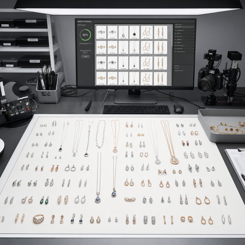
Step 7: Batch the Repetitive Steps, and Avoid the Common Mistakes
Retouching one ring is satisfying; retouching 200 to the same standard by Friday is the real job. The creative phases, cleanup, frequency separation, dodge-and-burn, gemstone work, can't be automated because the judgment changes with every piece. But the finishing steps (sharpening, profile conversion, resizing, export) are identical image to image, and that's what Photoshop Actions are for.
Open a finished file, open the Actions panel (Window > Actions), create a new set and action, and hit Record. Apply your sharpening pass, convert to sRGB (Edit > Convert to Profile), resize with Image Size to your target longest edge and resolution, then export the JPEG to your output folder, and Stop. Now any retouched file replays the whole finish with one click. Build separate actions for print TIFFs and Instagram JPEGs and you have a one-click pipeline per channel. To run a folder, use File > Automate > Batch, point it at the source and destination folders, and check "Override Action 'Save As' Commands" so everything lands where you want.
The mistakes that creep in
Inconsistent white balance is the one buyers feel before they can name it. Gold with a green tint looks cheap; silver with a blue cast looks cold. If you followed the Smart Object workflow, this is the easiest fix in the file: double-click the RAW layer, correct Temperature and Tint, and the change ripples through the whole stack non-destructively.
Over-sharpening halos are the most visible error, that glowing white fringe where polished metal meets a white background. As Kept Light Photography explains, sharpening lightens one side of an edge and darkens the other; push it and the lightening becomes a visible halo. Lower the radius first. If halos persist, try split sharpening: duplicate the sharpened layer, set one copy to Lighten and the other to Darken, then mask or reduce the Lighten copy along problem edges.
Over-smoothing strips the micro-texture that makes metal look real and leaves it plastic. Over-saturating stones breaks trust the same way a neon ruby does. Destructive editing (flattening to save space, cloning on the base layer, filtering without a Smart Object) feels harmless until a revision request arrives and you're rebuilding from scratch. The fix for all of these is the same discipline: keep cleanup on empty layers, dodge-and-burn on gray Soft Light layers, color on masked adjustment layers, and never flatten mid-project. Disk space is cheap; rebuilt retouching is not.
Most jewelry mistakes come from either skipping a foundational step or pushing an enhancement past realism. Restraint plus a non-destructive setup is the safeguard against both.
Have a full catalog to clear? Snappyit can batch listing-ready jewelry images in minutes. Try the jewelry retouch tool free.
Frequently Asked Questions
What Photoshop tools are best for retouching jewelry?
The Clone Stamp set to around 70-90% opacity with "Current & Below" sampling is the primary tool for metal, because it avoids the reflection smearing the Healing Brush causes on polished surfaces. Use the Spot Healing Brush in Content-Aware mode for isolated dust on matte areas, dodge-and-burn on a 50% gray Soft Light layer at low opacity for tonal sculpting, frequency separation to smooth tone without losing texture, and masked Curves and Hue/Saturation layers for gemstones.
How do I make diamonds look more brilliant in Photoshop?
Isolate the diamond with the Pen Tool or Quick Mask, then add a Curves adjustment layer using that selection as its mask. Lift the highlights and pull the shadows down slightly to increase internal contrast, which simulates brilliance. For fire, clip a separate Hue/Saturation layer to the same selection and raise saturation on the specific color channels where prismatic flashes show. Keep the stone reading predominantly white; if it looks tinted, ease off.
What export settings should I use for jewelry photos on e-commerce platforms?
For Amazon and Shopify, export JPEG in sRGB at 72 ppi with the longest edge at 2000 pixels and quality high enough to avoid compression artifacts on fine metal. For Instagram, use sRGB JPEG sized to 1080 px square or 1080×1350. For print, export TIFF or PDF in Adobe RGB or CMYK per your printer at 300 ppi. Always embed the profile and save a layered PSD master before flattening.
How can I speed up jewelry retouching for large catalogs?
Record Photoshop Actions for the repetitive finishing steps, sharpening, profile conversion, resizing, and JPEG export, then run them across folders with File > Automate > Batch. Creative steps like cleanup, dodge-and-burn, and gemstone enhancement need per-image judgment and can't be automated. For tight deadlines, AI tools such as Snappyit's jewelry retouch can handle many repetitive tasks automatically alongside your manual work.
Why does my gold jewelry look greenish after editing?
A greenish gold almost always traces back to white balance during RAW processing. Yellow gold needs a warmer temperature and a slight magenta tint to render accurately. If you opened the image as a Smart Object, double-click the layer thumbnail to reopen Camera Raw and adjust Temperature and Tint until the gold looks rich and warm without going orange. Compare against the physical piece or a reference swatch as you work.
Should I retouch jewelry on a JPEG or a RAW file?
Use a RAW file whenever you have one. RAW holds far more tonal and color data, so highlight recovery on polished metal and accurate metal color are much easier and survive heavier adjustment. A high-res JPEG can still be edited through the Camera Raw Filter, but you'll have less latitude to recover blown highlights and correct color casts.
Photoshop retouching is one route; Snappyit's AI product photography tools are the faster one.