At a glance
Shoot true-to-life flat lay apparel images with high-CRI light, RAW capture, gray-card white balance, and a calibrated post workflow that cuts color returns.
| Need | What to do |
|---|---|
| Get oriented | Read the short summary, then use the checklist below. |
| Create a test image | Try Flat Lay Photo Free |
The Short Version: A Color-Accurate Flat Lay Workflow
If your flat lay photos don't match the real garment, customers return clothes. Sizing, fit, and color are among the biggest drivers of apparel returns, and clothing is one of the most returned categories in e-commerce. A burgundy blouse that photographs as maroon ends up as a return label, and that cost repeats across every order.
The fix is a chain of decisions you control from start to finish:
- Light with a CRI 95+ source at roughly 5000-5500K.
- Remove colored surfaces that bounce a cast onto the fabric.
- Shoot RAW so white balance and shadow detail stay editable.
- Set a custom white balance from a gray card and re-check it during the session.
- Edit on a calibrated monitor, then export sRGB JPEGs with the profile embedded.
Each link feeds the next. A warm light source nudges navy toward purple, auto white balance drifts olive toward khaki, and a JPEG export clips shadow detail in a charcoal knit. The errors are small and cumulative, which is why a single pipeline that holds all the way through matters more than any one trick. For an overview of how this differs from automated approaches, see Snappyit's breakdown of flat lay photography, traditional vs AI.
The rest of this guide walks each stage in order, with the fabric-specific exceptions that trip up real catalogs.
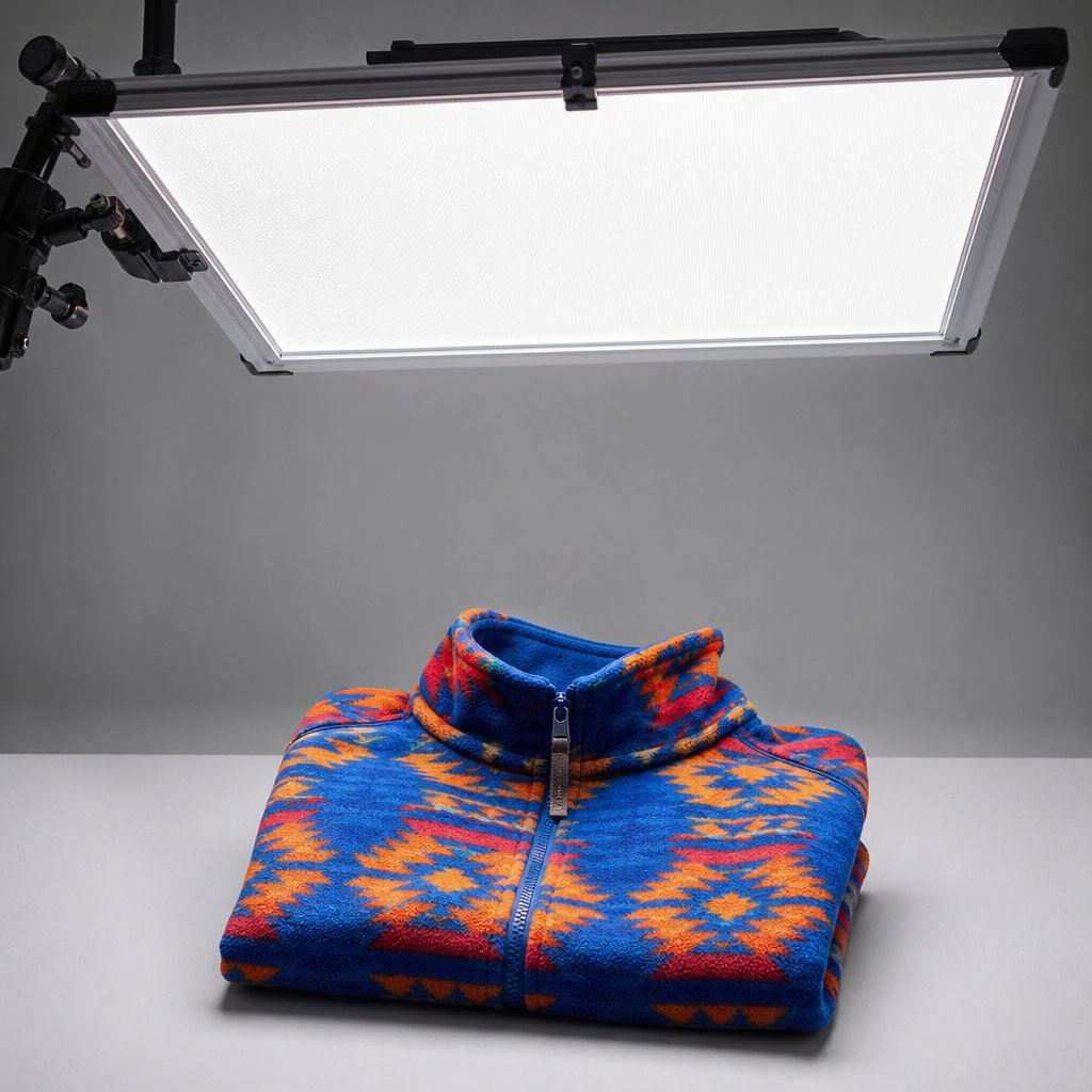
Lighting: High-CRI, Soft, and Stable
Your camera can only record color the light actually delivered to the fabric. A low-CRI light is missing wavelengths, so no amount of editing recovers a hue that was never captured. For apparel, use a Color Rendering Index of 95 or higher.
The reason the threshold sits that high is dye chemistry. A CRI 80 light might render a red cotton tee fine but push a teal silk blouse toward green, because it lacks output in the spectral bands those dyes depend on. Lights in the mid-80s and below tend to cause color problems that surface in post, and for fabric work even 85 is too low. At 95+, the light fills those gaps and the sensor records the hue your eye sees under neutral daylight.
Choosing a light source
| Light Source | Color Temp Stability | Typical CRI | Notes for Fabric |
|---|---|---|---|
| High-end LED panels | Excellent, locked Kelvin | 95-98 | Run cool, hold color across sessions, pair well with diffusion. Best all-round choice. |
| Studio strobes | Very good per flash | 92-97 | High output pushes through heavy diffusion without underexposing. |
| Continuous fluorescent | Moderate, drifts with bulb age | 85-95 (photo-grade) | Workable with high-CRI photo tubes, but verify regularly. |
| Natural window light | Poor, shifts all day | 100 sun, but variable | Beautiful, impossible to standardize for batch work. |
For catalogs spanning dozens or hundreds of SKUs, high-end LED panels give you the best balance of stability and practicality: cool running so they don't warm delicate fabrics, locked color temperature across sessions, and easy pairing with diffusion frames. Strobes earn their place when you need power to drive heavy diffusion materials, which can eat a stop or two of light.
Diffusion does more than soften the look; it protects color too. Harsh, undiffused light creates specular hot spots that blow out color data and micro-shadows in textured weaves that shift the perceived hue. With the camera directly overhead and the fabric flat, even diffusion keeps the center of the garment from washing out while the edges stay darker and more saturated. A 4x4 frame wraps light more evenly than a small reflector, so when you buy a light, check three things: CRI 95 minimum, tight color-temperature consistency across the dimming range, and compatibility with large modifiers.
Kill the Color Contamination Around Your Set
You can have a spectrally clean 97-CRI panel locked at 5000K and still get a warm cast you can't explain. Often the room is the culprit, not the light. Light bounces off every surface and carries that surface's color back onto the garment. A warm hardwood floor throws amber upward; a green wall casts onto anything within a few feet. Your eye corrects for it automatically, your sensor records it faithfully.
Mixed lighting makes it worse. When window light blends with studio LEDs, you have two color temperatures in one frame, and no single white balance setting fixes both. Mixed illuminants leave one region carrying a cast no matter what you do, so one sleeve reads neutral while the other drifts.
Here are the usual offenders and how to neutralize them:
- Painted walls. Place white or neutral-gray V-flats between the garment and any colored wall within six feet.
- Wood floors and warm tables. Shoot on a neutral gray or white surface; never on exposed wood.
- Colored props. Keep them at least two feet from the fabric, or flag them with black cards.
- Window light. Black out windows so your studio light is the only source.
- Your own clothing. Wear black or dark gray overhead; a red shirt reflects onto light garments below.
One related effect worth knowing: metamerism. Two colors can match under store fluorescents but not under your studio LEDs, because the dyes reflect different wavelengths under each source. That means a technically accurate studio shot can still look off under a customer's home lighting. Shooting under a broad-spectrum, high-CRI source at roughly 5000-5500K, the closest artificial match to midday daylight, aligns your captured color with the widest range of real viewing conditions.
Why mid-gray beats white or colored backgrounds
The background influences how the camera meters exposure and calculates auto white balance, not just the mood of the shot. A pure white background reflects light back onto fabric edges and can trick the camera into underexposing, which darkens and oversaturates the garment. Black absorbs light and pushes the camera to overexpose, desaturating lighter fabrics. Colored surfaces bounce their own hue onto the underside of the garment.
Neutral mid-gray sidesteps all of it. It doesn't contaminate color, doesn't fool the meter, and gives you a stable reference for white balance in post. If your brand requires a white or colored background, set exposure and white balance manually and add physical separation, such as a raised platform or acrylic sheet, so the surface bounces as little color as possible.
Lock Your Camera Settings: RAW, Color Space, White Balance
Clean light and a neutral set are wasted if the camera compresses or misreads color before it hits the card. Three settings decide how much color data survives: file format, color space, and white balance.
Shoot RAW
RAW is non-negotiable for color-critical apparel work. A JPEG is processed in-camera at capture, baking in white balance and compressing to an 8-bit file, which gives each channel only 256 tonal levels. For a navy with subtle gradations, that's not enough, and you get banding and locked-in white balance you can't fix without degrading the image.
RAW preserves 12 to 14 bits per channel, thousands of levels, and stores white balance as editable metadata. A modest temperature correction on a slightly warm burgundy dress is clean in RAW; the same shift on a JPEG introduces color artifacts and posterization. RAW is your safety net for every color decision downstream.
Pick the right color space
| Color Space | Gamut | Use In Workflow | Customer Impact |
|---|---|---|---|
| sRGB | Smallest, standard web | Final export for listings | Displays consistently on nearly all browsers and devices |
| Adobe RGB | Wider than sRGB | Capture and editing workspace | Looks desaturated if exported to non-managed browsers without conversion |
| ProPhoto RGB | Largest | RAW editing workspace | Must be converted to sRGB before web delivery |
Edit in a wide space (ProPhoto or Adobe RGB) and convert to sRGB only at final export. Saturated textiles like cobalt activewear or emerald silk sit near the edge of sRGB's gamut; editing in sRGB from the start clips those values early, while a wider space preserves them through your corrections and maps them gracefully at export.
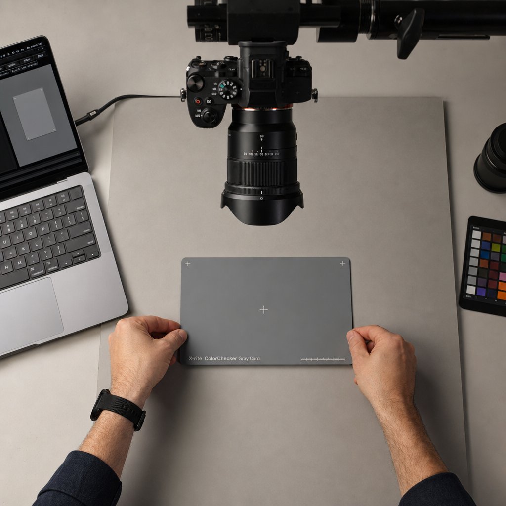
Set a custom white balance from a gray card
Auto white balance recalculates for every frame, so swapping a white garment for a black one can nudge color temperature a few hundred Kelvin between shots. Across 200 SKUs, those micro-shifts add up to visible inconsistency. A custom white balance from a gray card gives the camera one fixed definition of neutral under your light. The sequence:
- Lay the gray card flat where garments will sit, under the same light.
- Fill at least 80% of the frame with the card from shooting height.
- Capture the custom white balance in-camera and confirm it's accepted.
- Shoot a test garment and compare it to the physical fabric under your light.
- Re-check every 30 minutes, or immediately after moving lights or swapping bulbs.
If you prefer Kelvin values, daylight-balanced LED setups usually land between 4800K and 5200K. The advantage of a fixed number is repeatability, since you can log it and return to it session after session. Shoot a color checker frame at the start of each session too; it becomes your post-production anchor for syncing the whole batch.
Adjust for Fabric Type
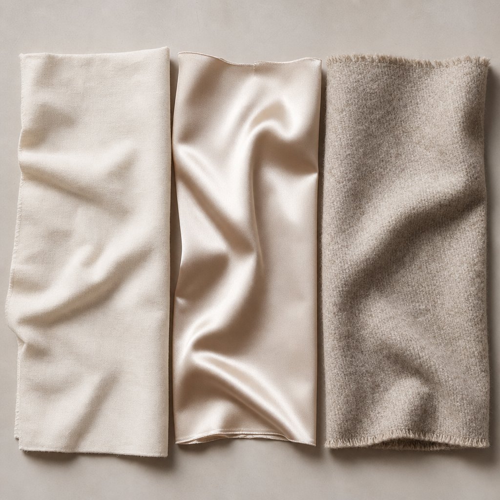
A matte cotton tee and a glossy satin camisole can sit under the same light with the same settings and produce completely different color. Surface behavior dictates how light meets the dye before it reaches your sensor, so universal settings handle the baseline while specific fabrics need their own adjustments, and in apparel those exceptions are most of the catalog.
Reflective and dark fabrics
Silk, satin, and some synthetics act like partial mirrors. Where matte jersey scatters light evenly, satin reflects your source at specific angles, creating specular highlights that blow out color entirely and read as white rather than the real hue. A deep emerald satin can look emerald in the shadows and pale mint where the highlight dominates. Fix it with more diffusion: a larger source wraps the surface from more angles, and bringing it closer softens the highlight-to-shadow transition. The aim isn't to kill all reflection (that makes satin look like cotton) but to keep highlights inside recoverable exposure.
Dark fabrics are the opposite problem. A black leather jacket or navy wool coat absorbs most of the light, so the sensor has little to work with and shadows crush, turning navy to black and forest green to charcoal. Open exposure by about a third to two-thirds of a stop beyond the meter, then check the histogram to confirm shadow detail separates from pure black without clipping highlights elsewhere.
Mixed-color garments
Photograph a navy-and-red striped shirt and you hit a wall: expose for the navy and the red blows toward orange; expose for the red and the navy crushes. Color-blocked activewear, patterned dresses, and multicolor knits all have this issue. There's no single perfect exposure, so combine strategies:
- Expose for the midpoint so neither extreme clips, checking the histogram rather than the rear screen.
- Lean on RAW headroom to recover the dark stripes and pull back the bright ones in post.
- Flatten the lighting with more diffusion and fill from below or the sides, compressing the scene's dynamic range so one exposure holds both.
- Correct selectively in RAW, targeting each color zone independently.
When one color is far lighter than another, such as a white-and-cobalt color-blocked jacket, bracket two exposures and blend them. It's more work but holds accurate color across contrast a single frame can't.
Quick reference by fabric
| Fabric | Color Challenge | Lighting Adjustment | Exposure |
|---|---|---|---|
| Matte cotton | Weave micro-shadows darken color slightly | Broad overhead diffusion; avoid raking side light | None to +1/3 for darks |
| Glossy satin | Specular highlights blow out color | Maximize diffusion size; bring source close; consider a polarizer | -1/3 to -2/3 to protect highlights |
| Textured wool | Deep texture shifts hue darker and flatter | Gentle fill opposite the key; large overhead panel | +1/3 to +2/3 to open shadows |
| Synthetic blends | Matte in spots, shiny in others | Feather the light across the surface; double-diffuse if needed | Neutral to -1/3, per garment |
| Sheer fabrics | Background color shows through | Background that matches the intended wear context | +1/3; meter off the fabric |
Sheer and textured fabrics deserve a closer look. With chiffon, organza, or mesh, the background becomes part of the perceived color: a white background makes a navy overlay look lighter and bluer, a black one makes it deeper. For most listings, a white or skin-toned surface beneath sheer fabric is the most honest representation of how it reads on the body. Textured knits like cable-knit or bouclé create hundreds of tiny shadows inside the weave that drag down saturation, so a cream sweater can photograph as beige. Fill those micro-shadows with soft ambient light so they read as gentle dimension rather than dark voids, without flattening the texture that tells the customer how the fabric feels.
Build a Batch-Consistent Station
One garment with perfect color is easy. Five hundred SKUs over three weeks with identical rendering is a systems problem, and it's what separates a professional catalog from one-off shoots that look fine alone but fall apart together. Shoot a navy blazer Monday and the matching trousers Friday, and if the blazer reads slightly warmer at launch, the customer hesitates and may buy neither.
The cause is rarely dramatic: a light that warmed a touch over a long session, a white balance that shifted after a power cycle, a background swapped without recalibrating. Each is minor alone; together they make your flat lays look shot in different studios. The answer is to fix variables physically so you return to a known state instead of recreating it from memory. Commercial photographers do exactly this, documenting light positions, power levels, and the camera's exact location so they can match shots years apart.
A color-stable station needs:
- A fixed overhead camera mount (ceiling rail, locked C-stand with horizontal arm, or copy stand) with the height marked in tape.
- Marked light positions taped on the floor and stands, with height, angle, and power noted.
- A permanent neutral background that stays put between sessions; if it's paper, replace from the same roll.
- A reference color checker (X-Rite ColorChecker or similar) shot in the same spot at every session start.
- A tethered preview so you catch color drift live rather than hours later in editing.
White balance drift is the quiet killer here. LED panels warm slightly as they run, blackout curtains develop gaps as the sun moves, and processing can shift after a power cycle. Two habits neutralize it. First, shoot the color checker every 30 minutes; those time-stamped frames let you sync white balance in segments in post rather than hoping one calibration held all day. Second, keep the camera tethered to a calibrated monitor and pin a reference image from the session start beside the live feed, so a small shift you'd never see on a 3-inch LCD jumps out on a 27-inch screen before you've shot 40 garments that all need fixing.
A workable session rhythm: shoot the reference at the start and verify it against the previous session, reshoot it every 30 minutes and after any interruption, and bookend with a final reference frame. That cadence adds a couple of minutes per hour and saves hours of selective correction later. For teams scaling from dozens to hundreds of SKUs a week, AI-assisted tools like Snappyit's flat-lay solution help hold color consistency across large catalogs without rebuilding the station every time.
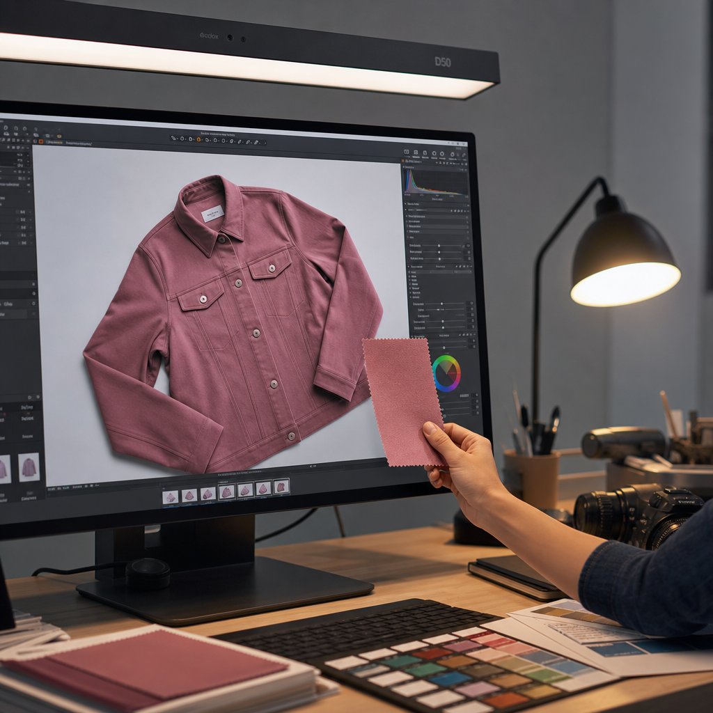
Correct and Proof Color in Post
Accurate RAW files still need a controlled editing pass, and before any slider you need a calibrated monitor. An uncalibrated display can show colors well off from reality, and you can't correct what you can't see accurately. Profile your screen with a hardware colorimeter (Calibrite ColorChecker Display, X-Rite i1Display, or similar) to a D65 white point, 2.2 gamma, and around 120 cd/m² brightness, and recalibrate monthly or whenever your editing environment changes.
With a calibrated display, follow this order in Lightroom Classic, Capture One, or your processor of choice:
- Import and organize by session, confirming the reference frames are in each batch.
- Sync white balance from the reference frame. Use the eyedropper on the neutral gray patch of your session-start color checker, then apply that setting to the whole batch. This one step removes the most common source of catalog inconsistency.
- Apply lens corrections to remove chromatic aberration, since purple or green fringing along fabric edges contaminates the outline color.
- Make selective adjustments per fabric. Use HSL or color masks to address the fabric-specific issues above; work on individual color ranges, not global saturation.
- Soft-proof in sRGB (Lightroom: View > Soft Proofing) to see which saturated blues, magentas, and cyans shift when converted from your wider editing space.
- Export with an embedded sRGB profile, JPEG quality 80-90 with sRGB IEC61966-2.1 attached so browsers know how to interpret the color.
For high volumes, edit one representative image per lighting setup and sync those adjustments across the batch. White balance, sharpening, and noise reduction that should be constant sync in seconds instead of hours.
ICC profiles and the physical swatch check
An ICC profile is the instruction set telling a device how to display specific RGB values. Embed an sRGB profile and the image renders predictably; leave it off and platforms guess, so the same file looks slightly different on Amazon, Shopify, and social. Some e-commerce profiles, like Capture One's EcommStandard, are tuned for the tricky garment ranges (blues, pinks, pastels, neons) that generic profiles tend to shift.
Soft proofing is your pre-flight check, simulating the destination color space so you can see a vivid coral dull as it maps from a wider gamut into sRGB and compensate before export. The final validation is physical: put the actual fabric swatch next to your calibrated display under a D50 viewing light (5000K, the graphic-arts standard for comparing physical objects to screens). D50 gives the closest perceptual match between reflected light off the fabric and emitted light from the monitor. If they match, the pipeline delivered. If they diverge, trace backward, since the broken link is usually upstream: monitor calibration, embedded profile, or the white balance reference.
Verify and Scale Without Losing Accuracy
Run a fixed pre-publish check on every batch so an error doesn't slip through in the final moments before a listing goes live:
- CRI 95+ light confirmed at its rated color temperature
- Custom white balance set from a gray card on the shooting surface
- RAW format verified (not accidentally switched to JPEG mid-session)
- Color checker frame shot at session start and every 30 minutes
- Monitor calibrated within the last month
- Export soft-proofed in sRGB with the ICC profile embedded
- Physical swatch compared on-screen under a D50 viewing light
Scaling to hundreds of SKUs a week is where teams hit friction, because you can't spend five minutes per image on manual swatch comparison. Batch-verify instead: compare one garment per fabric type and lighting setup, and if the sample passes, the batch passes, because your fixed station and reference discipline keep each group consistent.
Document the workflow so it survives beyond your memory, recording light positions, power settings, camera height, Kelvin value, and export settings on a station card or spreadsheet. When a second photographer steps in, the results reproduce without guesswork. Brands pushing volume while holding these standards can use Snappyit's flat-lay workflow to increase throughput without rebuilding the station each session. The whole pipeline, from CRI-rated lighting through white balance, RAW capture, fabric adjustments, station discipline, calibrated post, and swatch verification, is a closed loop where each step protects the next.
Frequently Asked Questions
What CRI rating do I need for accurate fabric color?
Use a Color Rendering Index of 95 or higher. Lights below that lack output in specific spectral bands, which shifts certain dyes, especially teals, magentas, and deep blues. High-end LED panels typically offer CRI 95-98 with locked color temperature, making them the most reliable choice when batch consistency matters across many SKUs.
Why do my flat lay photos look different from the actual garment?
Color drift usually comes from several small errors compounding: auto white balance shifting between frames, painted walls or wood floors bouncing a cast onto the fabric, shooting JPEG instead of RAW, and editing on an uncalibrated monitor. Fixing any one helps, but true accuracy requires controlling every stage from light source to export.
Should I shoot RAW or JPEG for flat lay product photography?
RAW. It preserves 12 to 14 bits per channel (thousands of tonal levels) versus JPEG's 8 bits (256 levels), so white balance is editable in post with no quality loss and shadow detail in dark fabrics can be recovered cleanly. JPEG bakes in white balance and compression at capture, leaving no room for accurate correction.
How do I keep color consistent across multiple shooting days?
Build a fixed station with marked light positions, a locked camera height, and a permanent neutral background. Shoot a color checker reference at the start of every session and every 30 minutes, tether to a calibrated monitor for live comparison, and sync white balance from the reference frame to each batch in post. That keeps a navy shirt shot Monday matching navy pants shot Friday.
What background color is best for true fabric color?
Neutral mid-gray. White reflects light onto garment edges and can trick auto exposure into underexposing, which oversaturates colors; black causes overexposure that desaturates lighter fabrics; colored surfaces bounce their hue onto the garment. Gray stays metrically neutral and gives a stable reference for white balance. If branding requires white or color, set exposure and white balance manually.
Color-accurate flat-lays feed everything downstream in a full AI product photography setup.