At a glance
Jewelry model photography shows jewelry worn on a real body, so shoppers grasp scale and drape. Learn lighting, posing, and retouching that balance metal
| Need | What to do |
|---|---|
| Get oriented | Read the short summary, then use the checklist below. |
| Create a test image | Try Jewelry Model Free |
Jewelry model photography is shooting fine jewelry as it's worn on a human model. The body becomes a reference that tells a shopper how big a pendant really is, how a chain drapes, and how light moves across a stone. A ruler beside a ring says it's 6mm wide; a ring on a finger says what 6mm actually feels like.
It's the closest substitute for an in-store try-on, which is why on-model jewelry imagery answers the questions people ask silently while browsing: How big is it? Will it suit me? Does it hang nicely? Those answers live in the contact point between metal and skin, where the hard part is that the two want opposite light.
Why On-Model Images Outperform Product-Only Shots
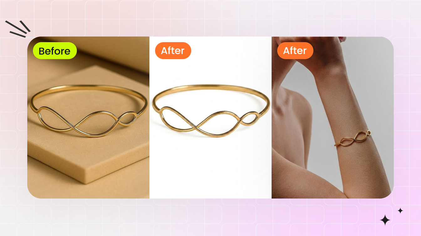
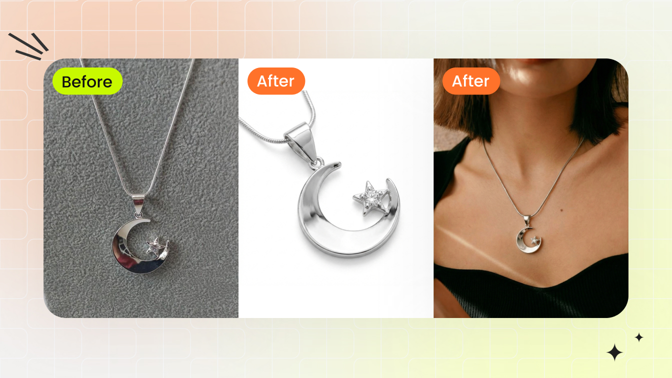
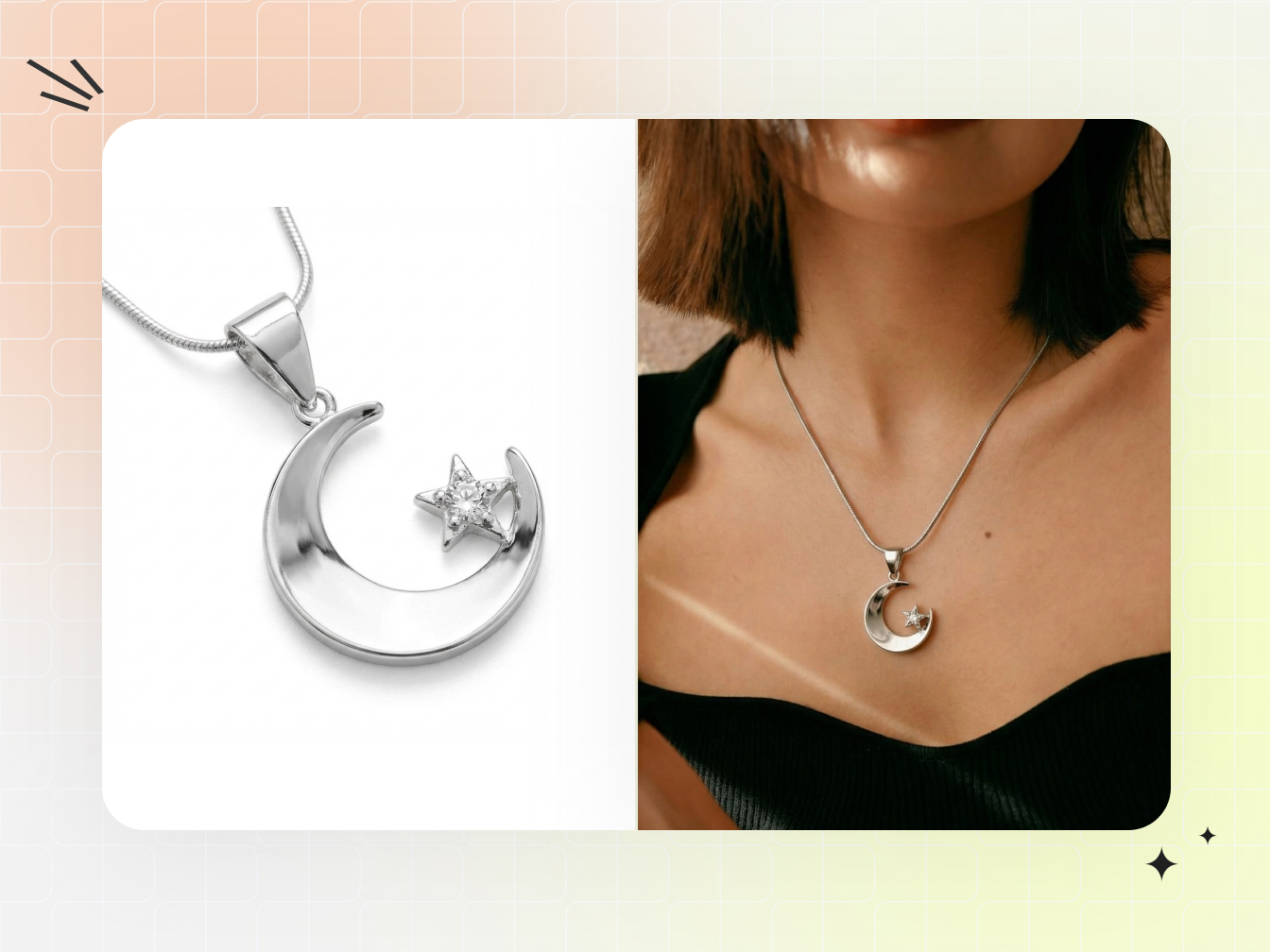
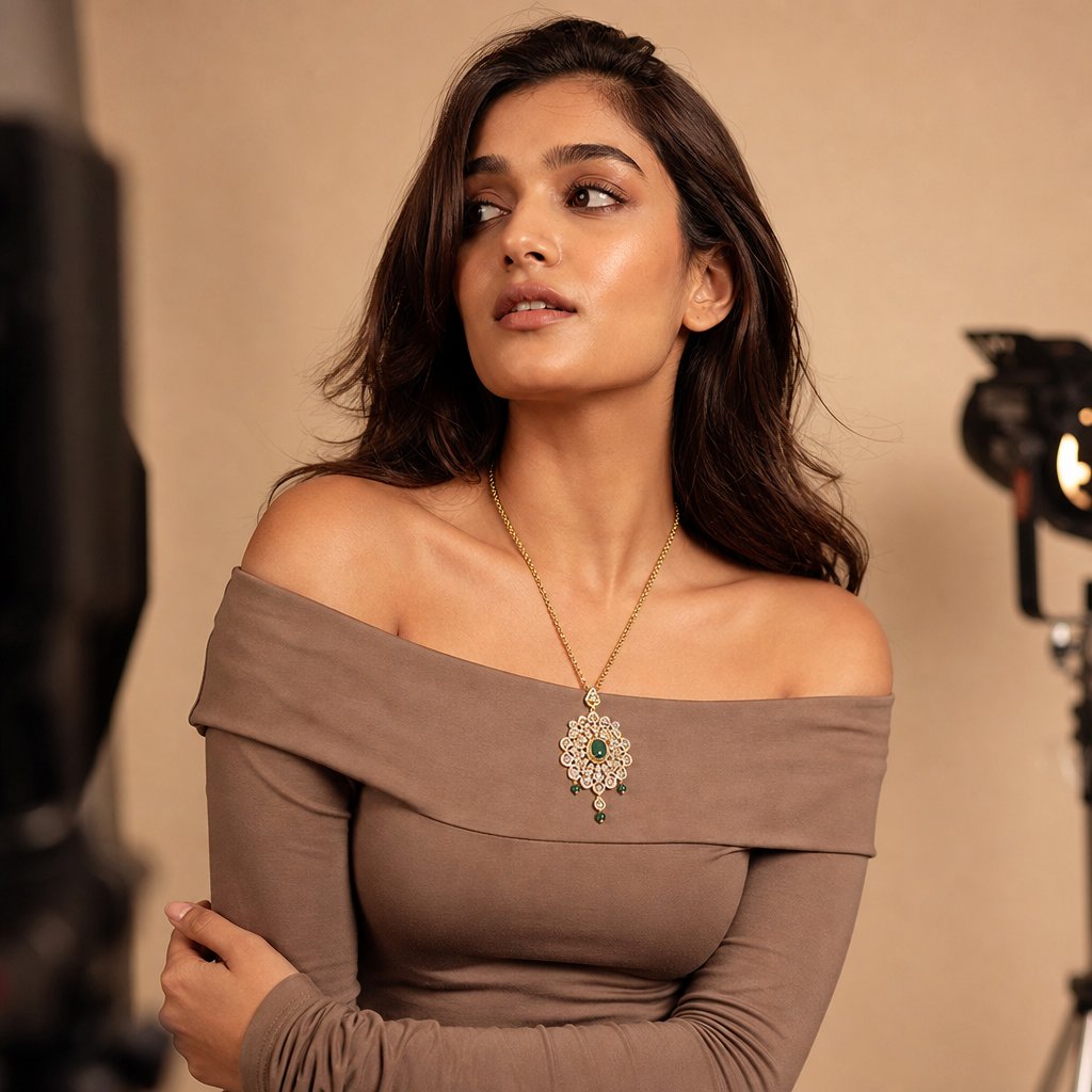
On-model images make scale and wearability obvious, and people respond to other people. A pendant on a collarbone reads instantly: you understand its proportion against a neck, how the chain falls, the angle at which the stone catches light. A flat-lay can't do that, because it's missing the one reference every shopper already understands, the human body. When a shopper can picture themselves in a piece, passive interest turns into wanting it, and lifestyle imagery also sets realistic expectations, which helps with returns.
- Scale is intuitive — proportion, drape, and weight come across without measurements.
- It's aspirational — the piece becomes part of a moment instead of a catalog entry.
- It shows how to wear it — necklines, pairings, stacking, visible at a glance.
- It reduces hesitation — seeing jewelry on a real person removes uncertainty at checkout.
Don't retire the lightbox, though. Marketplaces like Amazon and Etsy require clean white-background images as the main listing photo, and high-magnification detail shots let buyers inspect settings, clasps, and engraving in a way on-model framing can't. Treat the two as a pair: the white-background shot answers "what am I buying," the on-model shot answers "how does it look on a person."
Tailoring Your Approach by Jewelry Type
A necklace and a ring are both jewelry, but they need different framing, posing, and focus. One setup applied to every category produces flat shots, because each piece sits on the body differently and catches light from a different angle.
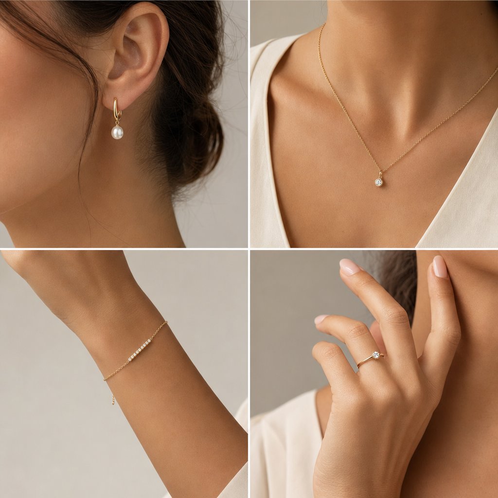
Earrings
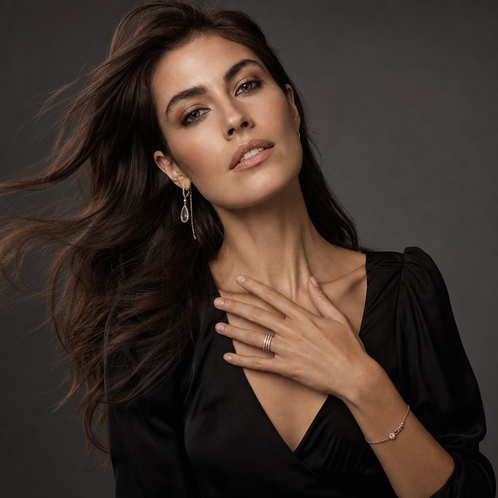
The crop defines the shot. Studs need a tight frame, roughly jaw to shoulder, or the piece gets lost. Statement earrings allow a wider crop but add movement: chandelier styles swing with every head turn, so you either freeze the motion with a faster shutter or lean into the blur for editorial energy. Manage hair ruthlessly, since one stray strand ruins the frame.
Necklaces and bracelets
Necklaces live and die by neckline. A crew neck competes with a choker; a deep V swallows a delicate pendant into shadow. The neckline should frame the piece without touching it, which is why off-shoulder, strapless, and simple scoop necks work across most lengths. Fine chains shift with every breath, so direct the model to elongate the neck and hold a slightly turned head for a clean line down to the pendant. Bracelets are about wrist and hand together: aim for a gently curved hand, fingers relaxed and slightly separated, with the arm angled so the bracelet faces the lens rather than sliding toward the elbow.
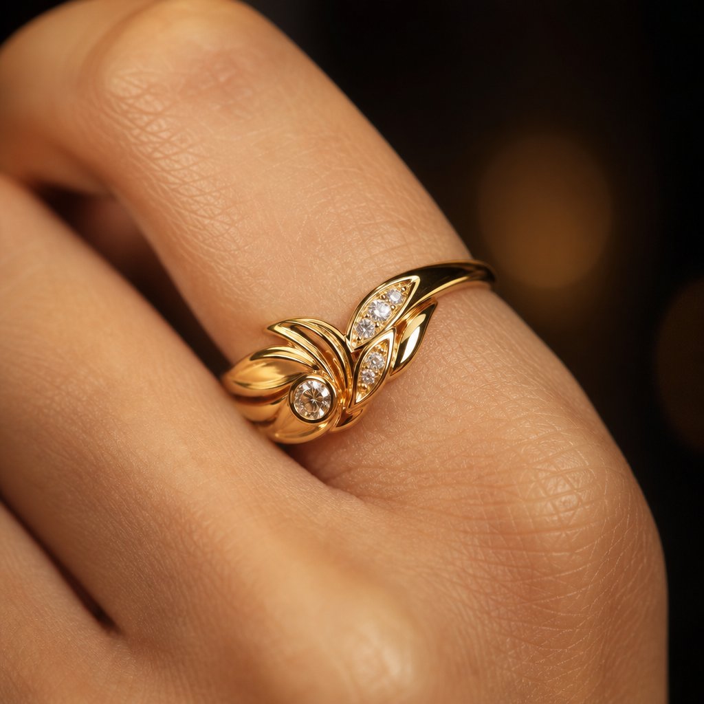
Rings
Ring photography is really hand photography, and hands are hard. The hand has to look natural while presenting the ring at an angle that shows the stone and setting. As Rachel Kimberley notes, hand models tend to have slender fingers and clear skin, with manicured nails in a polish color that complements rather than competes with the ring. Fingers pressed together look tense and hide the band; slightly separated fingers let light pass through. The technical hurdle is depth of field: at the close distances rings demand, even f/8 may not hold the stone and the knuckle sharp at once, so focus stacking becomes a creative decision.
Gold and mixed metals
A cool gray background can make gold look more vibrant by contrast, while a warm beige creates harmony but risks letting the piece blend in. Mixed-metal pieces want neutral lighting that doesn't push color temperature toward either extreme, so neither the warm nor the cool metal looks off.
| Jewelry type | Recommended crop | Key model feature | Primary challenge |
|---|---|---|---|
| Earrings (studs) | Tight: jaw to shoulder | Clean earlobes, defined jawline | Small size lost in frame |
| Earrings (statement) | Medium: head to chest | Neck length, hair kept clear | Movement and swing while posing |
| Necklaces | Medium to wide: face to mid-torso | Collarbone definition, neck length | Chain drape shifts with breathing |
| Bracelets | Medium: elbow to fingertips | Wrist shape, hand elegance | Bracelet slides and rotates |
| Rings | Tight: hand and fingers | Finger shape, nail and skin condition | Shallow depth of field up close |
Lighting Metal and Skin at the Same Time
Skin and metal want opposite things from light, and that conflict is the central problem here. Skin looks best under broad, soft light that wraps evenly and minimizes texture. Metal and gemstones need directional light that creates defined highlights and sparkle. Put a big softbox straight in front of the model and the necklace goes lifeless; swap to a small, hard source that makes a diamond fire, and now the skin is carved with harsh shadows. As photographer Eydis Einarsdottir puts it, "Trying to light both model and jewelry beautifully is not easy. It also changes with each pose."
The fix is to stop treating it as one setup. Run a primary system for the model, a large soft source for even skin, and a secondary system for the jewelry, smaller and more directional, placed close to the piece for the specular highlights metal and stones need.
- Separate intensity — the jewelry light usually sits brighter than the skin fill, because metal needs more contrast to read as reflective.
- Proximity — small reflectors or mirrors just outside the frame add sparkle without touching skin exposure.
- Flags and diffusion — black flags block spill from the jewelry light hitting skin; diffusion softens the skin light before it reaches the metal.
- Aperture — shooting around f/8 to f/11 keeps both jewelry detail and skin texture acceptably sharp.
Einarsdottir's approach is a clean example. She builds a large soft-box environment around the model using sheets or sheer curtains as scrims, then adds a specular light aimed at the jewelry; for close-up hand work, she's described shooting through a sheet so the studio didn't reflect in a large ring. The constant: broad and forgiving on skin, narrow and precise on metal, overlapping as little as possible.
Model Selection, Skin Tone, and Wardrobe
Lighting can be adjusted on the day; casting and wardrobe cannot. These choices lock in before anyone steps on set, and they decide whether the jewelry pops or disappears into noise.
Pairing skin tone with metal
Every skin tone works with jewelry when the pairing is intentional. Undertones fall into three groups: warm (golden, peachy, olive), cool (pink, blue, red), and neutral. Warm undertones pair well with gold; cool undertones suit silver, white gold, and platinum; rose gold reads as flattering across most complexions. For photography these relationships matter more than in person, because camera sensors amplify them. Deep, rich skin makes diamonds pop through contrast; lighter complexions better showcase saturated colored gemstones like emeralds, rubies, and sapphires; neutral undertones let one model wear gold and silver convincingly in a single shoot.
Wardrobe that supports the piece
Wardrobe is the most common place on-model shoots go wrong. The clothing is a stage, not a co-star, and it should recede.
- Solid, muted fabrics — black, ivory, soft gray, and earth tones let metal and stones command the frame.
- Necklines matched to length — V-necks for pendants, off-shoulder or strapless for chokers, scoop for mid-length chains.
- No busy patterns near the jewelry — florals, stripes, and bold prints compete and confuse the eye.
- No competing accessories — for a statement necklace, lose the watch, bracelets, and extra rings.
- Matte over shiny — satin, sequins, and metallics throw unpredictable reflections and can cast color onto the piece.
The general photoshoot rule applies doubly here: clothing should never pull focus from the real subject, which in jewelry work is always the piece. Lens choice plays in too: a longer focal length compresses proportions and makes jewelry look slightly larger relative to the body, and for most commercial work the 85mm to 135mm range gives the most natural relationship between body and piece.
Posing and Direction That Showcase the Piece
The difference between a stiff display shot and a living image almost always comes down to direction. As Einarsdottir puts it, "Shooting jewelry on models is a tricky situation, because you are selling the jewelry, not the model." The model carries emotion and context while the piece stays the visual anchor, and that takes specific cues, not "look natural."
Hands are where most shoots succeed or fail. The two recurring mistakes are clenched fingers that look tense and over-splayed fingers that look theatrical. Aim for gentle curves: tell the model to imagine lightly holding a small bird, just enough tension to create shape. Natural actions beat held poses, so have the model touch her collarbone or brush hair behind an ear at half speed so you can catch the most flattering frame mid-motion.
Head position controls everything between jaw and chest. A slight tilt toward one shoulder lengthens the neck on the opposite side and lets a drop earring hang cleanly; too much and it presses against the neck, too little and it's lost against the jaw. Einarsdottir gives models a scenario to inhabit instead of a position to hold, telling them what to feel so the gestures look genuine.
Adapting Shoots for E-Commerce, Editorial, and Social
One on-model image rarely works everywhere. The shot that converts on a product page can feel sterile in a feed, and the moody editorial frame that wins on Pinterest may confuse a shopper on Amazon. Each channel has its own visual language.
Product pages and marketplaces
Product pages want clarity. Keep backgrounds clean and lighting consistent across every SKU so the catalog feels coherent, which, as Stars Design Group notes, reinforces brand identity and buyer confidence. Shoot multiple angles per piece at high resolution so customers can zoom, and deliver at least 2000px on the long edge in the platform's aspect ratio: square (1:1) for most marketplaces, 4:5 for Shopify galleries.
Editorial and brand campaigns
Editorial flips the priority to mood and narrative. Creative lighting, real environments, and expressive styling serve the brand's story rather than the spec sheet: a gold cuff in warm afternoon light against weathered stone, diamond studs in a rain-streaked window. The image should feel ownable rather than interchangeable.
Social and paid ads
Social-first content lives on vertical screens and autoplay feeds. Frame for 9:16 or 4:5 and put the visual hook in the top third, since that's what shows before someone keeps scrolling. The volume is the real strain: feeding Instagram, TikTok, and Pinterest takes a steady flow of fresh visuals to avoid ad fatigue, more than most traditional shoot schedules can sustain. Many teams now supplement studio work with AI-generated imagery to keep pace. Snappyit's jewelry model tool is built for this, generating on-model visuals at scale so social feeds stay fresh while traditional shoots are reserved for hero content.
| Dimension | E-commerce | Editorial / campaign | Social / paid ads |
|---|---|---|---|
| Background | Clean white or neutral gray | Environmental, narrative-driven | Lifestyle contexts or bold color |
| Lighting | Consistent and reproducible | Creative, mood-driven contrast | Natural or mixed, mobile-optimized |
| Styling | Minimal, jewelry is the focus | Expressive, wardrobe tells a story | Trendy, platform-native |
| Typical deliverable | High-res, square or 4:5 | Full-resolution, varied ratios | Vertical 9:16 or 4:5 |
Post-Production for On-Model Jewelry
Retouching on-model jewelry is harder than editing a portrait or a product shot alone, because both disciplines collide in one frame. Smooth skin too aggressively near a clasp and the edit shows; clean a ring's reflections too thoroughly and it turns into a lifeless render.
Reflections without losing realism
Every polished surface is a small mirror, so your camera, lights, and even the model's skin can show up on a band or pendant. The instinct to erase everything leads to flat, fake metal. Separate two things: unwanted reflections that reveal the shooting environment versus structural highlights, the bright lines and gradients that give metal its shape and luster. Remove the first, protect the second. The Clone Stamp paints clean metal over small glare; for high-end work, frequency separation lets you neutralize a reflection's color cast while keeping every polish mark intact. Always zoom out after cleaning, because an edit that's perfect at 200% can look obviously retouched at normal distance.
Skin next to jewelry
Contact points create artifacts: redness where earring posts press the lobe, indentation from a tight ring, discoloration around a clasp. Over-smooth them and you hit the uncanny valley, especially if the skin around a ring finger looks airbrushed while the rest of the hand keeps its texture. Address redness first with a Hue/Saturation layer masked tightly to the affected area, smooth selectively with frequency separation matched to the rest of the skin, and clean stray hairs at the edges. Keep natural shadows, though: the shadow a necklace casts on the collarbone proves the piece exists in space.
Color accuracy for metals and gemstones
Color grading on-model jewelry creates a conflict product retouchers never face. Warming skin to look healthy can push gold toward orange and diamonds toward a muddy cream; cooling the image to keep platinum crisp can leave skin sallow. The answer is masking: isolate the jewelry with Select Subject or the Object Selection Tool, refine the mask edge where metal meets skin to avoid halos, then grade skin and jewelry independently. Gold deserves the most attention, because a small hue shift can make premium yellow gold look like brass. Export in sRGB with the ICC profile embedded so your color work survives the trip to a customer's phone.
Common Mistakes Moving From Product to On-Model
Product photography rewards control: position the piece, lock the light, fire. That mindset becomes a liability the moment a person who blinks and breathes enters the frame.
Treating the model as a mannequin
After years arranging objects, the instinct is to position a model like a prop, chin here, hand there, don't move, and the result feels like a display stand with a person attached. Swap positional commands for emotional cues. Instead of "hold your hand at 45 degrees," try "imagine you're admiring a ring someone just gave you," and the model's own interpretation reads as authentic.
Ignoring how clothing interacts with the piece
Isolated jewelry has nothing competing for attention; on-model work adds fabric, color, and pattern. A turtleneck crowds a pendant, long sleeves swallow a bracelet, a loud blouse fights statement earrings. As Tom Crowl emphasizes, keep wardrobe simple and in harmony with the piece. Think of clothing as negative space: it should recede, not advance.
Over-retouching the character out of the metal
Product retouching trains you to chase perfection, but apply it here and a real object starts looking like a 3D render. Real jewelry has character: a hammered band has intentional texture, a vintage piece carries patina, even a new polished ring has micro-variations that tell the brain it's catching real light. The test: does the jewelry still look like something you could pick up and hold?
Scaling On-Model Visuals Across a Catalog
Shooting one great image is a craft problem; shooting hundreds across a catalog, month after month, is a logistics and budget problem. A brand with hundreds of SKUs that wants several on-model images per piece faces model day rates, studio rental, and styling before a single ad runs, and the steady appetite of social and paid channels turns a full production for every collection into a bottleneck.
The brands keeping up don't pick traditional photography or AI tools; they layer both. Invest in real shoots for hero content, campaigns, and flagship pieces, then use AI-powered tools to extend on-model coverage across the everyday SKUs that fill out the catalog. Snappyit's jewelry model page is built for that long tail, generating conversion-ready on-model visuals without booking models, studios, and photographers for every SKU. As the American Gem Society's guide to AI visual tools notes, AI can reduce photography costs while delivering strong results when used with clear creative direction. The tools amplify human judgment rather than replace it: you still set the aesthetic and brand positioning, and the tool handles the repetitive production.
Frequently Asked Questions
What is jewelry model photography and how does it differ from product-only shots?
Jewelry model photography captures fine jewelry as worn on a human model, using the body to communicate scale, movement, drape, and lifestyle context. Flat-lay and lightbox product shots isolate pieces against controlled backgrounds for technical clarity, while on-model work adds skin texture, body movement, and expression. That helps shoppers grasp proportion and wearability instantly, building purchase confidence a static catalog image can't provide on its own.
How do you light jewelry and skin at the same time without ruining either?
Treat it as two overlapping systems. Use a large, soft source like an octabox for even, flattering light on skin, then add smaller, directional sources close to the jewelry for the specular highlights metal and gemstones need. Flags and diffusion panels keep spill from crossing between zones. The jewelry light usually needs to sit brighter than the skin fill, because metal requires more contrast to read as reflective and dimensional.
What skin tone pairs best with gold or silver jewelry?
Every skin tone works when the pairing is intentional. Warm undertones harmonize with gold, while cool undertones complement silver, white gold, and platinum; rose gold flatters most complexions. For photography, deep skin tones make diamonds and lighter stones pop through contrast, lighter complexions showcase saturated colored gemstones well, and neutral undertones let one model wear both gold and silver convincingly in a single shoot.
How can jewelry brands scale on-model photography without runaway costs?
Use a hybrid workflow: traditional shoots for hero content and campaigns, AI-powered tools for catalog-scale coverage. Traditional photography stays ideal for flagship pieces that need creative direction and physical authenticity. For the rest of the inventory, tools like Snappyit's jewelry model tool (https://snappyit.ai/jewelry-model) generate polished on-model visuals without booking models, studios, and photographers for every SKU, so the whole catalog gets on-model context.
What are the most common mistakes when photographing jewelry on models?
The big three are treating the model as a mannequin with stiff positional commands instead of emotional direction, choosing wardrobe that competes through busy patterns or wrong necklines, and over-retouching until the metal loses its texture and looks like a render. Photographers coming from product-only work often forget that on-model imagery needs portrait-style empathy alongside technical precision.
What lens and aperture work best for on-model jewelry?
An 85mm to 135mm focal length usually gives the most natural relationship between the body and the piece, with longer focal lengths compressing proportions to make jewelry look slightly larger. For aperture, f/8 to f/11 keeps both jewelry detail and skin texture acceptably sharp; in tight ring shots even f/8 may not hold the stone and knuckle at once, so focus stacking or prioritizing the stone becomes a deliberate choice.
Lighting jewelry on a model is one part of a larger system; the rest lives in Snappyit's AI product photography toolkit.