At a glance
High-end jewelry retouching enhances metal, gemstone, and pearl imagery while keeping how each material reflects light real. Here's how it actually works.
| Need | What to do |
|---|---|
| Get oriented | Read the short summary, then use the checklist below. |
| Create a test image | Try Jewelry Retouch Free |
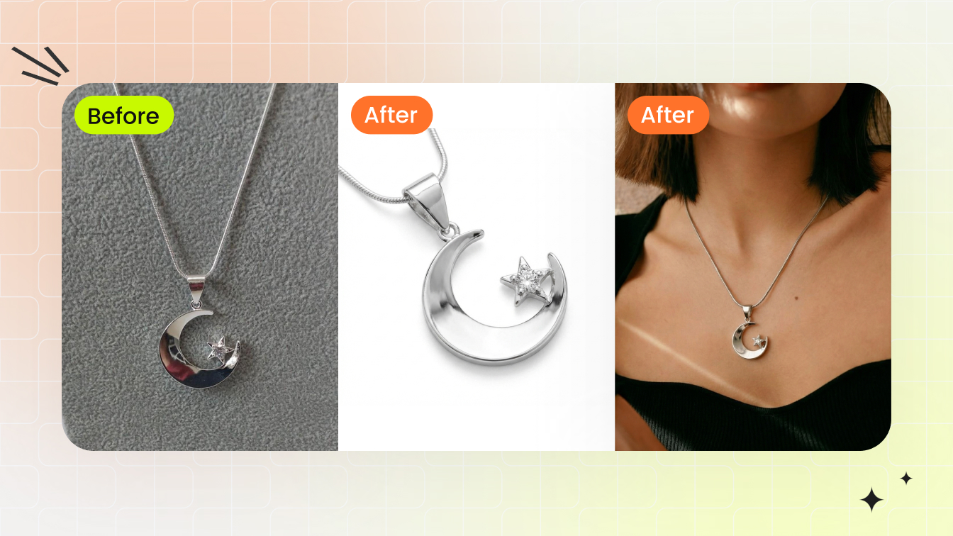
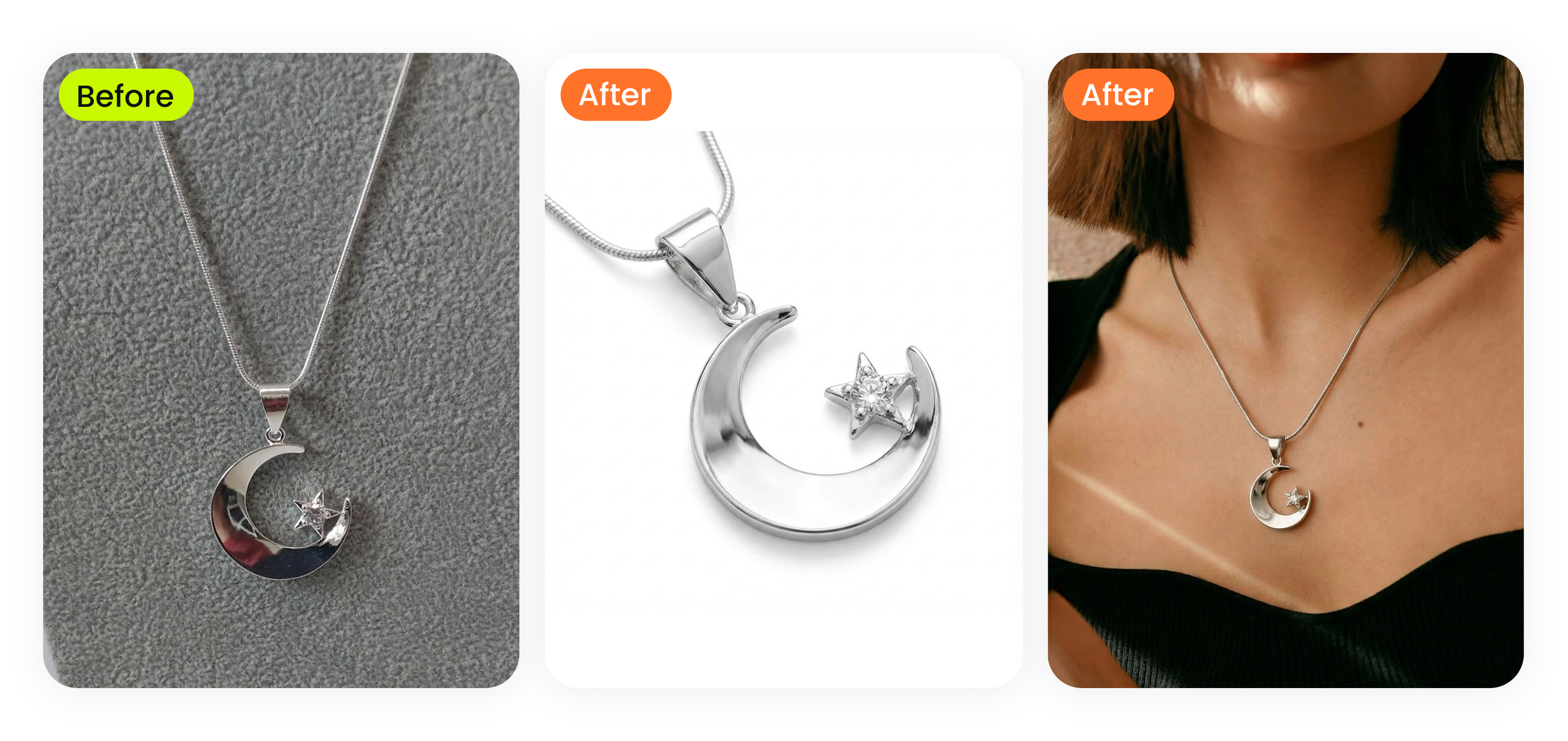
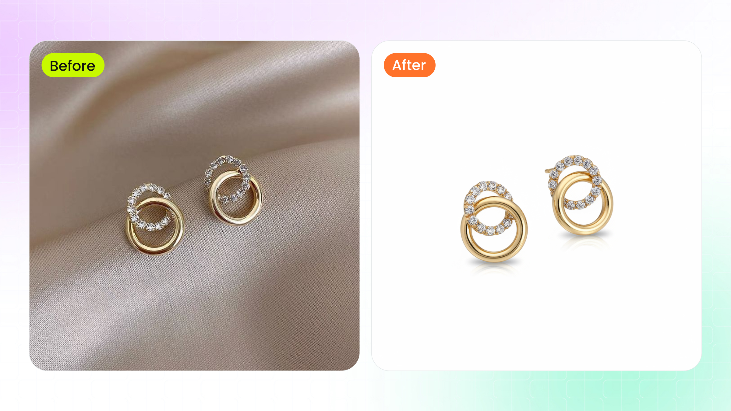
High-end jewelry retouching is post-production that enhances precious-jewelry photos while keeping the optical behavior of metals, gemstones, and pearls intact. The aim isn't a brighter, smoother image. It's an image where a viewer believes the metal is real gold and the stone has depth, because the light still behaves the way it would in a showroom.
What high-end jewelry retouching actually means
Basic photo editing handles corrections that apply to almost any image: cropping, exposure, white balance, removing a stray hair or dust speck. High-end jewelry retouching works at the level of the material itself. It controls specular highlights on polished platinum without flattening the surface, preserves the internal refraction inside a sapphire instead of just cranking saturation, and keeps a diamond's facet edges crisp so the stone still throws light.
Here's the practical difference. A general editor sees a bright spot on a ring and dims it. A jewelry retoucher reads that bright spot as the reflection that tells the eye the metal is real, then reshapes it to look intentional. Buyers can't always name what's wrong with a flattened image, but they sense it, and on a luxury piece that hesitation costs the sale. Luxury brands lean on this for campaign consistency, auction houses to represent estate pieces honestly, and ecommerce sellers because a piece that looks different in person comes straight back as a return. Whether it's a $500 engagement ring or a museum-grade necklace, generic filters and heavy smoothing make precious materials look like costume jewelry.
Why the original photo sets the ceiling
Retouching can only work with the data the sensor recorded. A skilled retoucher enhances and refines but can't invent detail that was never captured, so shooting RAW with controlled lighting saves far more time and money than any post-production trick. It helps to know what post can fix and what it can't.
- Recoverable: moderate exposure errors in a RAW file, dust on the piece or sensor, color casts from wrong white balance, small scratches or fingerprints, and background imperfections.
- Not recoverable: motion blur from camera shake, heavy noise from very high ISO, fully blown-out highlights where the specular detail is gone, and missed focus.
Motion blur is the unforgiving one. A diamond's facet edges have to be razor-sharp to read as brilliant; once they smear, sharpening only adds halos. White balance goes the other way: a gold bracelet shot under fluorescents picks up a green cast, but in RAW that color data is intact and corrects cleanly. Shoot JPEG and the camera has already baked in its interpretation, so your correction room shrinks.
RAW and color space for jewelry
RAW files are standard for professional jewelry work because they keep the full tonal range with no compression or color space baked in. The color-space decision happens later, during editing and export. Three matter:
- sRGB smallest gamut, works everywhere, but can't fully express saturated gemstone hues like deep emerald, vivid ruby, or tanzanite.
- Adobe RGB wider gamut, the practical working space for jewelry because it holds gemstone and warm-metal accuracy.
- ProPhoto RGB widest gamut but easy to mishandle, with color shifts that hide until output.
A clean workflow follows one path: capture in RAW, edit in Adobe RGB, convert to sRGB only at final export. That matters most across a large catalog, where the narrower sRGB space starts collapsing 14k yellow gold, 18k yellow gold, and rose gold toward the same tone; Adobe RGB keeps those warm metals distinct from the first image to the last. None of it works on an uncalibrated screen, which shows colors that aren't in the file and pushes your corrections further from reality. For gemstone work, where the client expects the on-screen stone to match the physical one, a calibrated wide-gamut monitor is the baseline.
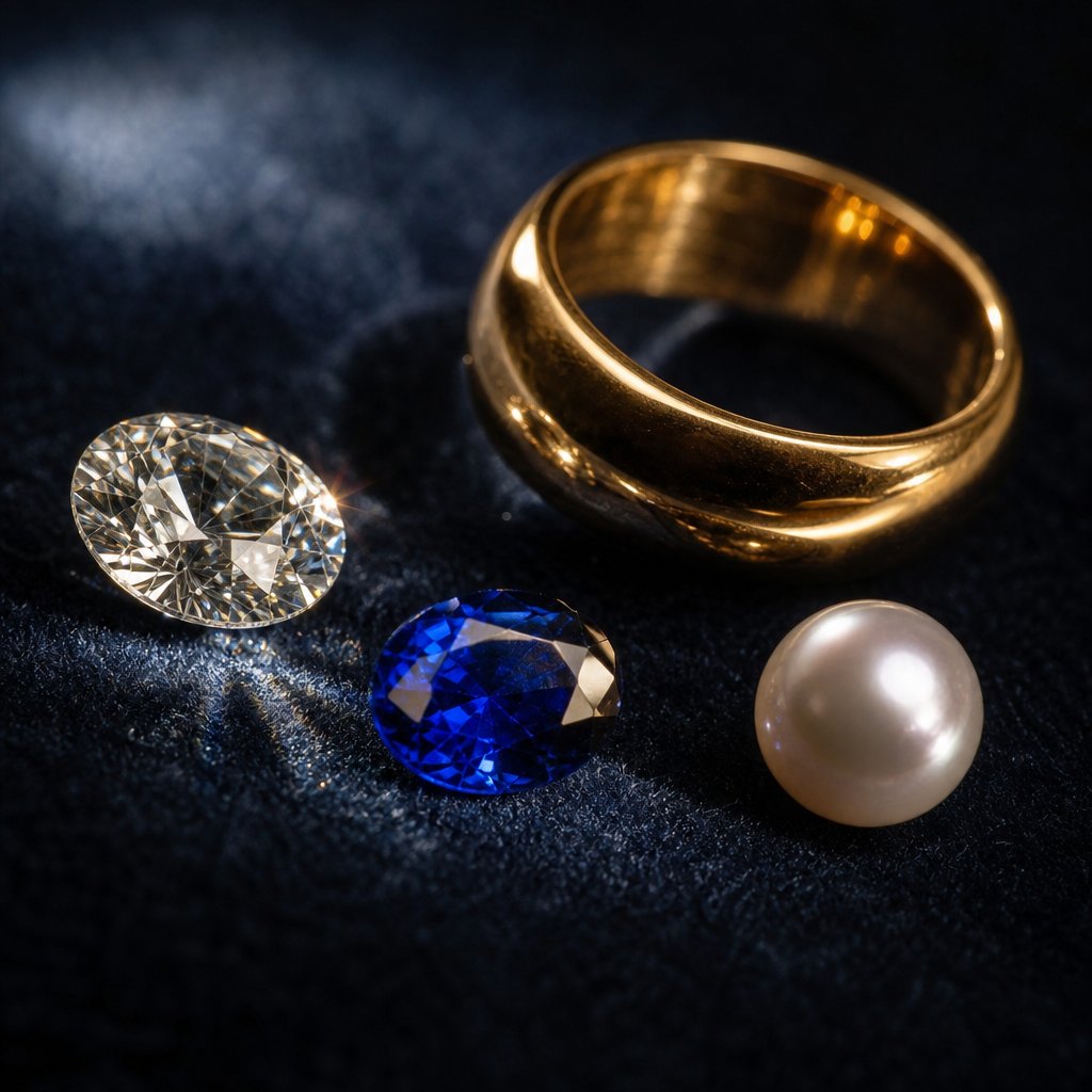
Every material needs its own approach
Gold doesn't reflect like platinum, platinum doesn't behave like a sapphire, and none of them behave like a pearl. Treating every surface the same way produces flat, unconvincing images, so good retouching starts by recognizing why a material looks the way it does before deciding how to enhance it.
Gold and platinum
Gold reflects warm light in broad, smooth highlights that roll across curved surfaces. Manage them without clipping into featureless white: lose highlight detail on a gold band and it stops reading as metal and starts looking like a yellow plastic tube. Careful dodge and burn keeps the gradual tonal rolloff that says polished precious metal.
Platinum, white gold, and silver have the opposite problem. Their cool, neutral surfaces throw sharp specular highlights that blow out easily on tight curves. Here you recover or paint back highlight detail while keeping the crisp, bright character that makes these metals look expensive instead of grey and dull.
Gemstones and diamonds
Transparent and translucent stones let light enter, bounce internally, and exit at various angles, which creates depth and color variation. Hit that with a global saturation or contrast boost and a three-dimensional gemstone collapses into a colored blob; a sapphire should stay darker near the edges and brighter where light exits through the pavilion.
Diamonds are stricter. A well-cut round brilliant has 57 or 58 facets arranged to maximize light return and dispersion, producing brilliance (white light) and fire (spectral flashes). Every facet edge has to stay crisp; soften those boundaries and you destroy the geometry that makes the stone sparkle. Enhance contrast between facets while leaving their angular relationships untouched.
Pearls and organic materials
Pearls are neither reflective like metal nor refractive like a gemstone. Their soft luster comes from light interacting with microscopic layers of nacre. The British Pearl Association notes that too little contrast makes pearls look plastic while too much turns them harsh and metallic. You want to preserve the faint pink, green, or blue overtone that floats across the surface without pushing it into anything artificial.
A single piece can demand several of these mindsets at once: a pearl-and-diamond pendant set in yellow gold might need three different treatments across one file. The table below sums up how to approach each material by its optical behavior.
| Material | Optical behavior | Common challenges | Technique |
|---|---|---|---|
| Gold (yellow/rose) | Warm reflections, broad smooth highlights | Highlight clipping, lost surface gradient, color cast | Gentle dodge and burn, warm-tone preservation, soft rolloff |
| Platinum / white gold / silver | Cool neutral reflections, sharp speculars | Blown-out highlights, surface looks flat or grey | Highlight recovery, reflection painting, controlled speculars |
| Colored gemstones | Transparent, internal refraction, color depth | Flattened depth, oversaturation, lost light play | Selective contrast inside the stone, no global saturation |
| Diamonds | High refractive index, precise facets | Soft facet edges, lost brilliance, muddy contrast | Facet-level sharpening, micro-contrast, keep geometry |
| Pearls | Nacre luster, diffused light, subtle overtones | Plastic look, lost iridescence, harsh contrast | Soft contrast, preserve overtones, minimal sharpening |
Skip the manual masking. Snappyit's jewelry retouch tool handles metals, gemstones, and pearls material-aware in one pass.
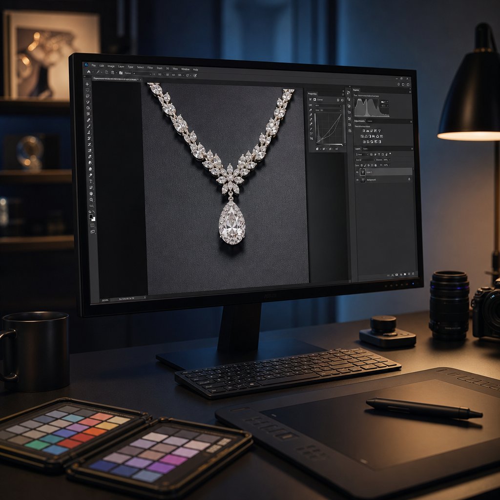
The core Photoshop techniques
Material-aware results inside a single file need a structured workflow. Most professional jewelry edits run the same pipeline: develop the RAW, focus-stack for sharpness, build a non-destructive layer structure, micro-cleanup, refine texture, sculpt with dodge and burn, shape reflections, then color grade and export per platform. Rush one stage and the problems compound downstream.
Focus stacking
Shoot a ring close with a macro lens and depth of field shrinks to a few millimeters: the front of the band is sharp while the back dissolves, and stopping down to f/22 doesn't help because diffraction softens the whole frame. Focus stacking captures several frames, each focused on a different plane, then blends them into one fully sharp composite. A web-resolution ring may need only a handful of slices; full-page print work needs many more.
In Photoshop, load the slices as layers (File > Scripts > Load Files into Stack), auto-align for tiny camera movement, then auto-blend with the stacking option, which masks in the sharpest part of each frame. You'll usually still clean up transition artifacts where masks overlap, and that manual cleanup separates a seamless result from a visibly seamed one.
Non-destructive layers
A complex jewelry composite can run past 50 layers, so organization keeps the file editable. Non-destructive editing preserves the original pixels at every stage:
- Adjustment layers for all color and tonal work, never Curves or Levels applied straight to pixels.
- Smart Objects for anything that might be rescaled or refiltered later.
- Empty layers with "Sample All Layers" on for Clone Stamp and Healing Brush.
- Neutral gray layers set to Overlay or Soft Light for dodge and burn.
- Layer groups by function: base composite, cleanup, color, light sculpting, sharpening.
The payoff is concrete: when a client asks you to "make the gold warmer" three revisions in, you adjust one Curves layer instead of rebuilding the edit, which is what makes consistent quality at volume financially workable.
Dodge, burn, and reflection painting
Dodge and burn turns flat metal dimensional. Lightening and darkening on a gray layer sculpts form: deepen shadows where a surface curves away, brighten where it faces the light. A gold band that read as a flat yellow stripe gains weight when you burn the edges and dodge the center ridge. Keep each stroke almost invisible alone; the dimension comes from the accumulation.
Reflection painting goes further. Rather than living with whatever the studio lighting produced, retouchers paint controlled speculars onto the metal with a soft, low-opacity white brush that follows the curvature of the piece. The reflections have to obey physics: wrap around curves, taper at edges, agree with the established light direction. Get it right and the piece looks like it's under perfect showroom lighting; get it wrong and the brain registers impossible light patterns as fake, even when the viewer can't say why.
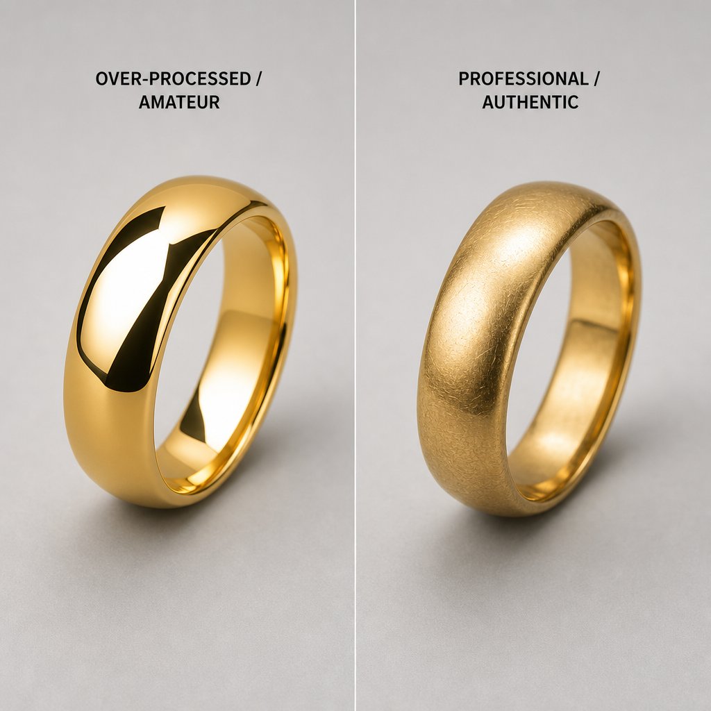
The mistakes that cheapen a piece
The fastest way to make expensive jewelry look cheap is over-smoothing, and most of these errors come from chasing a "perfect" image instead of an accurate one. Whether you edit in-house or review work from a budget service, knowing the failure modes is how you catch them.
Over-smoothing
This is the most common and most damaging mistake. Aggressive smoothing or noise reduction strips the micro-texture that tells the eye "real gold" or "polished platinum." Real metals have character: yellow gold shows faint directional polishing marks, platinum keeps a slightly satiny quality even when mirror-finished. Erase those cues and the surface reads as a 3D render, smooth but lifeless. Frequency separation lets you remove actual flaws on the high-frequency layer while leaving the underlying tonal structure and texture alone.
Reflections and depth
Reflections tell the brain about shape and material, so add or move them without respecting the light direction and the image feels wrong instantly. Copy a highlight from one side of a ring to the other, or drop in speculars that ignore surface curvature, and you create contradictions that read as fake. Gemstone depth fails the same way: boost contrast or saturation globally across a stone and the internal light play flattens into a colored disc. The rest of the common offenders, with their causes and fixes:
- Unnatural reflection angles painted or cloned without matching the key light. Reference the light position before adding any highlight.
- Flattened gemstone depth global contrast or saturation on the whole stone. Mask selectively and keep internal gradients.
- Pearls like painted spheres over-sharpening kills the nacre luster. Sharpen minimally, protect the overtones.
- Over-sharpening halos radius too high or applied globally. Use edge masks and check at 100% for fringing.
- Misaligned symmetry rings or earrings shot slightly off-axis. Correct with guides and transform tools.
- Camera or retoucher reflected in the metal on bezels and flat polished areas. Inspect reflective surfaces at high magnification and clone them out.
Categories carry their own traps. Rings demand precise symmetry, since a band that looks tilted reads as poorly made rather than poorly shot. Necklaces need chain-link consistency, where one soft or dark link breaks the rhythm. Watches are the most demanding: indices that must align, text that stays legible, hands that sit exactly without softened edges. Through all of it, enhance the piece toward its best real self, not an abstract idea of perfect.
What professional quality looks like
"Looks good" is an opinion. Professional jewelry retouching is judged on observable criteria you can check at 100% zoom, which is how quality stays repeatable across a catalog instead of drifting image to image. Five indicators carry most of the weight: edge sharpness with no halos, reflections that match physics (every specular tracing to one logical light source), color consistency across the catalog (thirty yellow-gold rings showing the same tone), clean product-to-background transitions, and natural shadows with the right direction and falloff. The table below contrasts amateur and professional results on each.
| Criterion | Amateur result | Professional result |
|---|---|---|
| Edges | Visible halos, jagged masks, soft borders | Clean narrow transitions, no fringing at 100% |
| Color | Inconsistent gold tones, shifted gemstone hues | Uniform metal tones, gemstone colors matched under D65 |
| Reflections | Contradict the light, copy-pasted, ignore curvature | One logical source, follow geometry, natural taper |
| Background | Visible fringe, uneven tone, extraction artifacts | Seamless transition, uniform background |
| Shadows | Hard-edged or missing, wrong direction, pasted-on | Soft graduated edges, correct direction, natural falloff |
Color accuracy and the ethical line
Color accuracy starts with the monitor; editing on an uncalibrated consumer display is essentially editing blind. Professional standards mean a hardware-calibrated, wide-gamut monitor with strong Adobe RGB coverage, set to a D65 white point and controlled luminance, recalibrated regularly with a colorimeter. Metamerism complicates things: two colors that match under one light source diverge under another, so a stone matched on your D65 monitor can look different on a phone under warm light, and going easy on saturation pushes keeps those shifts manageable. For catalog consistency, many studios keep a reference "gold standard" file per metal type and match every new image to it with Curves and selective color.
That raises the ethical boundary. Correcting a green cast so yellow gold looks like yellow gold is honest enhancement. Removing real inclusions, faking a higher karat, or inventing fire a diamond doesn't produce is deception. Ask whether the customer would feel misled when the physical piece arrives. Acceptable work removes dust, fixes white balance, cleans the background, and shows the piece under its best honest lighting. For an ecommerce seller this is also financial: misrepresented products come back as returns and bad reviews.
Where AI helps, and where it doesn't
AI retouching is fast and useful for the repetitive groundwork, but it isn't yet good enough to replace a human on luxury imagery. It's much quicker than manual work while still falling short on the material-aware decisions that define high-end results, which tells you exactly where it belongs.
What AI handles well
- Background removal and replacement it isolates jewelry from studio backgrounds reasonably well, even on chains and prong settings.
- Dust and scratch cleanup it removes small surface blemishes automatically, clearing the tedious first pass.
- Batch color correction consistent white balance and exposure normalization across hundreds of images.
- Upscaling and noise reduction neural models add resolution and suppress noise without the heavy smoothing of older tools.
- Output formatting automated resizing, format conversion, and platform exports.
Where AI falls short
- Metal texture AI tends to over-smooth polished surfaces and can't tell a flaw to remove from a texture to keep.
- Gemstone refraction internal light play needs an understanding of crystalline structure that AI flattens rather than enhances.
- Reflection work sculpting form with painted speculars takes judgment; AI often produces physically impossible highlights.
- Brand aesthetics a warm, romantic campaign and a stark, architectural one are different visual languages AI can't reliably internalize.
- Compositing and fine detail blending focus-stacked layers and protecting engravings, hallmarks, and small text still need a human eye.
The useful framing is AI plus human, not AI instead of human: let AI carry the predictable groundwork, then bring in a retoucher for material-specific refinement. Tools built for jewelry, like Snappyit, lean on this model, pairing AI efficiency with quality controls aimed at metal, gemstone, and pearl accuracy.
DIY or outsource
Do it yourself when your volume is low, your pieces are simple, and your retouching skills are solid. Outsource when volume climbs, pieces get complex, turnaround tightens, or your time is worth more elsewhere. The factors interact differently for a solo seller than for a studio running hundreds of SKUs a month:
- Volume at low volume, learning DIY pays off; at high volume the per-image time cost compounds against you.
- Complexity studs on white are manageable; multi-stone, mixed-metal pieces needing focus stacking and reflection painting are specialist work.
- Turnaround if images must go live within a day of the shoot, in-house becomes a bottleneck without dedicated staff.
- Skill can you run frequency separation on platinum without killing grain, or clean inclusions while keeping gemstone depth? If not, the learning curve is months.
- True cost per image not just your hourly rate times time, but software, hardware, calibration gear, training, and the opportunity cost of the hours.
That last point trips people up. The real cost of an in-house retoucher goes well beyond salary, as Pixelz's total-cost-of-ownership analysis lays out: benefits, equipment, space, management time, and downtime during slow periods. The logic holds for a solo seller too. Spend three hours on a ring when your time is worth more in product design or marketing, and that ring cost you more than any service would charge.
By stage, it breaks down cleanly. At low volume, DIY makes sense: get a calibrated monitor, learn non-destructive workflows, and build an eye for quality that helps you judge outsourced work later. In the awkward growing middle, you see the quality problems but lack hours to fix them, so outsource the groundwork (background removal, cleanup, batch color) and keep the creative retouching yourself. At high volume, in-house needs dedicated staff and the cost climbs fast, so a specialized jewelry service usually wins.
When you outsource, judge vendors on more than per-image price. Ask about onboarding, revision policy, and whether they actually specialize in jewelry. A generalist that also does apparel and electronics will over-smooth your gold and flatten your stones, and you'll pay twice to fix it. For sellers who want catalog-quality output without running a team, Snappyit's jewelry retouching offers a middle path purpose-built for precious materials. Many brands start DIY, move to partial outsourcing, then go full-service as scale demands.
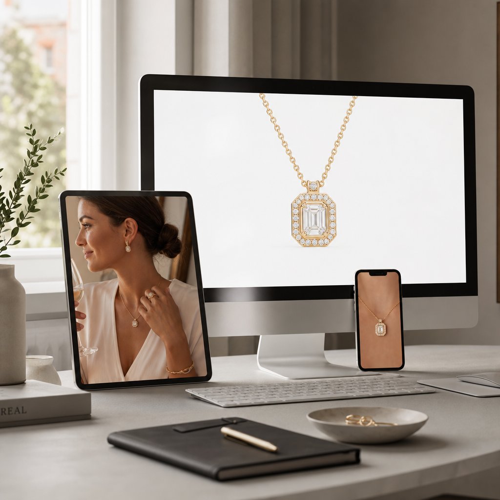
Output specs by platform
Target each platform's requirements from the moment you open the RAW, not at export. Resizing after sharpening introduces different artifacts than sharpening at the target size, cropping to square after compositing can clip chain ends you carefully retouched, and converting Adobe RGB to sRGB at the wrong stage can shift an emerald's hue enough to trigger a return. Plan the destination first and you sidestep all of it.
Amazon and marketplaces
Amazon enforces the strictest standards. Its jewelry guidelines require a pure white background (RGB 255,255,255), no text, watermarks, or models, and the product filling at least 80% of the frame. The longest side runs 500-2100 pixels, with at least 1000 on a side to enable zoom; retouch at 2000 or larger so the zoom shows gemstone detail. Upload JPEG in sRGB, since Amazon doesn't handle embedded Adobe RGB profiles consistently. One detail sellers miss: the main image must show the piece alone, with no ring boxes, velvet displays, or pouches.
Etsy, Shopify, and editorial
Etsy rewards lifestyle imagery, with square images around 2000 x 2000 performing best; it welcomes styled backgrounds and on-model shots, so retouching extends to props and environmental lighting. Shopify gives you full control, with about 2048 x 2048 recommended and file sizes kept small for fast loads; the priority there is catalog-wide consistency. Editorial print is a different world: 300 DPI at final size, often CMYK, a full-page ad needing roughly 2550 x 3300 pixels, and a look that leans toward mood over literal product accuracy.
| Platform | Background | Min resolution | Recommended | Format | Color |
|---|---|---|---|---|---|
| Amazon | Pure white (255,255,255) | 1000 x 1000 | 2000 x 2000 | JPEG (preferred), TIFF | sRGB |
| Etsy | Flexible / lifestyle | 1000 x 1000 | 2000 x 2000 square | JPEG, PNG | sRGB |
| Shopify | Seller's choice | 800 x 800 | 2048 x 2048 | JPEG, PNG, WebP | sRGB |
| Editorial print | Creative | 300 DPI at size | 2550 x 3300 full page | TIFF, PSD | Adobe RGB / CMYK |
If you sell across platforms, build one master at 3000+ pixels in Adobe RGB, retouch there, then create platform-specific exports last. Sharpening, resizing, color conversion, and compression happen once, at the end, so the master never degrades and every channel gets an image tuned to its specs. If you outsource, hand your retoucher those specs upfront and ask for multiple export versions from a single master edit.
Frequently Asked Questions
What is the difference between jewelry photo editing and high-end retouching?
Basic editing covers universal corrections like cropping, exposure, and white balance. High-end retouching goes deeper into material-specific work: sculpting light across diamond facets, managing platinum speculars without flattening the surface, and preserving internal refraction in gemstones. The difference is understanding how each material interacts with light, then using frequency separation, dodge and burn, and reflection painting to enhance rather than fabricate.
Can AI replace human retouchers for jewelry?
Not for luxury-grade results. AI is much faster and handles background removal, dust cleanup, and batch color well, but it over-smooths metal texture, flattens gemstone depth, and struggles with creative reflection work and brand-specific aesthetics. The strongest approach is hybrid: AI for the routine groundwork, a human for the material-aware refinement.
Which retouching mistakes most often cheapen a piece?
Over-smoothing metal (which strips the grain and makes gold look plastic), reflections that contradict the light direction, gemstone depth flattened by global contrast, over-sharpening that leaves halos on metal edges, and inconsistent lighting across composited elements. They share one root cause: chasing abstract perfection instead of physical accuracy.
What image specs do Amazon and Etsy require for jewelry listings?
Amazon wants a pure white background (RGB 255,255,255), at least 1000 x 1000 pixels (2000 x 2000 for zoom), JPEG in sRGB, with the product filling at least 80% of the frame. Etsy recommends square images around 2000 x 2000, allows lifestyle and styled shots, and accepts JPEG or PNG. Selling on both? Retouch one master at 3000+ pixels in Adobe RGB and export per platform last.
Why does shooting RAW matter so much for jewelry?
RAW keeps the full tonal range and unbaked color data, so white-balance and exposure corrections are clean and lossless. It also lets you work in Adobe RGB and convert to sRGB only at export, which preserves distinctions between warm metals like 14k gold, 18k gold, and rose gold across a whole catalog. JPEG bakes in the camera's interpretation and shrinks your correction room.
How does focus stacking improve macro jewelry shots?
At macro distances, depth of field shrinks to a few millimeters, so part of a ring is sharp while the rest blurs, and stopping the lens down too far just adds diffraction softening. Focus stacking captures several frames focused on different planes and blends the sharpest parts into one fully sharp composite, with a manual cleanup pass to remove any seams where the masks overlap.
High-end retouching is the finishing layer over the rest of Snappyit's AI product photography tools.